
You are using an out of date browser. It may not display this or other websites correctly.
You should upgrade or use an alternative browser.
You should upgrade or use an alternative browser.
Divine inspiration
- Thread starter Luga
- Start date
- Messages
- 6
- Name
- sime.beck@googlemail.com
- Edit My Images
- No
What's all that halo shizzle?
- Messages
- 2,453
- Name
- Piotr
- Edit My Images
- Yes
What's all that halo shizzle?
tone mapping.
- Messages
- 447
- Name
- Chris
- Edit My Images
- Yes
What's all that halo shizzle?
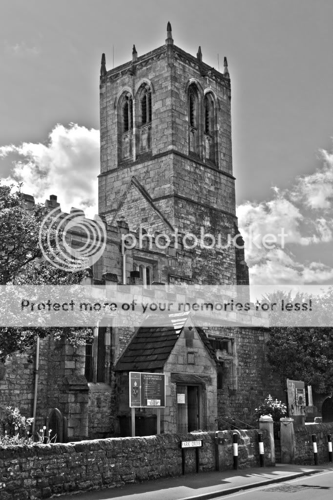
Just means there's a glow around the subject. In this case, it's the white glo (halo) around the church tower.
HTH
MWHCVT
In Memoriam
- Messages
- 28,467
- Name
- Matthew
- Edit My Images
- Yes
I like the image looks like a great location, I love churches, not a big fan of the processing,
I think it is leaning a little, when I level a church I look at the corner of the tower closest to camera as my point of reference and have found that to be the best option unless of course you have a liquid horizon visible i.e. The sea
I agree that off centre composition would have been better, I would also like to see the colour version
Matt
MWHCVT
OP
- Messages
- 616
- Name
- Chris
- Edit My Images
- No
I like the image looks like a great location, I love churches, not a big fan of the processing,
I think it is leaning a little, when I level a church I look at the corner of the tower closest to camera as my point of reference and have found that to be the best option unless of course you have a liquid horizon visible i.e. The sea
I agree that off centre composition would have been better, I would also like to see the colour version
Matt
MWHCVT
I see what you mean about the level and position of the church being new to photography i didnt think about this at the time of the shot.

This is the shot b4 i put it in PS for HDR toning.

OP
- Messages
- 616
- Name
- Chris
- Edit My Images
- No
There is so much detail on the photo and when you look at it again you see things you didnt notice before hence you only just noticed that the window had floating brick work. I will revisit the photo and make the improvements. Already i've learnt so much.
- Messages
- 6
- Name
- sime.beck@googlemail.com
- Edit My Images
- No
Will this shizzle fix it? http://www.talkphotography.co.uk/forums/showthread.php?t=279249
- Messages
- 6
- Name
- sime.beck@googlemail.com
- Edit My Images
- No
ah ok. It looks easy to do though. I'm sure you could manage it with a little practice.
- Messages
- 6
- Name
- sime.beck@googlemail.com
- Edit My Images
- No
Picture before. Please notice the halo.

And after editing using the link provided. Notice no halo now.

Easy peasy
And after editing using the link provided. Notice no halo now.
Easy peasy
- Messages
- 9
- Name
- Graham
- Edit My Images
- Yes
Nay, as they dare. I will bite my thumb at them; which is a disgrace to them, if they bear it.

- Messages
- 1,602
- Name
- Fiona
- Edit My Images
- Yes
i think for someone new to photography you have a great start,
you have done very well getting rid of and minimising the signage outside the church ( inconsiderate councils! lol) the halo has already been pointed out as has the leaning, always check your buildings for lean and CV's ( converging verticals) which CAN work in some images specially when shot with a very wide angle .but it doesnt here.
what bothers me most about this is the composition, and that is key to any good image no matter how good the processing.
the whole image leaves me feeling somehow cut off from the rest of the church, i dont mind so much that the steeple is central, BUT it would have been so much better if the whole church had been captured instead of a part of it,
- Messages
- 130
- Name
- Ross
- Edit My Images
- Yes
It's very easy to get into the habit of over-processing an image when you are new to photography, I'm sure most of us have been there, done that! Try to develop your skills with your camera to nail the "look" you are after without much more than a White balance tweak!
OP
- Messages
- 616
- Name
- Chris
- Edit My Images
- No
i think for someone new to photography you have a great start,
you have done very well getting rid of and minimising the signage outside the church ( inconsiderate councils! lol) the halo has already been pointed out as has the leaning, always check your buildings for lean and CV's ( converging verticals) which CAN work in some images specially when shot with a very wide angle .but it doesnt here.
what bothers me most about this is the composition, and that is key to any good image no matter how good the processing.
the whole image leaves me feeling somehow cut off from the rest of the church, i dont mind so much that the steeple is central, BUT it would have been so much better if the whole church had been captured instead of a part of it,
Thanks for your feedback its good to get proper feedback like yours.
Due to the road being so narrow and its being a road which i cars are still going down at time. It was the best i could do with my limited skills and lens in my bag.
But i shall look in to this CV i dont even know what it means.
 LOL
LOLThank you very much.