- Messages
- 133
- Name
- Kane
- Edit My Images
- Yes
Hi guys,
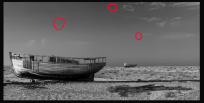
Would you mind taking a look at the below. Think I'm going to get it printed to display and just want to see if there is any changes you'd recommend in the editing suite. Or any tips for future.
Cheers,
Kane
View: https://www.flickr.com/photos/196545869@N02/52375040988/in/dateposted-public
Would you mind taking a look at the below. Think I'm going to get it printed to display and just want to see if there is any changes you'd recommend in the editing suite. Or any tips for future.
Cheers,
Kane
View: https://www.flickr.com/photos/196545869@N02/52375040988/in/dateposted-public