- Messages
- 94
- Name
- Mark
- Edit My Images
- Yes
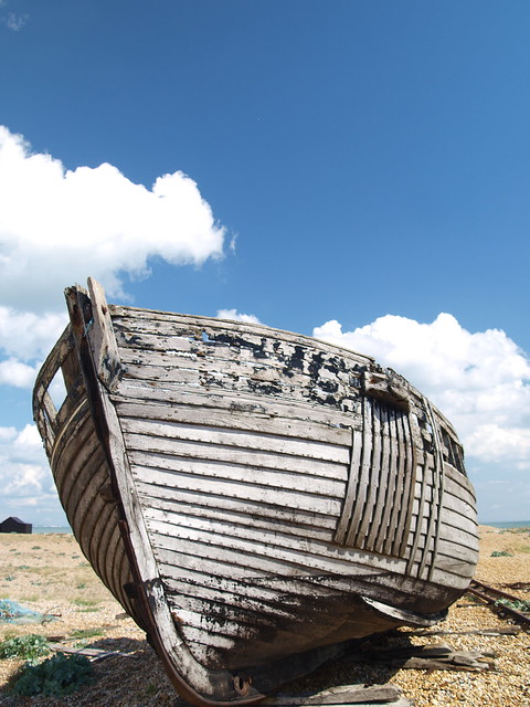
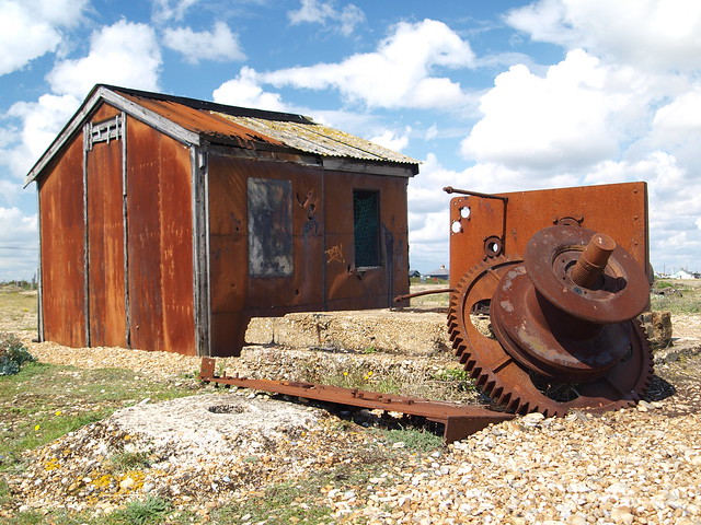
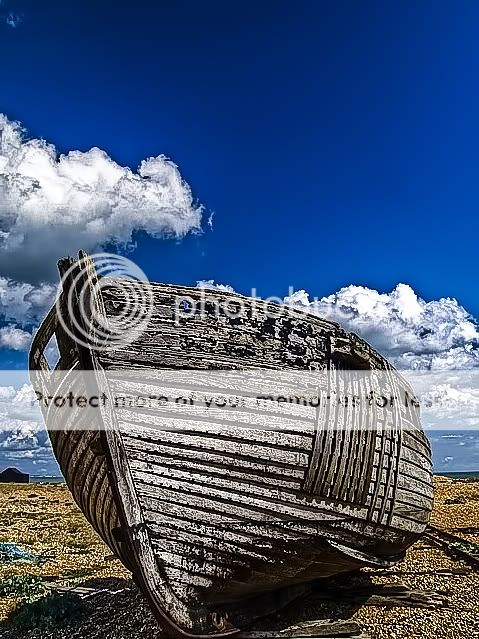
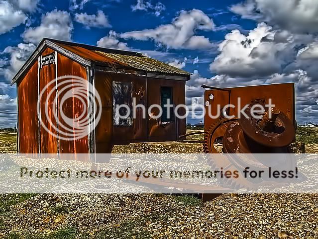
I know Dungeness has probably been done to death and HDR is not everyones cup of tea but I was down there the weekend so took some shots. Hopefully my composition has improved slightly since my last posts but still not 100% on PP. C&C welcome as always.

Dungeness 2 HDR 2 by mja'81, on Flickr

Dungeness 2 HDR by mja'81, on Flickr

dungeness 4 HDR by mja'81, on Flickr

Dungeness 3 HDR by mja'81, on Flickr

Dungeness 1 HDR by mja'81, on Flickr
hope you like.
Dungeness 2 HDR 2 by mja'81, on Flickr
Dungeness 2 HDR by mja'81, on Flickr
dungeness 4 HDR by mja'81, on Flickr
Dungeness 3 HDR by mja'81, on Flickr
Dungeness 1 HDR by mja'81, on Flickr
hope you like.
")


 . I shall upload them to Flikr now and post the bracket shots. Best advice I've had of this forum to date so for that I thank you.