Easter Wedding

Messages
4,330
Name
John
Edit My Images
Yes
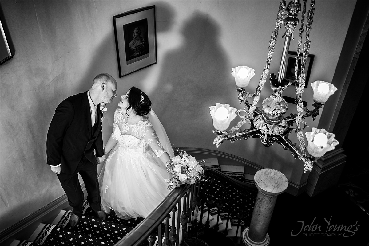
I don't post many photos on here but thought I would share a few from a recent wedding which was on Easter weekend. The weather all week (before and after the wedding) was naff so we were so lucky on the day

(1)
Sam%20%282%29.jpg


(2)
Sam%20%284%29.jpg


(3)
Sam%20%287%29.jpg


(4)
Sam%20%2810%29.jpg
 
Really liking the bridge shot.

The first one seems a bit bright, not over exposed or anything just bright, to my taste :)
 
Thank you... Yes I see what you mean with the first shot. It was strong direct sunlight behind which I tried to compensate with fill flash but maybe I used a little to much... :)
 
1. I'd turn the bride a fraction more - she's a little straight on and s pose would work well to give her more shape. Brightness looks fine to me.
2. Like this - but why the tilt? Doesn't need it imo.
3. This just doesn't work for me at all. The groom looks a little clumsy leaning over, has a halo on his arm and the shadow is very strong. How did you light this?
4. Like this as a silhouette shot
 
Thanks for the feedback.

1 Yes I known what you mean turning her would have been more flattering

2 to be honest I don't tilt many of my photos but I thought it just gave it a little edge to compliment the bride with the hands on hips and daft attitude.... Well that was the idea anyway.

3 I lit it with flash off camera in front of them and I was trying to mess with their shadows. I do agree the groom looks awkward and I did notice at the time and moved him for next shot but I still liked the shadow in this one
 
Really like 2 3 and 4, I think they each have strongpoints:
In No2 the lead in from the corner works well. I like the diagonal, not too over-emphasised.
Clever sighting of, and use of shadows in No3.
Powerful positioning and dynamic silhouette in the final one.
No1 does appear a little bright, perhaps a small loss of detail in the dress and I'd remove the electricity pylon to the left of her head - once I noticed it, I couldn't stop looking for it every time.
 
1. I'd turn the bride a fraction more - she's a little straight on and s pose would work well to give her more shape. Brightness looks fine to me.
2. Like this - but why the tilt? Doesn't need it imo.
3. This just doesn't work for me at all. The groom looks a little clumsy leaning over, has a halo on his arm and the shadow is very strong. How did you light this?
4. Like this as a silhouette shot

Same comments as above for me.
 
Really like 2 3 and 4, I think they each have strongpoints:
In No2 the lead in from the corner works well. I like the diagonal, not too over-emphasised.
Clever sighting of, and use of shadows in No3.
Powerful positioning and dynamic silhouette in the final one.
No1 does appear a little bright, perhaps a small loss of detail in the dress and I'd remove the electricity pylon to the left of her head - once I noticed it, I couldn't stop looking for it every time.


Thank you - informative review with some useful points there. Yes I think No 1 does seem a little bright the more I look at it and yes I was trying to play with their shadows in No 3 and would have liked to remove the picture on the wall but it was screwed on. With the last photo it was unplanned really they just walked in the room and I saw how dramatic the light looked

You know what I never even noticed that pylon :thinking: well spotted
 
I like them all not sure if I like or hate the shadows on 3 though


Thank you :) - well to be honest I usually avoid shadows like the plague but this time I thought I would do something a bit different. I did do something similar a while back at a castle but this time it was much more visible.


Maybe a Marmite thing..... o_O
 
Back
Top