

Entrance Exam

Messages
185
Name
Fuglstad
Edit My Images
No
I need your help on this one.
I'm applying for a school, and this is the entrance exam.
What do you think? Is it good enough?

Take 4 photos. 2 of them shall be based on your interpretation of two words; the first shall be Contrast and the second Shall be movement. The last two shall be portraits of people that mean something to you. The portraits shall bring forward their personality.

So it's basically:
1. Contrasts
2. Movement
3. Portrait
4. Portrait


And this is what I've come up with.

1.
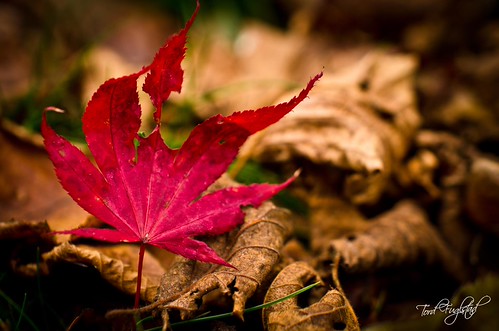
20111023-TF1_8057 by TordFuglstad, on Flickr

2.
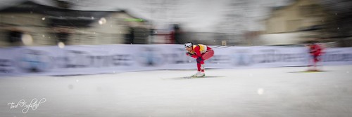
20120307-TF2_7888 by TordFuglstad, on Flickr

3.
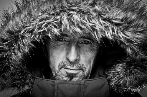
20111204-TF2_0748 by TordFuglstad, on Flickr

4. Still blank on this one, until I get my Lightroom catalog working again :shrug:
 
#3 is a cracker, #1 you have just clipped the top of the leaf - can you re-crop? #2: The figure to the right is distracting and the main skier a bit central for my taste. I'd crop to exclude the building and figure. Also, I don't like seeing signatures on photos, but that's because I don't like seeing signatures on photos.

Good luck!
 
I'm probably being an over-thinking nit picker but the theme for no.1 is "Contrasts", plural. Your pic is lovely but involves a single dimension of contrast i.e. colour. They might be wanting you to look a little deeper and find a way to show more than one contrast in the image.

And, sorry about this but your second shot is "Movement" but the main skier looks absolutely still. I'm probably in a minority of one but I don't get a sense of movement at all.

You already know that I think no. 3 is a terrific portrait :-)
 
Number 2 really stands out for me, I think you've got movement on several levels.. the central skier stopped in motion, the panning blur of the background, the independent motion blur of the second skier, and the out-of-focus snow drops caught in mid-air. Definitely shows something a little different and unconventional.

I'm less certain about the first shot, there is the contrast between the autumn red leaf and the dead brown leaves but it's a little conventional. The stray pine needle at the bottom of the frame is a little distracting and could be removed.

I like the portrait, the fur hood has a larger than life quality which I hope matches the subjects personality!

I'd make sure the fourth was in portrait orientation as the three you've selected so far are all landscape format.
 
No 2 is great movement shot, and personally I like the crop as it stands because it adds to the context of a race.

No1 doesn't do a great deal for me, but then I'm not a still life fan - I quite like the concept though.

No3 good portrait & excellent choice of crop.
 
Back
Top