You are using an out of date browser. It may not display this or other websites correctly.
You should upgrade or use an alternative browser.
You should upgrade or use an alternative browser.
Critique Ferrari 488 Pista
- Thread starter Davephoto
- Start date
Thanks Robabsolutely stunning
- Messages
- 2,664
- Name
- Paul
- Edit My Images
- No
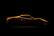
Nice set Dave, for my taste in shot 1 I'd have liked to see a bit more detail in the shadow areas so I could see a bit of the lower half of the car and a bit of detail in the wheels. I ought to add that I couldn't have done such a good job myself but when asked that's my thoughts.
Thanks Paul I’ll have another look.Nice set Dave, for my taste in shot 1 I'd have liked to see a bit more detail in the shadow areas so I could see a bit of the lower half of the car and a bit of detail in the wheels. I ought to add that I couldn't have done such a good job myself but when asked that's my thoughts.
- Messages
- 7,842
- Name
- Mike
- Edit My Images
- No
Don't like any of them!
- Messages
- 8,029
- Name
- David
- Edit My Images
- Yes
They make a modern supercar adorned with far too many scoops, bumps, bugles, spoilers look beautiful. These modern cars can't hold a candle to a 1960';s Ferrari in the beauty stakes..
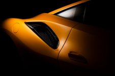
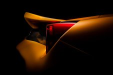
That said (and thsi is a personal preference) I don't like the OOF type roll off in images 3 and 4, it jars with the crisper edges.
Image 1 is stunning
That said (and thsi is a personal preference) I don't like the OOF type roll off in images 3 and 4, it jars with the crisper edges.
Image 1 is stunning
- Messages
- 3,069
- Name
- Tim
- Edit My Images
- Yes
These were my thoughts too. Maybe something white above the camera to bounce a little bit of the ad200 light back?Nice set Dave, for my taste in shot 1 I'd have liked to see a bit more detail in the shadow areas so I could see a bit of the lower half of the car and a bit of detail in the wheels. I ought to add that I couldn't have done such a good job myself but when asked that's my thoughts.
Good idea Tim but there usually is enough light to bounce back from the floor to the car so all the info is there in the RAW file so it’s just a case of re-editing the image to brighten the shadows.These were my thoughts too. Maybe something white above the camera to bounce a little bit of the ad200 light back?
sk66
Advertiser
- Messages
- 8,687
- Name
- Steven
- Edit My Images
- Yes
Very nice set.
IMO, the bright area at the rear of the window in #1 is too much; and if there was going to be a bright area like that it should be near the logo towards the front.
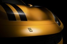
In #2 the badge highlight area is a bit heavy and artificial looking to me. And in #4 the highlight on the fin has gone gray.
IMO, the bright area at the rear of the window in #1 is too much; and if there was going to be a bright area like that it should be near the logo towards the front.
In #2 the badge highlight area is a bit heavy and artificial looking to me. And in #4 the highlight on the fin has gone gray.


