You are using an out of date browser. It may not display this or other websites correctly.
You should upgrade or use an alternative browser.
You should upgrade or use an alternative browser.
Few of my bmx shots
- Thread starter Pricer
- Start date
mobilevirgin
I'm a cheeky little sausage
- Messages
- 2,697
- Name
- Peter
- Edit My Images
- Yes
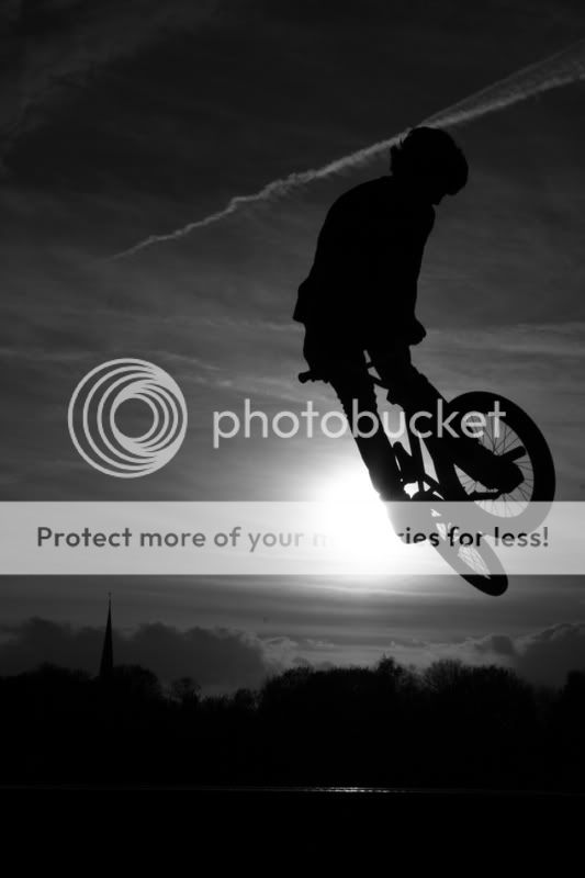
The B&W ones work really well - just a pity about the skytrails. Not that there's anything wrong with the others. Good set that.
OP
- Messages
- 483
- Name
- Dave Price
- Edit My Images
- No
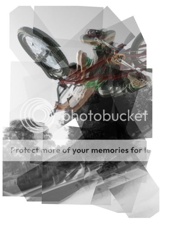
cheers for the comments, that last one is a "pano" style shot, You split the picture up into equal segments and then re arange them in what ever manner you want the picture to portay. So i just made all of the edges jagged a bit to give a warped/sureal effect
- Messages
- 1,797
- Name
- David Bridges
- Edit My Images
- Yes
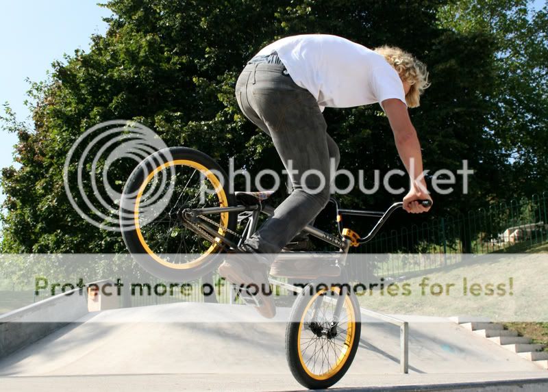
2 is my favorite, the rest do nothing for me
dod
TPer Emeritus
- Messages
- 16,678
- Name
- Ebenezer McScrooge III
- Edit My Images
- Yes
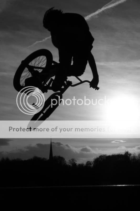
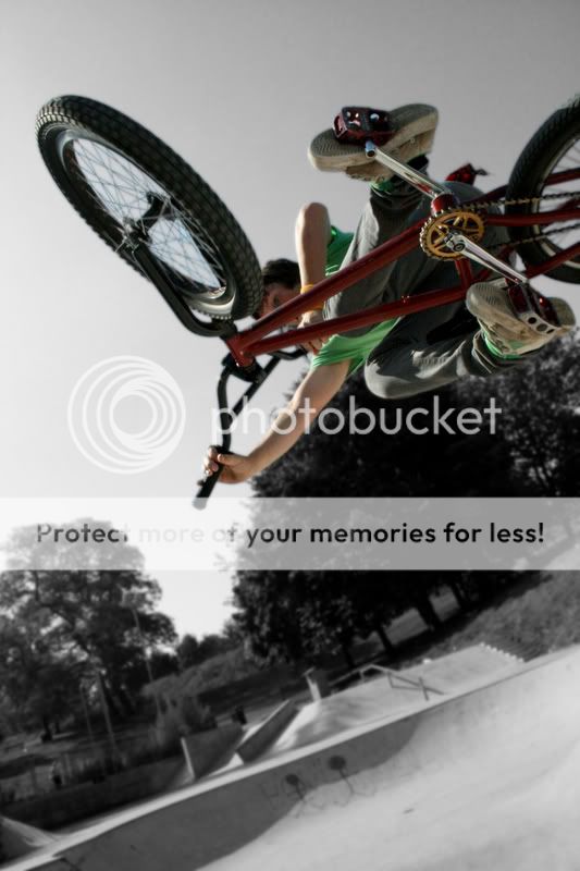
Exactly how I feel, the B&W treatment works really well with these.Love 1,2 and 4.
3 ok - but not as good as the others. Still trying to work the last one out!!!!
Oh, and welcome Pricer, hope you enjoy it here
")
- Messages
- 635
- Name
- Darren
- Edit My Images
- Yes
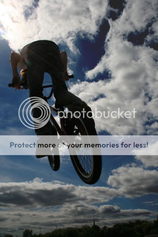
Nice shots, loving the B&W background color rider one. What sk8park is it by the way.
- Messages
- 387
- Name
- David
- Edit My Images
- Yes
4 is my favorite.
- Messages
- 446
- Edit My Images
- No
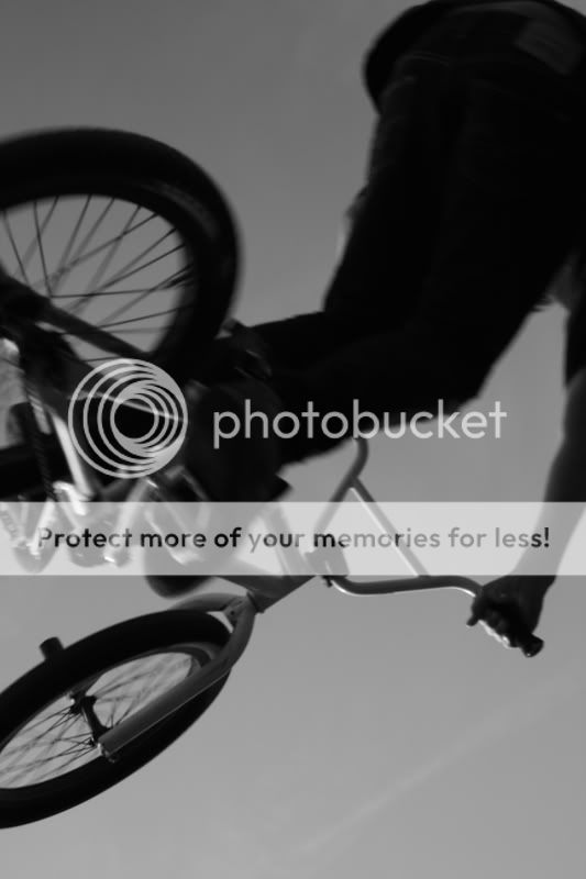
No 1 would be kick ass if it were in focus. No 2 is my favorite. No 4 doesn't work for me, because selective colouring went out with noah (thankfully). I would like to see that in full B+W with the colour channels mixed and light mid-tones/dark(ish) shadows .
.- Messages
- 443
- Name
- Martyn
- Edit My Images
- No
I like #1 the best... the softness is actually what I like about it... different strokes for different folks I guess. Brilliant silhouette and cracking composure.
That would make great pack art backing for a console bmx game!
edit - I think you should remove the highlighted bit at the bottom though - make it all as dark and even as possible.
That would make great pack art backing for a console bmx game!
edit - I think you should remove the highlighted bit at the bottom though - make it all as dark and even as possible.