Critique Few shots from my sisters wedding

Messages
357
Name
David
Edit My Images
Yes
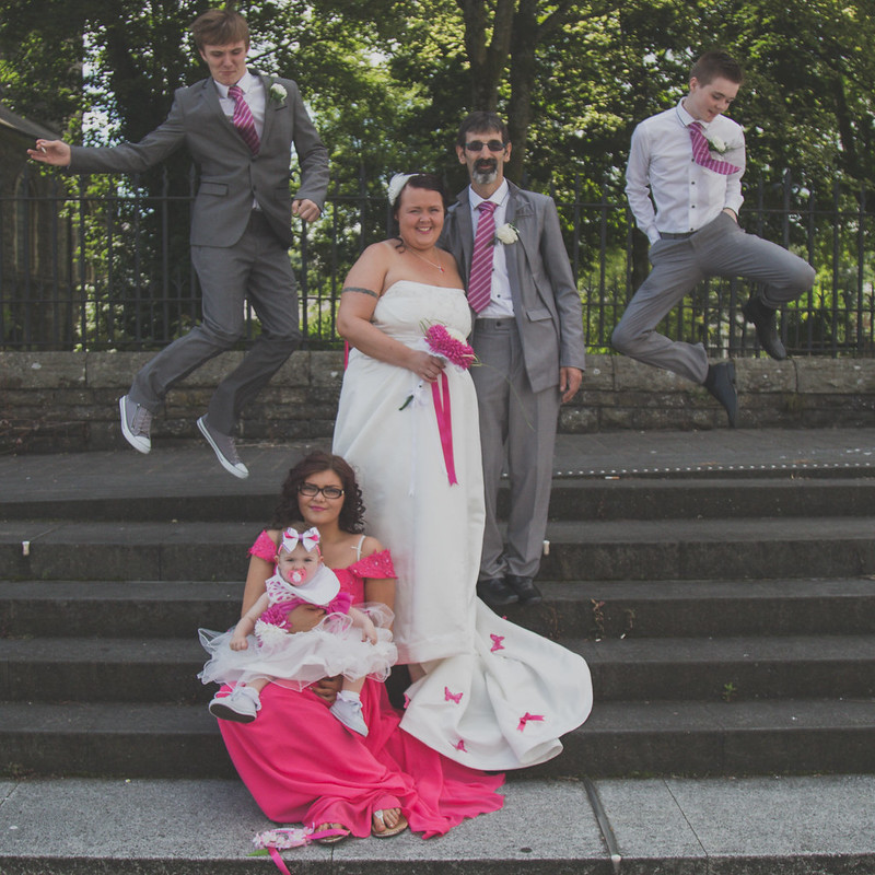
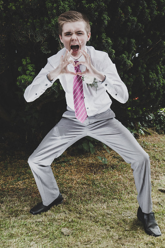
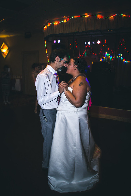
My sister got married on Friday and asked for me to take a few shots, She didn't want a professional photographer as it was a small gathering and quickly organised.
I don't consider myself a decent photographer let alone a professional one haha. But I consider these some of the best that I was able to capture on the day.

Just looking for some critique to improve my photography, Be as harsh or nice as you'd like

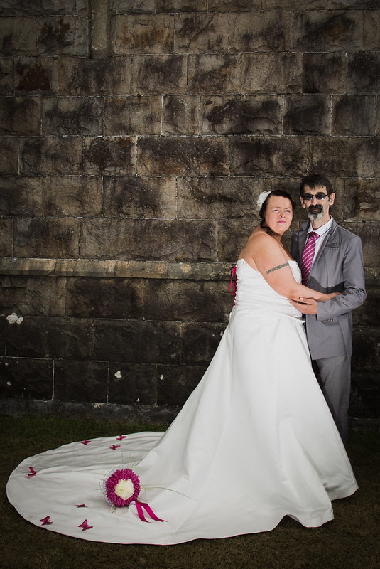
905A7428 by David Malpas, on Flickr

905A7527 by David Malpas, on Flickr

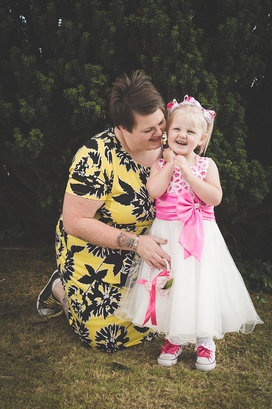
905A7386 by David Malpas, on Flickr

905A7264 by David Malpas, on Flickr

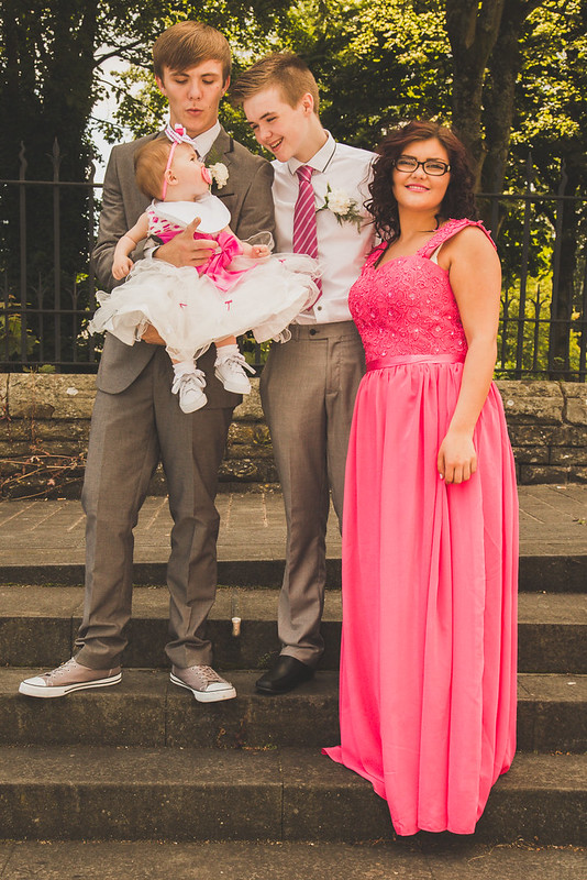
905A7288 by David Malpas, on Flickr


905A7564 by David Malpas, on Flickr

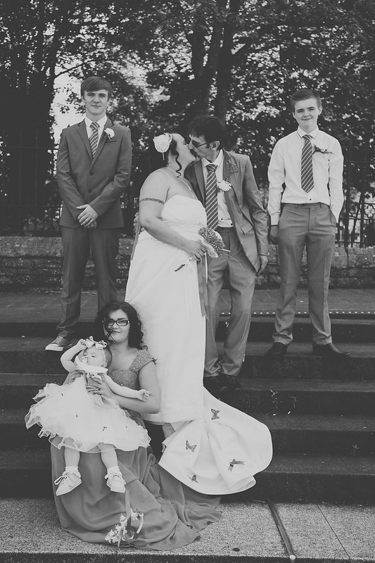
905A7706 by David Malpas, on Flickr
 
Well she was more than pleased, she had nothing to compare them to so I suppose that went in my favour!

What pointers can anyone give me on starting in this field.. Not weddings per-say just people in general?
 
Hi David, I've a few pointers if that's ok with you:

#1 looks rather posed and they're squeezed too close to the right side. Also the flash light is a bit too harsh on their faces - ideally an umbrella to diffuse or natural light would have been better.

#2 is a nice moment. I would crop it slightly closer

#3 is nice too, but cropped a bit too close to the top

#4 is good! I would personally darken the blacks a bit, but otherwise I like :)

#5 is fun, but the contrast is a little flat

#6 fun shot indeed!

#7 could do with more light. both ambient and flash.

Hope that helps!

ps. The popped collar on the groom's jacket would have been bugging me all day :D
 
I am no expert by any means and am still very much finding my own way as far as weddings are concerned but the biggest thing for me here is, the processing. It's all over the show. Lots of contrast, no contrast, funky colours and then weird, scary heart boy.
 
Honest feedback!:

#1 Looks a bit forced - a little like she's squinting, the bouquet on the dress is a little old hat for my taste

#2 Shot works great as far as emotion and composition but for me the PP lets it down. Really not a fan of low contrast shots, some people like them as they are 'in' at the moment but in 20 years they almost certainly won't be. If you re-edit this with the blacks lower it would be a good photo

#3 Again, nice but the WB is off, far to yellow/green. Have a play with the wb and tint in LR, maybe use the wb selector aoff the little girl's white dress - it will get you somewhere close

#4 Posing a bit skewed but I'm guessing the little girl wasn't co-operating? (we've all been there) Again, not a fan of the low contrast - I'd lower the blacks

#5 See above

#6 Don't really get it, the flash (or PP) make's him look like a bit like a zombie. If this is part of a fun shot you were aiming for it then fair play

#7 The flash is very harsh, looks like it's been sprayed at them. If you have a flash with a head that rotates try bouncing off a wall or ceiling for a more flattering spread of light. If you were shooting manual you could slow the shutter speed down a bit for more ambient light so you could see the background more.

Hope this helps
 
Back
Top