
- Messages
- 5,635
- Name
- Shaheed
- Edit My Images
- No

Looks good to me, well done on your first self-develop.
Are these colours normal for whatever film you've used? It looks a bit like what happens when I mistakenly export AdobeRGB instead of sRGB.
Colours aside, they're fab!
")
I imagine it's properly challenging.I think there may be user error with temperature/timing of the developing.
I think there may be user error with temperature/timing of the developing.
I dunno - my results on Portra 400 have usually come out very similar to this - it's definitely not a particularly "in your face" film, colour rendering wise... Indeed when I saw the shots my first technical thought was "bet that's portra, go have a look in the film & conventional section where he showed the negs..."

I imagine it's properly challenging.
I agree with Gareth that the colours look slightly off to me too. It looks almost like an inconsistent temperature during developing. That said I rarely shoot Portra so it may just look like that.
I like number 2 though.
When I develop colour film I keep the tank in the water the whole time(well, after I have done the first lot of agitations)... using the 'stick' thing to swish the reel in the tank. It is that drop in temperature when lifting in and out that is enough to colour cast your film(not always, but is often a factor).Thinking back, I might have left the dev tank out of the "water bath" despite the reagents being at temp!
Although I guess you live and learn so I'll see what happens next time!!
When I develop colour film I keep the tank in the water the whole time(well, after I have done the first lot of agitations)... using the 'stick' thing to swish the reel in the tank. It is that drop in temperature when lifting in and out that is enough to colour cast your film(not always, but is often a factor).
Great to see that you're now doing colour at home, Shaheed!
I will be honest, I think the colours are a little off. I saw them on my phone but wanted to look on the computer before commenting. Wouldn't be what I would expect from Portra 400 anyway. This is one reason I still leave colour developing to the lab. That and dust spotting! Haha.
Hope you appreciate the honesty.
 Sophia Natural Light by Sir._.SR, on Flickr
 Father and Son B&W by Sir._.SR, on Flickr
 Father and Son_ by Sir._.SR, on Flickr
 Jess Petri7s by Sir._.SR, on Flickr
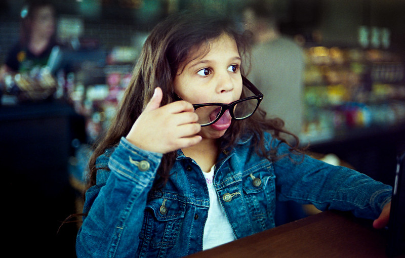 Selfie Jess Petri7s by Sir._.SR, on Flickr
 Sophia Petri7s by Sir._.SR, on Flickr
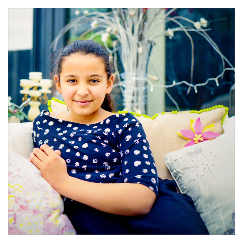
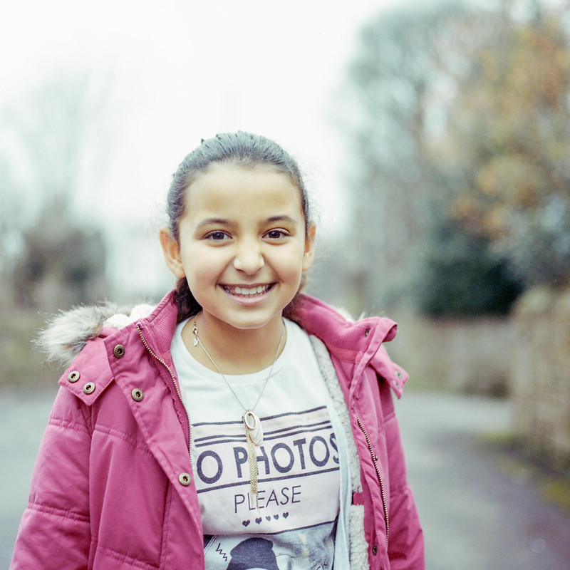 No Photos
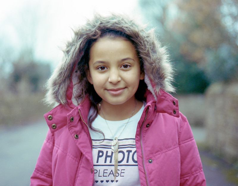 No Photos 3
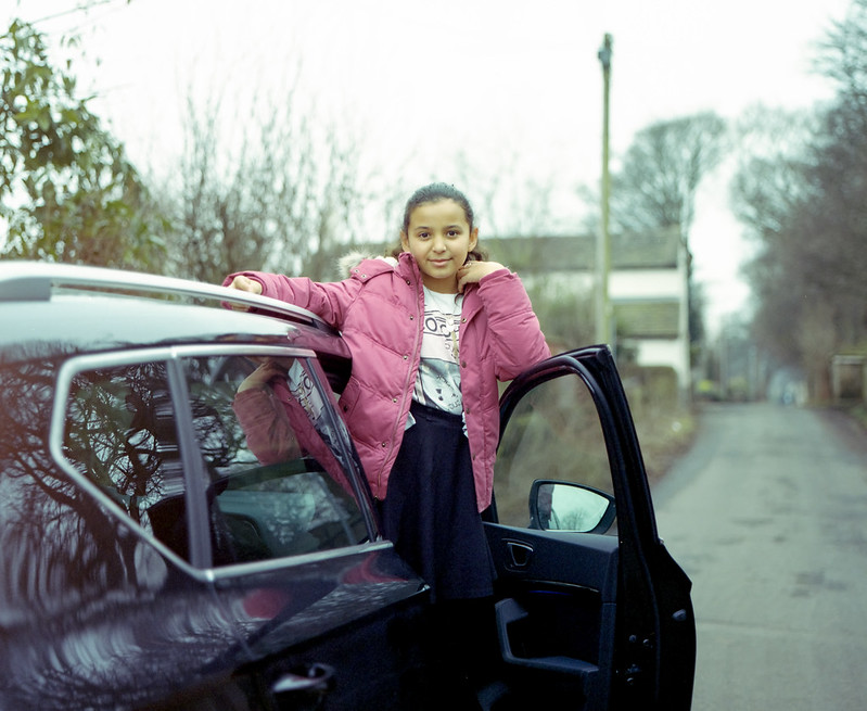 No Photos 2
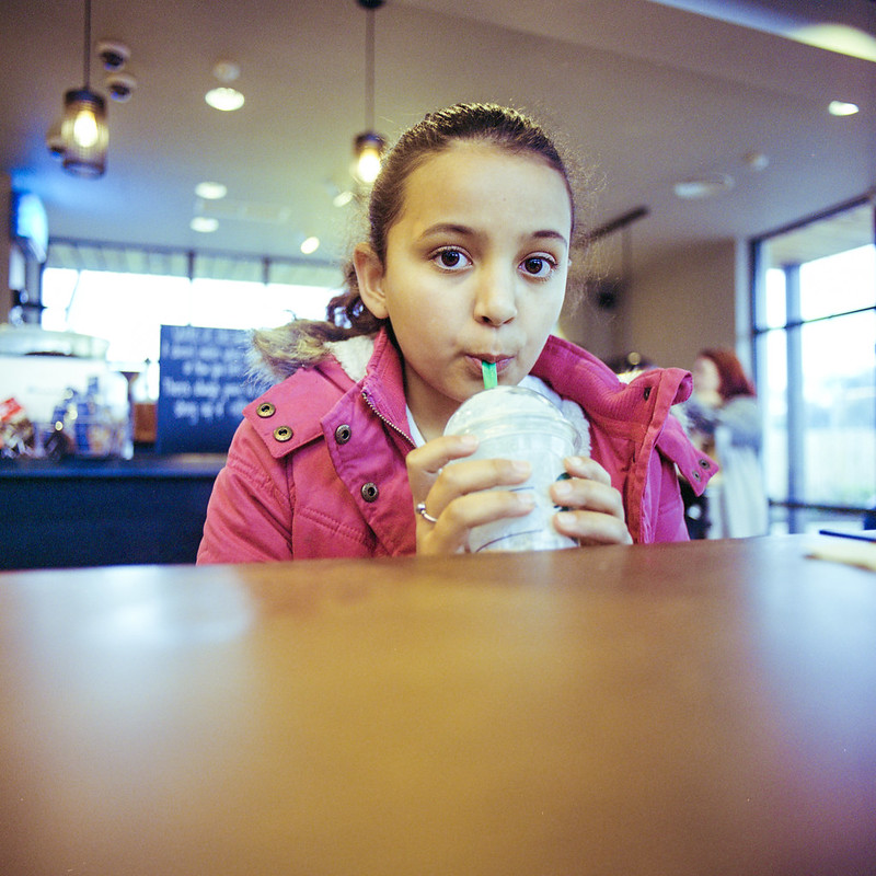 Coffee
 Me
Me Petri 7S test