
You are using an out of date browser. It may not display this or other websites correctly.
You should upgrade or use an alternative browser.
You should upgrade or use an alternative browser.
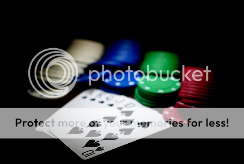
First attempt at light painting
- Thread starter pooma
- Start date
- Messages
- 9,818
- Edit My Images
- No
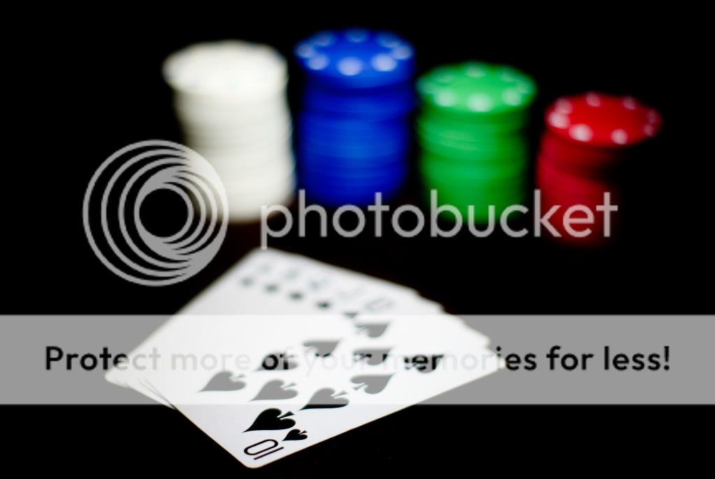
I think the second works better than the first. I'm not sure about more depth of field, but I wonder if the other "10" on the top-most card would have been better to be in-focus? that would have given a lead-in out-of-focus area as well as allowing the other cards to be identified - I can't tell you're holding two pairs in the second shot.
New years day afternoon.. there's probably a few people having a meal or out for a walk, maybe too soon to worry about a lack of response")
New years day afternoon.. there's probably a few people having a meal or out for a walk, maybe too soon to worry about a lack of response
MWHCVT
In Memoriam
- Messages
- 28,467
- Name
- Matthew
- Edit My Images
- Yes
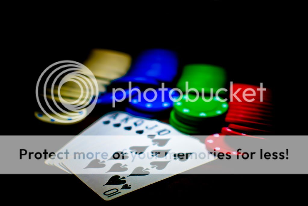
Personally I find the DoF far to shallow in all of these and the last you've pushed the blacks to far in PP :shrug:
I think that if you broaden the DoF a little to have more of the cards in focus and then maybe have the chips in actual stack it would work a lot better
Matt
MWHCVT
I think that if you broaden the DoF a little to have more of the cards in focus and then maybe have the chips in actual stack it would work a lot better
Matt
MWHCVT