First Family Shoot In A While

Messages
3,884
Name
Danny
Edit My Images
No
Just started offering family shoots again after a few years. The idea is to run them alongside the weddings to compensate for quieter periods.

Anyway, we got a nice night at the beach and some cracking light for a change. All shot on x2 6D's with a combo of 35mm & 50mm.

Any feedback and crit always welcome :)

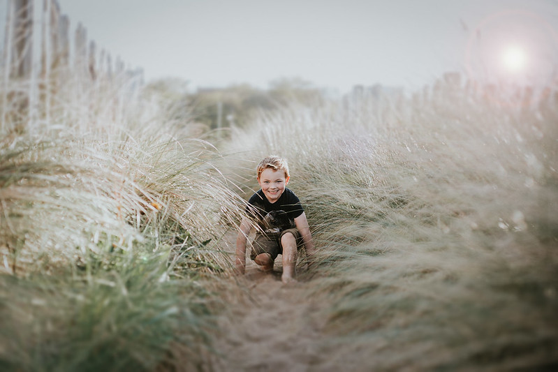
Family Shoot-46 by Danny Birrell, on Flickr

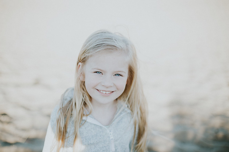
Family Shoot-47 by Danny Birrell, on Flickr

Family Shoot-27 by Danny Birrell, on Flickr

Family Shoot-28 by Danny Birrell, on Flickr

Family Shoot-24 by Danny Birrell, on Flickr

Family Shoot-16 by Danny Birrell, on Flickr

Family Shoot-15 by Danny Birrell, on Flickr
 
Nice set of images. It's interesting, the order you have them in down the page as they become tonally more bland as one scrolls down. That's simply an observation and if that's the look you're happy with that's all that matters. You could maybe look at the colour content of some of these and raise the saturation of one primary and the secondary colour which is devoid of the chosen primary in its make up, Monet style in a subtle way to add little more interest beyond what is available by simply contrast differences in luminosity. The last two are quite flat. However it is a pleasing set of images to peruse.
 
Nice set of images. It's interesting, the order you have them in down the page as they become tonally more bland as one scrolls down. That's simply an observation and if that's the look you're happy with that's all that matters. You could maybe look at the colour content of some of these and raise the saturation of one primary and the secondary colour which is devoid of the chosen primary in its make up, Monet style in a subtle way to add little more interest beyond what is available by simply contrast differences in luminosity. The last two are quite flat. However it is a pleasing set of images to peruse.
Kinda agree with this.
The flare in the first couple doesn't look quite natural, but the images work.
They do seem to lose colour as you scroll down through these images. The last 2 just seem rather grey. I'm not averse to the processing, but I think they need a little more colour putting back, the faces especially look odd in that tone. Maybe it's because they seem to be standing in (your?) shadow?
The composition and expressions are great though.
A few tweaks in the processing is all I'd do.
 
Nice set of images. It's interesting, the order you have them in down the page as they become tonally more bland as one scrolls down. That's simply an observation and if that's the look you're happy with that's all that matters. You could maybe look at the colour content of some of these and raise the saturation of one primary and the secondary colour which is devoid of the chosen primary in its make up, Monet style in a subtle way to add little more interest beyond what is available by simply contrast differences in luminosity. The last two are quite flat. However it is a pleasing set of images to peruse.

A lovely set of images really well photographed with good composition and capture but (IMO) ruined by the processing.

Love the processing Danny, hate the flare, they don't need it, the subjects have all the flare they need.

Favourites are 4 and 5 by a fair margin mate. They're right little posers and very photogenic.

Kinda agree with this.
The flare in the first couple doesn't look quite natural, but the images work.
They do seem to lose colour as you scroll down through these images. The last 2 just seem rather grey. I'm not averse to the processing, but I think they need a little more colour putting back, the faces especially look odd in that tone. Maybe it's because they seem to be standing in (your?) shadow?
The composition and expressions are great though.
A few tweaks in the processing is all I'd do.

Thanks for taking the time to have a look guys, much appreciated.

Yeah, the processing, I accepted a while ago that it's always going to be a marmite kinda situation - it's not the first and sure won't be the last time I hear that it's not to someone's taste :)

Looking back, the added flare was probably a mistake. I was aiming for a bit more drama but the light was already good and I had the composition I was after so, yeah, I've probably over-egged the pudding a wee bit.

Delivered the full set this morning and the client loved them, even had a little tear, so that's me happy too :)
 
Lovely set and great compositions but the last two do seem to lose a little too much colour. Children have great skin so I don't feel they need any artistic adjustment, same for B&W with children which I feel is rarely necessary unless essential for the scene. Would love to see the last two with a touch of colour put back in just to see. My favourite is the first one though.
 
Not sure about the 1st and 2nd images, squatting down. With the little girl, maybe her hands running along the tops of the grass, the boy, could have just stood there hands on hips - since these were posed shots (obviously) rather than candid shots of the kids having fun.

If you wanted to show happy kids, I would have not posted shot #4, looks out of place compared to the other images in the set.

Processing is bad, theres no contrast, the last two images are the worst - sorry to be horrible about them - you have photogenic children.

Take away the processing, get rid of #4 for the set and change the poses in 1 and 2 and I would have liked the whole set.

Thanks for the feedback Carl. I appreciate you having a look.

Now, I'm not one for taking the hump over crit in any way but I've got to disagree with your assessment that the processing is 'bad'. I've currently got a considerable amount of weddings, lifestyle, commercial & model shoots booked based mainly upon my style so while it might not be to your taste (I previously referred to it as marmite) I'd have to disagree that it's 'bad'.

As for the poses, we got stacks of shots of the kids laughing and having a good time but the parents also wanted some shots to reflect how grown up the kids are now compared to their last shoot, hence the more serious looks. Kids love that kinda thing too, especially the more grown up ones, imagine being told you had to smile for every photograph....yawn! :) The first two were their choice of pose too - really helps to reflect the kids personalities if you give them a little freedom of choice.

Again, not rejecting your crit as I appreciate you having a look.
 
i don't know anything about shooting weddings, commercial or people, so don't feel i can comment on processing much :) but as mentioned, from my lay(wo)mans perspective, the lens flare is a bit too much - but then again someone else may like it :)
 
i don't know anything about shooting weddings, commercial or people, so don't feel i can comment on processing much :) but as mentioned, from my lay(wo)mans perspective, the lens flare is a bit too much - but then again someone else may like it :)

Definitely with you on the flare D! Bit of a lapse in judgement there! :)
 
Happy about the flare (quite like it really) but the last two have been tonally crushed too much IMO. Glad your client loved them.
 
Snip:
With the little girl, maybe her hands running along the tops of the grass,
If she wants a trip to A&E, that marram grass tends to be very sharp! :whistle: I know what you mean composition wise, but thought I'd better mention why it might not be a very good idea.
 
Last edited:
Again, as others have said, the flare is not at all to my taste and the processing for me is way overdone. It might be just me, but this kind of look is popular with some right now, but I feel it is going to age very quickly. In the same way people look back to the white vignette from the 80's.

I like 3 & 4, but would liked to have seen her hands. Again in 6, the way the arms are cut off at the bottom of the frame is distracting to me. Some nice interaction though, it looks like it captures their personalities.

Funny how we all see things differently eh :)

Again, I'm gonna have to disagree with the 'way overdone' sentiment re the processing but definitely accept that the added flare was a mistake (broken record syndrome going on here).

Muchos gracias for taking a look though.
 
i like these too, the processing really suites, but i agree about the lens flair.... the images would look nicer without, imo.
 
Very nice set and I can see why the family were happy with them. I agree about the lens flare, but I think that's becoming almost a given at this point :ROFLMAO:
The processing reminds me of catalogues like the old grattan and the like for summer collections.
 
Lovely set of images, numbers 3,4 and 5 are my fave.

Not a fan of the processing in the others though - with the latter being a bit over exposed and devoid of any real detail, in my opinion.

Can see why the client was chuffed though
 
Back
Top