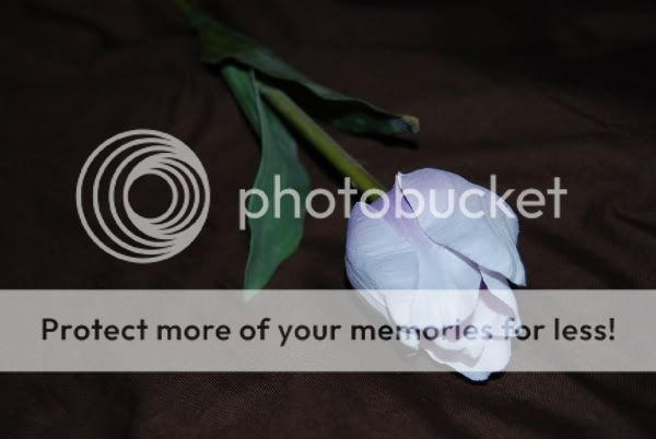
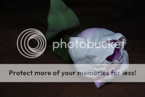
The first one looks upside down and the background is more prominante than it needs to be. The second over all is better but would be improved with a real flower thats open so you can see inside it.
Don't have any complaints about the lighting thought which is what you were working on
This site uses cookies to help personalise content, tailor your experience and to keep you logged in if you register.
By continuing to use this site, you are consenting to our use of cookies.

")