D
Deleted sulking member 63079
Guest
Critique Welcome, still fairly new to the game, so always looking for places I can improve.


")
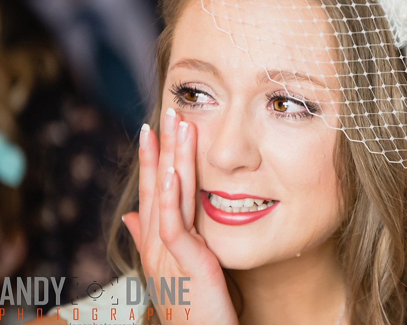
Nice photos. The biggest thing that signs out. I don't know who the bride is till the last photo
The bride isn't getting all of her photos until tomorrow though, so I've only shared a few publicly so far. Will post a bigger set once she has them.Image 2 & 3 go together well... lol... looks like a brides head on a blue suit.
Lovely images!
 Not my pic_TP edit 1 by Ian J Bradshaw, on Flickr
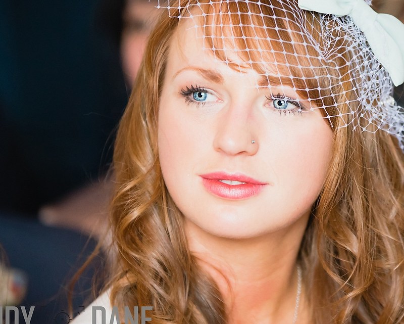 Not my pic_TP edit 2 by Ian J Bradshaw, on Flickr
 Will take some of the suggestions on board and make some more edits tonight. This was only my 3rd wedding shoot, so happy with the results. But need to get better at spotting things like mentioned above!
That's exactly what I thought scrolling down. The suit complements her eyes nicely!
Nice sharp images with great colours. To offer some (being picky) crit the first two have the subjects looking out of frame rather than into "space" and although the backgrounds are nicely blurred they are a little cluttered (which it may not have been possible to avoid). Nice moment captured in the first though, especially with the tear.
Is the guy in the blue suit shy? Not really getting this one.
In the last one, the groom looks like he's made the biggest mistake of his life and the woman near his elbow looks like she's in agreement with the groom. If this was shot from higher up the groom wouldn't have a lighting rig cutting across his head in the background and you may have got the "Just Married" bunting in the shot instead.
I'm no expert by any stretch of the imagination so I'm probably taking b0ll0x so feel free to ignore!
Simple cropping (10x8 ratio) to focus on the subject and remove the background distractions (hope you don't mind, you have "yes" for edit my pictures).
I prefer the originals if I'm honest?
not entirely sure the crop one of the above done on the image is ok, as lots of the head got taken out.
but lovely set of images and just some cropping required in post process.
also I was a bit thrown by 1st and 2nd image that the same person all of the sudden changed eye colour. I take it they are all sisters?
Noisy background couldn't be avoided with how little space I had to move during the ceremony.
Well done on your third wedding
The only thing I'd add to what's already been said is the girl with the blue eyes. Unless it's my monitor, they look completely overdone in post.
