- Messages
- 294
- Edit My Images
- Yes
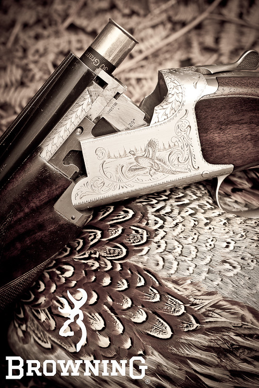
Doing a photo a day and this was todays. Crit and com welcome.

6 of 365 (6 of 6) by wysiwyg_photography, on Flickr
6 of 365 (6 of 6) by wysiwyg_photography, on Flickr

") I was expecting blood and gore. LOL
I was expecting blood and gore. LOLThat is a really great idea brilliantly executed.
Thats a front cover for a magazine if ever I saw one.