

You are using an out of date browser. It may not display this or other websites correctly.
You should upgrade or use an alternative browser.
You should upgrade or use an alternative browser.
Critique Hanningfield Reservoir
- Thread starter LewisHall
- Start date


GardenersHelper
In Memoriam
- Messages
- 6,344
- Name
- Nick
- Edit My Images
- Yes
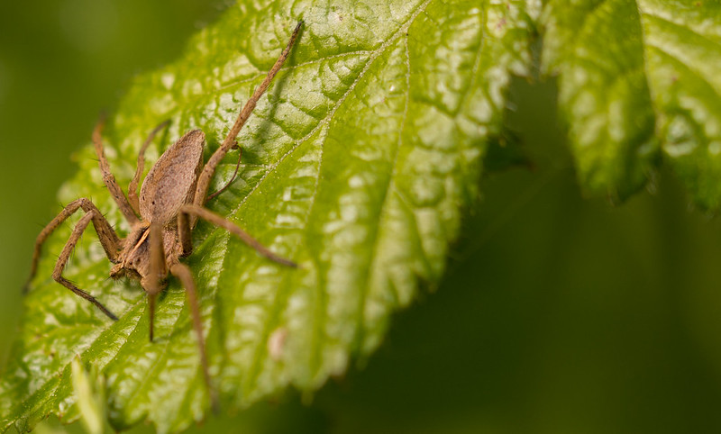
Lewis, to my eye there is something odd about these images. They look to have very low contrast and an overall misty look to them. Here is the histogram of the spider.

NOT MY IMAGE - LewisHall spider histogram by gardenersassistant, on Flickr
Notice the huge gap at the bottom of the histogram. All four have histograms like this. Is this an effect you have produced deliberately (in post processing presumably) to please your eye? If so, please read no further, as it is what pleases you that matters.
Here is what the duck image looks like when adjusted to close up that gap. It is a matter of taste exactly what changes to make - it is simply the general principle that I'm addressing here.

NOT MY IMAGE - LewisHall duck adjusted by gardenersassistant, on Flickr
You will see from the sliders on the right that I have also adjusted the white balance. Another matter of taste.
And here is the ant, similarly adjusted.

NOT MY IMAGE - LewisHall ant adjusted by gardenersassistant, on Flickr
Like I said, these may be carefully adjusted to meet your preferences, in which case you won't like what I've done to them! And if that is the case, that is fine of course.")
NOT MY IMAGE - LewisHall spider histogram by gardenersassistant, on Flickr
Notice the huge gap at the bottom of the histogram. All four have histograms like this. Is this an effect you have produced deliberately (in post processing presumably) to please your eye? If so, please read no further, as it is what pleases you that matters.
Here is what the duck image looks like when adjusted to close up that gap. It is a matter of taste exactly what changes to make - it is simply the general principle that I'm addressing here.
NOT MY IMAGE - LewisHall duck adjusted by gardenersassistant, on Flickr
You will see from the sliders on the right that I have also adjusted the white balance. Another matter of taste.
And here is the ant, similarly adjusted.
NOT MY IMAGE - LewisHall ant adjusted by gardenersassistant, on Flickr
Like I said, these may be carefully adjusted to meet your preferences, in which case you won't like what I've done to them! And if that is the case, that is fine of course.
OP
LewisHall
Suspended / Banned
- Messages
- 567
- Name
- Lewis
- Edit My Images
- Yes
Lewis, to my eye there is something odd about these images. They look to have very low contrast and an overall misty look to them. Here is the histogram of the spider.
NOT MY IMAGE - LewisHall spider histogram by gardenersassistant, on Flickr
Notice the huge gap at the bottom of the histogram. All four have histograms like this. Is this an effect you have produced deliberately (in post processing presumably) to please your eye? If so, please read no further, as it is what pleases you that matters.
Here is what the duck image looks like when adjusted to close up that gap. It is a matter of taste exactly what changes to make - it is simply the general principle that I'm addressing here.
NOT MY IMAGE - LewisHall duck adjusted by gardenersassistant, on Flickr
You will see from the sliders on the right that I have also adjusted the white balance. Another matter of taste.
And here is the ant, similarly adjusted.
NOT MY IMAGE - LewisHall ant adjusted by gardenersassistant, on Flickr
Like I said, these may be carefully adjusted to meet your preferences, in which case you won't like what I've done to them! And if that is the case, that is fine of course.
Thanks! I did actually choose for them to be like that lol I originally had them how you edited to but I really like the faded/matte look I understand though it's not to everyone's taste! Thanks for the advice though!!
- Messages
- 2,176
- Edit My Images
- Yes
I like the tone of the ant and spider, guess that you did it intentionally, brings out something different. Would you mind sharing how did you process them?
I tried black and white for insect macro, certainly not my taste. By the way, the last one is a hoverfly, not a wasp. Sorry that I have a OCD about insect
I tried black and white for insect macro, certainly not my taste. By the way, the last one is a hoverfly, not a wasp. Sorry that I have a OCD about insect
- Messages
- 13,051
- Name
- Alf
- Edit My Images
- Yes
Well shot images but let down by the PP
Wasps and bees have antenae hoverflies do not
http://syrphidae.3644.co.uk/
Wasps and bees have antenae hoverflies do not
http://syrphidae.3644.co.uk/
Last edited:
OP
LewisHall
Suspended / Banned
- Messages
- 567
- Name
- Lewis
- Edit My Images
- Yes
I like the tone of the ant and spider, guess that you did it intentionally, brings out something different. Would you mind sharing how did you process them?
I tried black and white for insect macro, certainly not my taste. By the way, the last one is a hoverfly, not a wasp. Sorry that I have a OCD about insect
Thankyou! yes was intentional, ill share a picture of the PP..
Yeah i weren't to sure myself about the black and white just thought it was something different. Thanks lol I'm not that great with insects


OP
LewisHall
Suspended / Banned
- Messages
- 567
- Name
- Lewis
- Edit My Images
- Yes
Both sets of pics are much better than anything i could ever do! but personally i prefer the ones without the fade, really cool!
Thankyou!!
OP
LewisHall
Suspended / Banned
- Messages
- 567
- Name
- Lewis
- Edit My Images
- Yes
Lewis, to my eye there is something odd about these images. They look to have very low contrast and an overall misty look to them. Here is the histogram of the spider.
NOT MY IMAGE - LewisHall spider histogram by gardenersassistant, on Flickr
Notice the huge gap at the bottom of the histogram. All four have histograms like this. Is this an effect you have produced deliberately (in post processing presumably) to please your eye? If so, please read no further, as it is what pleases you that matters.
Here is what the duck image looks like when adjusted to close up that gap. It is a matter of taste exactly what changes to make - it is simply the general principle that I'm addressing here.
NOT MY IMAGE - LewisHall duck adjusted by gardenersassistant, on Flickr
You will see from the sliders on the right that I have also adjusted the white balance. Another matter of taste.
And here is the ant, similarly adjusted.
NOT MY IMAGE - LewisHall ant adjusted by gardenersassistant, on Flickr
Like I said, these may be carefully adjusted to meet your preferences, in which case you won't like what I've done to them! And if that is the case, that is fine of course.
Hi Lewis, they are nice shots but I agree with Graham about them having a misty look, an edit like Graham has shown will bring them back
Nice images but not your processing (sorry) last one is a Hoverfly not a wasp.
Well shot images but let down by the PP
Wasps and bees have antenae hoverflies do not
http://syrphidae.3644.co.uk/
Okay so I've redone my PP once again and think these are what I'm most happy with..


OP
LewisHall
Suspended / Banned
- Messages
- 567
- Name
- Lewis
- Edit My Images
- Yes
GardenersHelper
In Memoriam
- Messages
- 6,344
- Name
- Nick
- Edit My Images
- Yes
They look good to me.
OP
LewisHall
Suspended / Banned
- Messages
- 567
- Name
- Lewis
- Edit My Images
- Yes
They look good to me.
Thanks!