Has it been overdone?

Messages
360
Name
Joe Kelly
Edit My Images
Yes
I have this image which is only ok,
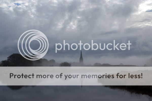
orig_DSF6278.jpg


thought i would have a play with it, so I converted to B&W, cropped partially, shadow and highlight and altered levels slightly and added the figure and reflection.

ending up with

_DSF6278-1.jpg


do you think its overdone?
 
Last edited:
i think the processing works but the church isnt straight and i find that a bit distracting

:agree: I am unsure that the figure adds any value to a scene that's excellent without the figure.
 
I think I would like the picture more without the figure, but thats just my personnal opinion. I think it stands out too much, and you can tell it's added.
The person would also be in the mist too, so would be far less visible.

regards.
 
Hi Joe,

I think the original has some potential as it has a fairly good range of tones. I'd straighten it so the church spire is vertical, maybe crop it a touch and then have a play with the curves, levels and brightness/contrast to get the best tonal range I could manage. It's quite a low-contrast scene by virtue of the mist and any post-processing should, in my opinion, maintain that.

I don't think your B&W treatment works. It's muddy. By that I mean the tonal range is flat, with no detail to speak of in either the highlights or shadows. You've also lost the atmosphere of the original. Adding the figure does nothing IMHO.

My view of post-processing in either Lightroom or Photoshop is 'Less is More'. I always strive and often fail to get a good exposure at the taking stage, so I minimise the amount of work needed on the computer (or in the darkroom if I ever get back in there!).

Cheers


Mark
 
Hi,

Did you 'smudge' the figure slighty when you edited at 20.21?
It seems not to stand out so much?

regards.
 
Back
Top