[HDR] Ruined Abbey.

Messages
199
Name
Alan
Edit My Images
Yes
Thought I'd post a few pictures from a trip down the coast to a place called Greyabbey. Lovely spot, lovely day. Just had a fiddle about with the presets in Photomatix. Only used 3 images to make these, havn't got round to taking more than 3 for an HDR image.


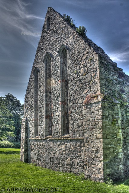
tonemapped 7 by illist, on Flickr.


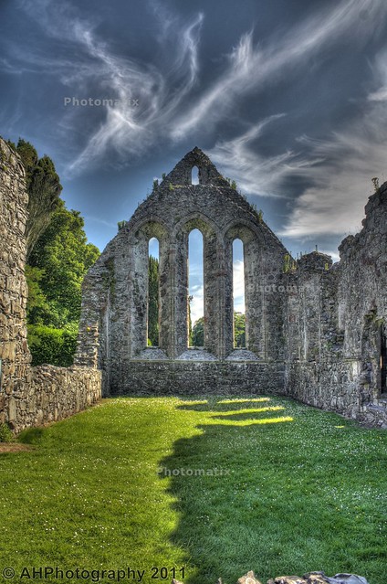
tonemapped 4 by illist, on Flickr.


tonemapped 3 by illist, on Flickr.

Only using the trial Photomatix on the laptop as the PC is old and dated lol!

Thanks for looking.
 
Last edited:
Think HDR works well on these, brings the stonework to life (y)
#3 possibly crop the body on the right to avoid detracting from the main theme.
 
#3 is quite nice, far to much halo'ing on 1 and 2 for my liking. You don't always need more than 3 images, really depends on the full range of the scene.
 
gramps said:
Think HDR works well on these, brings the stonework to life (y)
#3 possibly crop the body on the right to avoid detracting from the main theme.

One is true, that little eejit was running all over the shop lol.

Thanks for the comments all.
 
I agree, too much haloing in 1+2, but 3 is nice. You can clone out the kid!
 
Compositionally, No 2 is the pick, but totally ruined by the processing (IMO), sky colours are all over the place, and totally false, all the shadow detail has been bleached out of the building, which it desperately needs to give it depth and perspective, and of course the inevitable ghastly halos and you have sensor dust spots.

Get the technicals sorted, and you will have a good image here.
 
Hiya

Agree with comments already made, and first thing I noticed were the dust spots especially the big one top right corner, but easy to clone and then a sensor clean may be in order.

Sorry but #1 doesn't work for me, there is something not right about the colours, especially down the right side of the building .... could be due to the moss on the building being overemphasised with the tonemapping.

#2 is still a bit heavy, however I prefer this one out of the three. I like the whispy clouds, however the building does look a little washed out and it also needs a straighten to the horizontals.

#3 I think would have been better if you had taken a few steps to the left to get a better angle of the building.

Hope this doesn't sound too critical, it is a lovely building with loads of potential for some fantastic shots.

Cheers

Dawn :)
 
HDR has ruined #1 and #2 for me.

That aside, #1 is too close for me. Now if the woods in the LH side weren't there it may improve.

#2 has a great perspective. It's also nice and level. The slither of stone at the bottom needs to be removed or if you have any get more in to ancor the photograph. Shadowed on the grass lead the eye in.

#3, I quite like, but the composition, that is the angle the photograph was made, is off putting. Feels a tad close at the bottom LH corner and although the trees were there, the way they are peeping above the top distracts me. Nice colours and nice whispy clouds.

Cheers.
 
Hi Method, can't work out where this is as you have no location in your signature

It's in a spot called Greyabbey on the Ards Penninsula over here in Northern Ireland matey.

To all the posts above, I appreciate the constructive crititism, but please be aware these were just a muck about using Photomatix, using the presets.

All the pictures included in these HDR's are up on Flickr.

I see, perhaps here may have been a better place to place them.

Cheers.
 
Personally, I think the last one is the best. The others seem to suffer from a "halo" effect, quite often seen in many HDR pictures.
 
i like the sky in #2, but i would get a bit closer to main wall (middle fasade or whatever it is called :) ) and sky, try to loose the side walls. Ovarall, really nice as i'm fan of HDR....
 
Number 3 is my favourite from a processing point of view as it doesn't seem as overdone as the first 2.

Composition wise, I like 2, and 3!

But the HDR processing is a little ott for me.
 
Back
Top