HELP WITH AN ARGUMENT!

Messages
6,584
Name
Phil
Edit My Images
Yes
People of TP...I call upon your wisdom :)

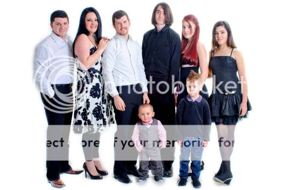
My brother and I were having an argument because of a difference in opinion on a portrait.

It was a family photo taken by me for our mother's birthday present (which would be printed 18x12).

As you can see there are 2 opposite ends of the light spectrum to expose for and I simply done this using the RAW file and worked a bit on the blending of 2 images. As the whites were exposed for on shoot so not to blow them out, bringing the darks up by 3 stops meant a little grain entered the image. Not enough to bother me as it was such a large print and it wouldn't be noticed, but the darks were probably the equivalent of ISO 800 on my camera in terms of grain. Not even enough to justify additional NR.

My brother took it upon himself to "remove the grain" by banishing the blacks!

Anyway, I felt like as a photographer I was right, but my brother was so adamant I thought I would put it up for debate here...

so...ANY C & C WILL BE APPRECIATED!

MY EDIT:

Light6.JPG


MY BROTHER'S EDIT:

Dark.JPG
 
the second, just looks plain wrong, the black is just too flat with no texture, and the kidas he's completely changed what they've got on
 
+1 I agree. You might risk lowering the mid-tones a tad in your original, but the edit is waaay to black!
 
In your shot the blacks are just a tad too grey and could do with darkening a bit but your brothers efforts are just plain terrible.

I would rather do without a photo at all if the only option was the second one, it is an abuse of my eyes :nuts:
 
Get this folks - he had the print come back and thought "it's darker than it looked on my screen" ...I asked him "are you seriously telling me that you haven't calibrated your screen with your printer?!?"

It has been annoying me because he has just started using photoshop and seems to think he can do a better job...very frustrating that my mum is stuck with it (even though she likes it).

Thanks for all your comments :)

Carol, I agree - the skin looks a bit washed out and could have had more time spent on it...
 
1 easily. IMO 1 could do with darkening marginally….not to the extremes in number 2 though.
 
I think its all been said.... No. 2 doesn’t work, it has lost all the detail in the black (clothing / hair etc).

Number 1 could benefit from a small tweek on the levels but it is definitely the better image IMO.
 
Definitely No. 1 by a mile, even if the blacks do look a bit grey. The detail is all there for a start albeit a little washed out. You could probably do with a bit more saturation and a tad of contrast and it should be perfect.
 
IMO, you photo 1 blacks are to grey, maybe a slight contrast or "Black" boost in LR will help.

Photo 2 is miles to dark though, as been said prior, the blacks are to dark loosing all detail.

you need to be somewhere in between.

Daz

PS (hope you dont mind my edit)
Light6-1.jpg

Black darkened slightly from image 1 and slight saturation boost
 
Last edited:
Way too much on the blacks in the second pic but the first needs a bit more saturation/density.

+1 (y)

Before he starts even thinking of sending any PP work for printing he must calibrate !!!!!
Tell him to sign up here for the PP section ;)

At least your Mom is happy (y)

Best wishes
Cliff
 
+1 (y)
Before he starts even thinking of sending any PP work for printing he must calibrate !!!!!
Cliff

When I heard that I wanted to just fall on the floor!!! He's just getting into photography (he has a business selling family portraits but up until recently he hasn't been doing any of the work himself, just sales), and after reading a few articles in magazines RE PP and playing about with some studio lights, he now considers himself an expert.

Maybe this pixel peeping "expert" will see what I mean with time :)
 
number 1111111111111111111111111111111111111111111111111111111111111111111111111111111111111111111111111111111111 oh and tell the young dude in the middle to get his hair cut! :D
 
as has been mentioned your brother's is terrible he needs to learn to use photoshop and calibrate his monitor

your's needs to be a bit darker than it is (i'd be inclined to move the mid point slider a tad)
 
IMO, you photo 1 blacks are to grey, maybe a slight contrast or "Black" boost in LR will help.

Photo 2 is miles to dark though, as been said prior, the blacks are to dark loosing all detail.

you need to be somewhere in between.

Daz

PS (hope you dont mind my edit)
Light6-1.jpg

Black darkened slightly from image 1 and slight saturation boost

This looks a lot better.
 
When I heard that I wanted to just fall on the floor!!! He's just getting into photography (he has a business selling family portraits but up until recently he hasn't been doing any of the work himself, just sales), and after reading a few articles in magazines RE PP and playing about with some studio lights, he now considers himself an expert.

Maybe this pixel peeping "expert" will see what I mean with time :)

show him this thread :LOL:

incidentally if he really wants to remove the noise what about a plug in like noise ninja
 
Last edited:
show him this thread :LOL:

incidentally if he really wants to remove the noise what about a plug in like noise ninja

Well I didn't have his jpg so I remade his version and even though you wouldn't tell the difference - I know what he would say!

The way I see it...he should not have edited my edit anyway, should have just made suggestions to me. I just think he wanted to feel like he did more of the work than just sending and picking up a print...
 
what the **** did he use a jpeg for anyway - I'd have processed that from a Raw and outputted it as an uncompressed Tiff for printing
 
I'm going to get shot for saying this, but neither.

The blacks on 2 are far to strong and lose all detail, and its fa and away the worse edit, but for her birthday present your Mum deserves a lot better then # 1 as well - you've got a lot of what looks like light bleed going on (but it can't be cause of the way you've done this) and some very shoddy editing going on around the blokes in white shirts. Personally I'd shoot it again properly
 
Last edited:
Somewhere in between for me. I find 1 has an overexposed back which i dont like.
 
Shoot again i say but this time Sort your metering, get your white balance sorted and you should be nearly there

No can do! I'm in the photo so wasn't actually behind the cam on this one...

We had 45 mins to get all photos (individuals of everyone there and 2 family poses) AND video footage (I put together a little birthday message and family history photos together for her in addition to this...so unfortunately as with rushing, certain things on shoot was forgotten about and had to be clawed back as much as possible in PP...

I appreciate it's not the absolute best I could have done, but given the two edits above it just boils down to a case of "Am I going mad or am I right in saying my brothers image is a joke?"

Appreciate the suggestion though.
 
Looks like you have your argument solved already but i'll give a +1 for image 1 for good measure.

Gary
 
Back
Top