Home page image

Messages
1,620
Name
Stephen
Edit My Images
Yes
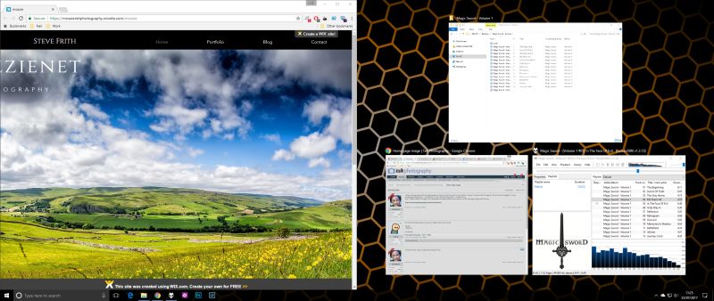
I enjoy messing about with web page designs to keep my OAP brain active. My portfolio is varied in content. WHAT image do I stick on the home page? If I was a landscape photographer ... a landscape. If I was a street photographer ... simple choice.
But, if I take a variety of images, from landscapes to street scenes to sport and so on. Still working on layout and links etc.

https://mossienetphotography.wixsite.com/mozzie
 
How can I make sure that ALL users can see the site? I can view it on my own monitor and tablet with no problem.
 
not just mobile users, I have an ultrawide so often put windows to half the screen width.

2s7qZhG.jpg
 
Here is a site that you may find useful: Screenfly

Thanks for that Keith. I still can't see how you can create a website that fits all sizes. It's more of a BRAIN exercise than anything else, no business attached. I'' have a look through you tube later. The screenfly is very useful, thanks for that.
 
Thanks for that Keith. I still can't see how you can create a website that fits all sizes. It's more of a BRAIN exercise than anything else, no business attached. I'' have a look through you tube later. The screenfly is very useful, thanks for that.

As far as I can see you only define the viewport size once and set it to 980 pixels whereas screen sizes on tablets, phones and monitors can vary considerably.

This may help you:

https://www.html5rocks.com/en/mobile/mobifying/

BTW it looks good on my 40" TV set to 1600x900 pixels, but I don't like the WIX advert at the bottom.
 
Last edited:
Try keeping images sizes in % rather than px also font sizes em; or % instead of px, it will help make your site more responsive.
Also, if your using firefox holding down ctrl/shift and m key will give you loads of viewing options for your site from iphones to large tv screens.
 
Last edited:
Try keeping images sizes in % rather than px also font sizes em; or % instead of px, it will help make your site more responsive.
Also, if your using firefox holding down ctrl/shift and m key will give you loads of viewing options for your site from iphones to large tv screens.

Thanks for this. Sorry to be a pain, I don't understand what you mean by % and px. Are you saying that the images are too big in terms of file size? What do I need to do to correct this?

Still waiting for an answer to my original question. smiley face thingy.
 
Thanks for this. Sorry to be a pain, I don't understand what you mean by % and px. Are you saying that the images are too big in terms of file size? What do I need to do to correct this?

Still waiting for an answer to my original question. smiley face thingy.
I believe he's referring to the sizes in your css. Rather than using say header image of max-width or width of 1280px to have it width 100%. That way you have less to worry about when the window is resized/different viewports.

Obviously this can involve additional work/images for polite loading (only loading smaller versions of the image when accessing on mobile).
 
Thanks for this. Sorry to be a pain, I don't understand what you mean by % and px. Are you saying that the images are too big in terms of file size? What do I need to do to correct this?

Still waiting for an answer to my original question. smiley face thingy.

if you have 20 mins to spare here is a good youtube >>>
View: https://youtu.be/BIz02qY5BRA
demo explaining a bit more on responsive design. I found it easy to listen to.
 
Back
Top