
You are using an out of date browser. It may not display this or other websites correctly.
You should upgrade or use an alternative browser.
You should upgrade or use an alternative browser.
honesty, please
- Thread starter Lateralus
- Start date

- Messages
- 1,443
- Edit My Images
- No
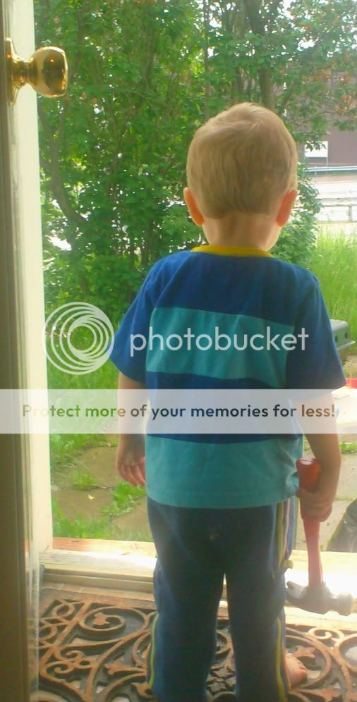
Personally, I don't think it's a keeper.
Please take the following as constructive critisism, I'm not trying to be overly nasty, but this is my honest opinion.
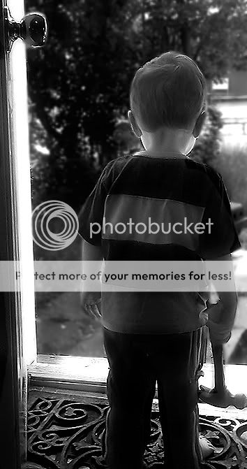
The top one is oversaturated, both are overexposed, too soft, and the composition just doesn't work. I'd much rather see a face on smiling shot than his back and slumped shoulders.
Looks like he's had enough of you and is off to find another home
**Insight** If you were going for that as a comedy shot, then it's brilliant
Please take the following as constructive critisism, I'm not trying to be overly nasty, but this is my honest opinion.
The top one is oversaturated, both are overexposed, too soft, and the composition just doesn't work. I'd much rather see a face on smiling shot than his back and slumped shoulders.
Looks like he's had enough of you and is off to find another home
**Insight** If you were going for that as a comedy shot, then it's brilliant
OP
- Messages
- 622
- Edit My Images
- Yes
Personally, I don't think it's a keeper.
Please take the following as constructive critisism, I'm not trying to be overly nasty, but this is my honest opinion.
The top one is oversaturated, both are overexposed, too soft, and the composition just doesn't work. I'd much rather see a face on smiling shot than his back and slumped shoulders.
Looks like he's had enough of you and is off to find another home
**Insight** If you were going for that as a comedy shot, then it's brilliant
i don't take anything to heart
thx for your honesty
- Messages
- 57
- Name
- Carly Joanne
- Edit My Images
- No
nice idea but might've been easier if you'd been lower down, made him seem bigger in the frame and would've caught the irony of the little-un weilding a hammer!
sweet little model thou, bless him!
sweet little model thou, bless him!
- Messages
- 1,854
- Edit My Images
- Yes
Is it overexposed? Looks more like bad flare from light reflecting on the UPVC frame/sill. I'm guessing its from a compact, which has heavily processed the image giving the apparent saturation. There's also a ton of noise in the shadow on the legs.
Anyway that aside.... I actually quite like the idea. But you can't see enough of the background to see what he might be looking to work on, but there again there is too much clutter just visible for be just about the boy.
Hope that helps, sorry it's rather negative!
Anyway that aside.... I actually quite like the idea. But you can't see enough of the background to see what he might be looking to work on, but there again there is too much clutter just visible for be just about the boy.
Hope that helps, sorry it's rather negative!

OP
- Messages
- 622
- Edit My Images
- Yes
I've just given it a small tweek of brightness and contrast.....stops me squinting. Hope you didn't mind.
Bob
nope,don't mind at all- in fact i encourage such things
looks good

- Messages
- 386
- Edit My Images
- No
I think shots behind can work somtimes but I'm not sure this is one of those instances. I don't know what it is about it, but there's almost too much going on, fighting for interest... the hammer, the patterned floor, the doorknob, the bushes, the other building, etc. Rather than play with this existing shot, I'd try a few more variations. Take lots and you'll invariably come up with something which "works".
Hope this is constructive. Keep trying...
Hope this is constructive. Keep trying...
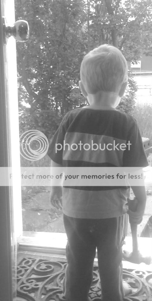
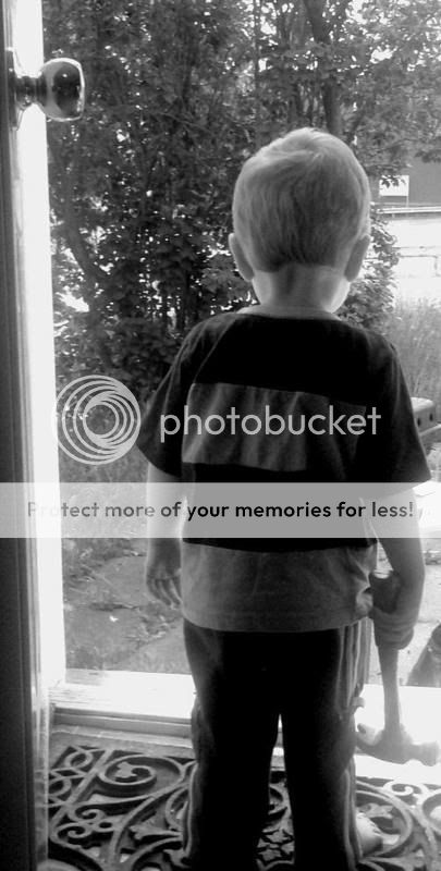
there is a lot of noise in the pictures for what looks like quite a bright day. Did you give the levels a boost?
do you have the full exif data for these pictures? I remember the other pictures you posted also had these characteristics. Perhaps if you have such harsh lighting where you live, it is creating a very heavy haze...it may be worth using a lens hood or even a polarising filter on occasion to give you back a bit of contrast.
Anyway, my edit for what it's worth. For such a picture lacking in contrast I crush the levels in both the highlights and shadows.
OP
- Messages
- 622
- Edit My Images
- Yes
image is a tad soft and over exposed. some of the edits look better
i agree-love them= )