India - Trans Himalayan Region

Messages
463
Name
Dougie
Edit My Images
Yes
Hi folks,

I was interested to see what feedback people might have on the pictures from this set I've just put up on Flickr
http://www.flickr.com/photos/52531730@N04/sets/72157639898606794/

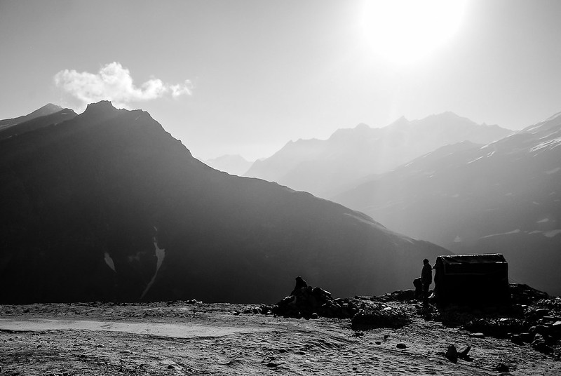
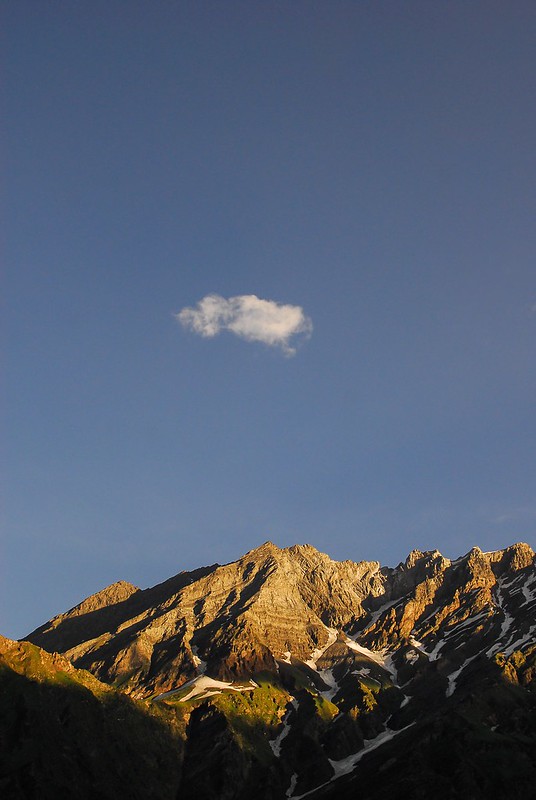
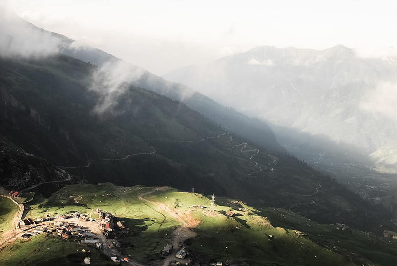
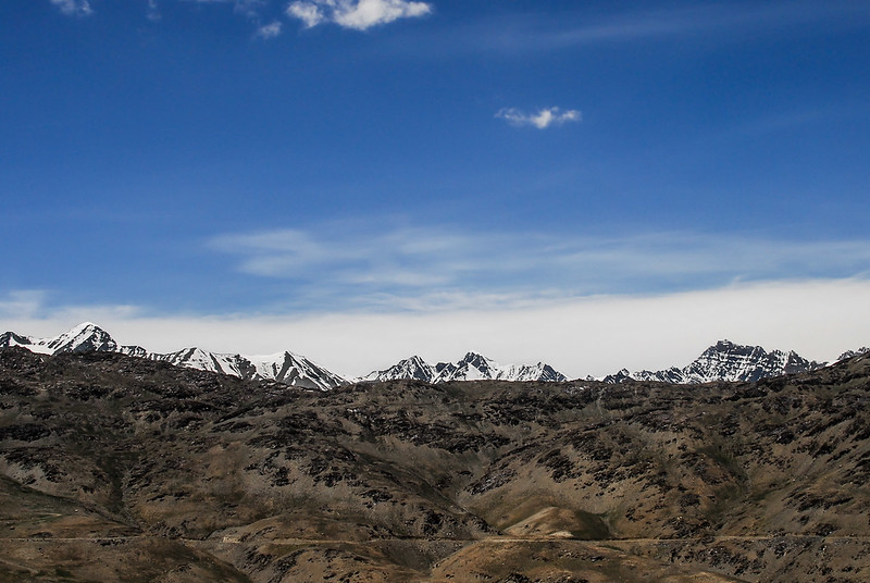
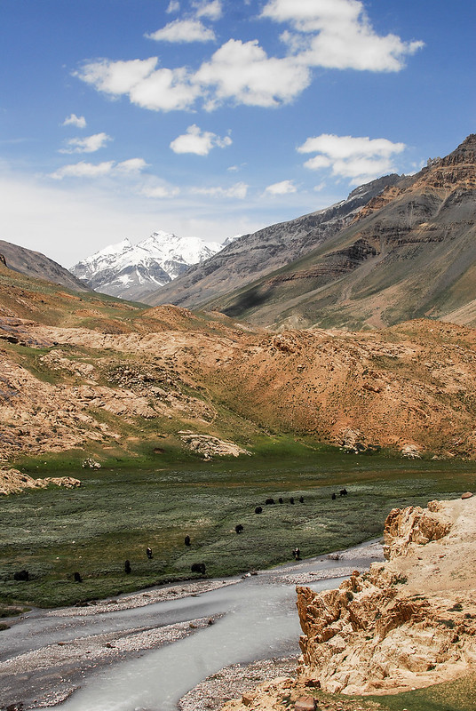
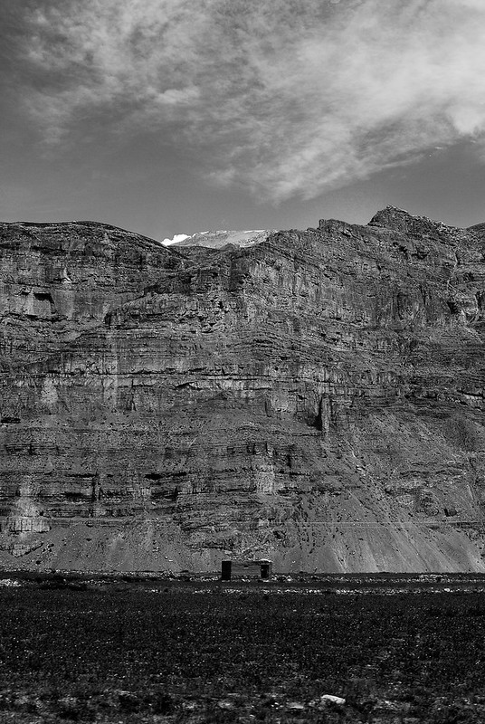
I should start by saying that landscape photography is not something I've ever really put much time into. Most of these were kind of incidentally taken because I was travelling through this region as part of a community project and trek we were doing. I took an old D200, a 35mm 1.8g and a sigma 10-20 to record the trip and I'm glad I did. My big concern is processing - I'm never sure whether I'm over-doing things because I quite like the drama that comes from high contrast...anyway, here are a few from the set. I'm interested to see what people think.

12012975804_1969005784_c.jpg


12012524105_fe12d47749_c.jpg


12012584255_5c37fd51cc_c.jpg


12013548786_fec20941f6_c.jpg


12013149984_e7dab29f5e_c.jpg


12012273715_61b4117d38_c.jpg
 
Great set,
  1. Works really well like the silouhette feel to the hut and the man composition is good.
  2. I like the detail in the mountains and compositionally it's great, tho I can't help feel there's a little to much blue sky, I am also not sure about the singular cloud.
  3. Looks very cloudy which is masking some of the detail of the mountains in the background so doesn't work for me sadly.
  4. Nice and simple composition but works very well.
  5. Is spot on compositionally I like it
  6. I love it the b&w seems to work with this helping to draw out the details in the rock face. I also like the feeling of isolation and loneliness the image gives by the little hut in the middle of the image (y)
 
Thanks for posting these - I'm glad you took the camera too, and never be afraid of making every shot dramatic unless you want peaceful images. We're all different, and where I disagree with Mandy then I'll comment.

2. I'd be inclined to crop a little from the left and a fair bit from the top to get the cloud off centre and less isolated.
3. Probably my favourite of the set, but I'd have reduced the brightness of the highlighted houses a touch and increased the green area in the highlight to make it stand out without it being quite so light. Love this gap-in-the-clouds type of image.
4. My eye can't find anywhere to settle, though the image looks nice.
6. I wonder how this looks in colour, and whether the tiny hut at the bottom would stand out a little more if it were? Great image though.
 
Great set,
  1. Works really well like the silouhette feel to the hut and the man composition is good.
  2. I like the detail in the mountains and compositionally it's great, tho I can't help feel there's a little to much blue sky, I am also not sure about the singular cloud.
  3. Looks very cloudy which is masking some of the detail of the mountains in the background so doesn't work for me sadly.
  4. Nice and simple composition but works very well.
  5. Is spot on compositionally I like it
  6. I love it the b&w seems to work with this helping to draw out the details in the rock face. I also like the feeling of isolation and loneliness the image gives by the little hut in the middle of the image (y)

Thanks for taking the time to reply Mandy, always good to get another perspective. I see where you are coming from with 2 and 3, I quite liked the big sky but wondered about re-cropping it.

Thanks for posting these - I'm glad you took the camera too, and never be afraid of making every shot dramatic unless you want peaceful images. We're all different, and where I disagree with Mandy then I'll comment.

2. I'd be inclined to crop a little from the left and a fair bit from the top to get the cloud off centre and less isolated.
3. Probably my favourite of the set, but I'd have reduced the brightness of the highlighted houses a touch and increased the green area in the highlight to make it stand out without it being quite so light. Love this gap-in-the-clouds type of image.
4. My eye can't find anywhere to settle, though the image looks nice.
6. I wonder how this looks in colour, and whether the tiny hut at the bottom would stand out a little more if it were? Great image though.

Again, Toni, thanks for taking the time to reply. Some good points about three, I might go back and tweak it. I originally processed 6 in colour then switched to black and white to emphasise the texture in the rock but I agree, the hut is a little lost. In colour the hut is actually a similar hue to the rock so it doesn't make it a great deal more visible.
 
1 and 3 for me with 3 being the one I would choose. The rest don't seem to offer a real point of interest.
 
1 and 3 for me with 3 being the one I would choose. The rest don't seem to offer a real point of interest.

Thanks Roger. It's interesting you say that. A point of interest is something I often don't consciously think about when taking lanscape pictures, I'm just looking at the scene as a whole - sometimes it is quite obvious and sometimes as you say there isn't anything in particular. Something to consider.
 
Dougie;

In my eyes your doing everything right, a superb set of images, excellent photography Sir, splendid talent. Love the tone & contrast on the mono's. wOOw


Regards;
Peter
Alloa - Scotland
 
Back
Top