

- Messages
- 255
- Name
- Mike
- Edit My Images
- Yes
Digging through some old LR albums.
Critique welcome, particularly for #3, which I've just revisited having got nothing interesting from it after I first shot these early last year. I think I'm getting there now but would welcome people's thoughts.
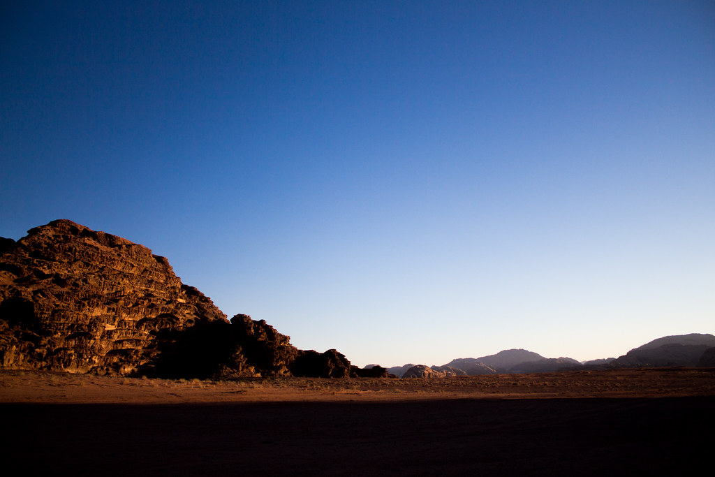
Wadi Rum by stickyfiddle, on Flickr
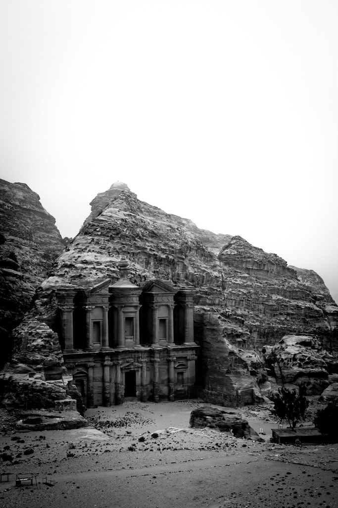
The Monastery, Petra by stickyfiddle, on Flickr

Big Sky by stickyfiddle, on Flickr
Critique welcome, particularly for #3, which I've just revisited having got nothing interesting from it after I first shot these early last year. I think I'm getting there now but would welcome people's thoughts.
Wadi Rum by stickyfiddle, on Flickr
The Monastery, Petra by stickyfiddle, on Flickr
Big Sky by stickyfiddle, on Flickr
 I would loose most of it and take it down to a letterbox crop coming just above the peak on the left. Great light hitting that peak on the left