Just one from a bunch of holiday snaps

Messages
54
Edit My Images
Yes
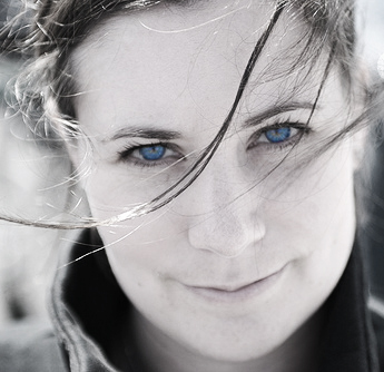
Whilst flicking through some recent holiday stuff I came across this shot which stood out to me. This is it straight out of the camera and converted to JPG.


I'm interested on your thoughts on my attempts at processing this. I like the square crop (and it cuts out the dross to the right of the frame) and I'm a sucker for a B&W portrait. I've also added a slight vignette. Anyway, what do you think?


EDIT: looking at it here it looks a touch over sharpened now. Is this a Flickr thing?
 
Last edited:
I think its a great shot, but much prefer the first version, i think the B&W ruins it a tad bit! Just my opinion though!
 
After three attempts to wake flickr up, I got both versions. I much prefer #1. With eyes that are such a lovely colour it's a shame to hide them in a B&W version.
 
I like both. Even though you lose the lovely blue of her eyes, they're still gorgeous in b&w. I think that the crop would be good for both.
 
:LOL: Great. Thanks everyone for the comments.

Just in case things aren't clear the first shot is straight out of the camera. It has potential I think but needs some processing to bring the best out of it. The B&W was my first shot at processing.

The comments are interesting and as a result I've had another crack, this time retaining the colour but going for a lomo effect.

I think the square crop would help this too.

Any thoughts?

 
There seems to be a bit of discolouration under her hairline in the new one. I think the original was better. Also - I just noticed a bit of flare behind her left ear which is a bit distracting.
 
much prefer the original to the edit. The B&W convesion i think is stunning!
 
I think it's better in the first shot and the format too. Simplicity. Sometimes it just can't be beaten.
 
much prefer the original to the edit. The B&W convesion i think is stunning!

I think it's better in the first shot and the format too. Simplicity. Sometimes it just can't be beaten.

Really? OK so my processed versions might not be great but to me the original is a bit washed out, a bit soft in the areas that matter and generally lacking punch. Or am I just a bit :wacky:
 
hope you dont mind..... i had a little go with the original colour version....

2680828442_ebe5c448a6_o.jpg


duplicated colour layer and desaturated the top layer. Then deleted the area at the eyes to let the colour show through and set the opacity to 80% to let a hint of colour push through.
Duplicated the desaturated layer and set the upper layer to "overlay"
 
No problem at all Gav, thanks for your input.

I like the tone you've got in the mono conversion but I must be honest, selective colouring is not my cup of tea.

I'll definitely have a go at your 'hint of colour' mono method though. Thanks :)
 
np.... each to their own :)

selective colour is like every other tool we have at our disposal..... There is a time and a place that they come in handy... Your mrs eyes are fantastic and well worth making a feature of..

:)
 
Back
Top