Kilchurn Castle. (reflection portrait)

Dale.

Bo Derek
Moderator
Messages
11,979
Name
Dale.
Edit My Images
Yes
It was getting to that kind of time, the part of the day when the light just gets a little too much and I have had to pull this one back slightly as it was a little contrasty and saturated. Not often I say that.

The wind had just started to pick up too and by the time we got to Glencoe a little later, it was very breezy, so not quite a perfect reflection but I think it just about works.


I have another portrait format that I'm looking at too, a little more simplistic than this one, watch this space.


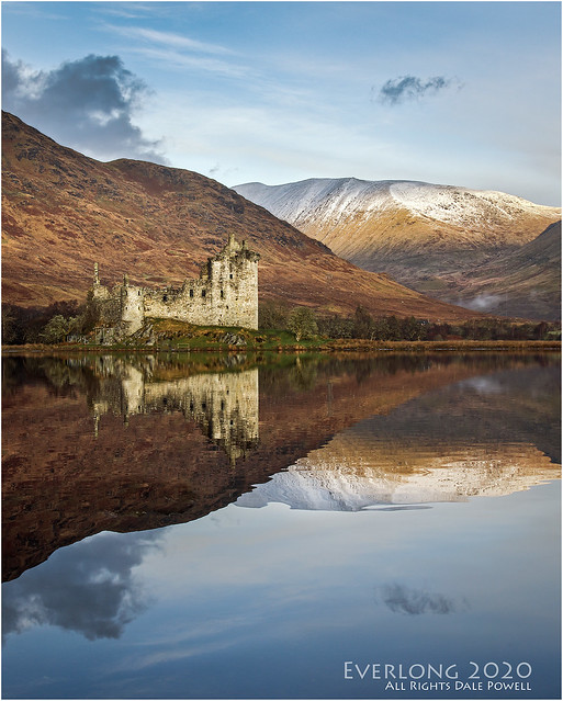
Kilchurn Castle. by Dale, on Flickr
 
Nice - that sort of ripple can be smoothed with a long exposure. Soon as you see distant silver pack up and go or don’t unpack. This is fine but with some camera craft you’d get that totally smooth. I can live with that though

There’s a lot of contrast in this image - too much - the distant bushes left of the castle look a bit dark - given the lighting is quite gentle I’d expect the finer details to be a bit softer
 
Last edited:
Nice - that sort of ripple can be smoothed with a long exposure. Soon as you see distant silver pack up and go or don’t unpack. This is fine but with some camera craft you’d get that totally smooth. I can live with that though

There’s a lot of contrast in this image - too much - the distant bushes left of the castle look a bit dark - given the lighting is quite gentle I’d expect the finer details to be a bit softer


Thanks Steve.

Contrast was a dilemma in PP, go with the PS levels suggestion or go with my own.

Pull it back even more?
 
Thanks Steve.

Contrast was a dilemma in PP, go with the PS levels suggestion or go with my own.

Pull it back even more?

Aye pull back a bit more

I'd be wary of using any suggestion. PS and other editors are very keen on setting black and white points giving quite a few 100% black zones and 100% whites meaning you've blocked shadows and clipped whites. This throws away the dynamic range advantages of modern sensors and using filters.

I tend to set my own just out of these zones retaining a very wide spread of midtones (not always possible) and sometimes you'll have a few pure blacks and that is ok but in a scene with little direct sunlight the shadows won't be very deep so I'd expect to see more details in the darker zones

In this shot in levels - I'd lift the mid point (gamma it might be labled) out a bit more to brighten the thing up. Or if you use curves pick a point 1/4 up and lift it up slightly. Curves gives more control than levels - they do the same basic thing - except curves has more flexibility.
 
Last edited:
Aye pull back a bit more

I'd be wary of using any suggestion. PS and other editors are very keen on setting black and white points giving quite a few 100% black zones and 100% whites meaning you've blocked shadows and clipped whites. This throws away the dynamic range advantages of modern sensors and using filters.

I tend to set my own just out of these zones retaining a very wide spread of midtones (not always possible) and sometimes you'll have a few pure blacks and that is ok but in a scene with little direct sunlight the shadows won't be very deep so I'd expect to see more details in the darker zones

In this shot in levels - I'd lift the mid point (gamma it might be labled) out a bit more to brighten the thing up. Or if you use curves pick a point 1/4 up and lift it up slightly. Curves gives more control than levels - they do the same basic thing - except curves has more flexibility.


Awesome, thanks, I will look into that. (y)
 
"Excellent" shot, well composed, nice colour & light, and some good reflections.

George.
 
Looks good to me, nice tones and again no issues with the slightly rippled reflection. I do prefer the best of your landscape ones but sometimes a spot on a wall demands portrait and this would look great in print
 
Got the RAW file - having a terrible time getting it decoded using iOS X 10.11.06 and cannot seem to load it into Aperture 3 or C1

Had similar problems when I got my 5Div. Windows still won’t open 5Div raw files to this day.

TIFF any good to you? :)
 
Here's my take

Some thoughts - I'll have added a lot less sharpening and clarity than you. Your's is very gritty and crunchy looking compared to mine - totally fine either way but I don't add nearly as much structure/grain or clarity. In terms of saturation and colours I've definitely added less in

The mid point in levels needed pulled back a long long way and I added in an extra 1/4 point in curves to lift out the details on the far embankment. The whole histogram was filled so there was no need to increase blacks or whites but rather lift out the mid tones.

In levels I shifted the red mid point in from 0.5 to 0.47

Sharpening and clarity - my normal although I suspect if the raw this would look better - the tiff seemed very smooth as if some NR had been applied.

NOT MY PICTURE by Stephen Taylor, on Flickr

Nice composition
 
Last edited:
Thanks Steve, and thanks for the pointers too. I like your take. (y)

I'm getting to know the radial tool in LR, I've not long had it pointed out to me and how to use it at my camera club. I do apply local clarity that way but very gingerly (if ever) globally, as that can increase haloing which is a pet hate of mine.

I think the file I sent you as a TIFF was much the same as the RAW, more or less straight out of camera, apart from whatever PS might've done to it when I opened it and converted it to TIFF there, then saved it.

I've double checked my camera now, as I had a suspicion there was some in camera sharpening happening but it wasn't the case. I've noticed too that my workflow method does seem to sometimes make images a little grainy, I will be more concious of that in the future. I'm not sure why as I rarely, if ever add any clarity globally.

Levels and curves are a little mysterious to me at the moment, again it's something I'm learning. I always check levels first, not to trust the PS suggestions entirely but to get an idea. Curves seem to be more powerful and sensitive than levels and I'm trying to work with just one or the other but sometimes I can't resist that extra little tweak.

Thanks for the time you took Steve, all will be noted for next time, everyday is a school day. :)
 
There’s nothing wrong with your original edit Dale, I'd leave it as it is and be proud of your work that morning
 
Back
Top