lens, over contrasting ?

Messages
2,053
Name
Harry
Edit My Images
Yes
either its my eyes or my new (used) Sigma 70-200 f2.8 seems to produce a lot (to much) contrast)..

its not an issue as i can dial it out in the camera settings or PP, but thought id see what the panel thinks..

1 straight out the camera
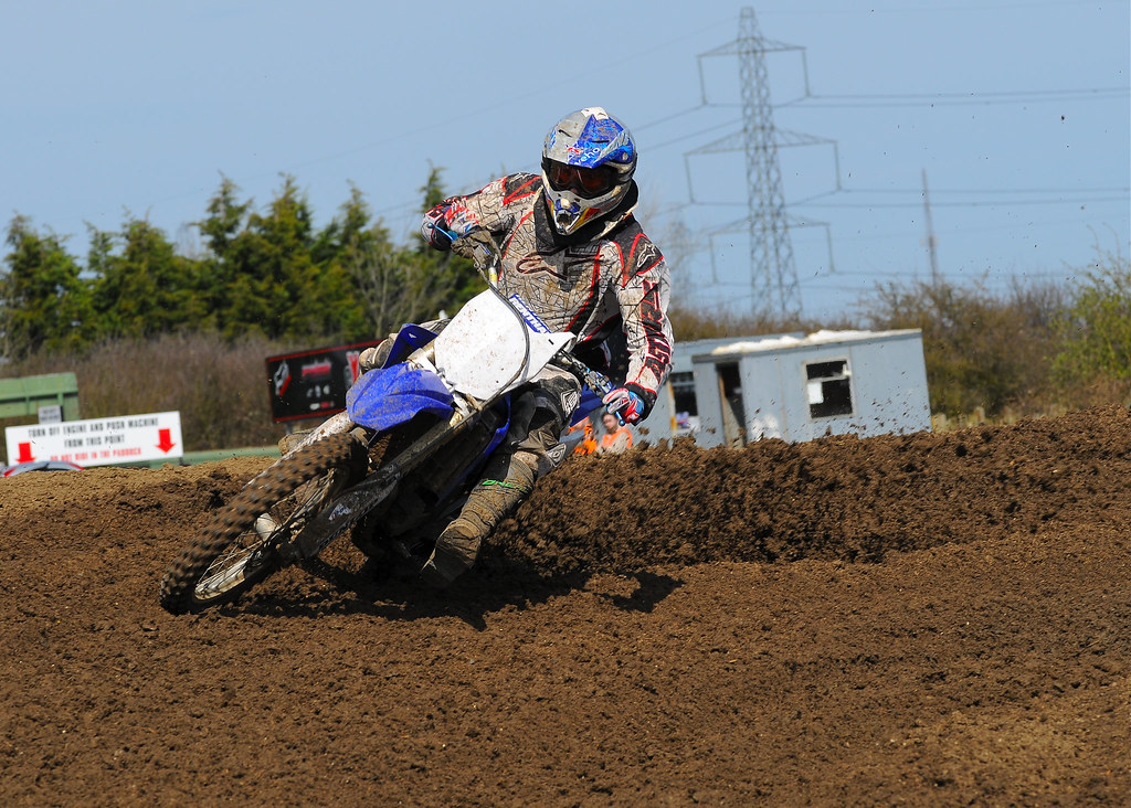

CW8_8384_2 by harrylessman, on Flickr

2 same but with contrast reduced to minimum in PP
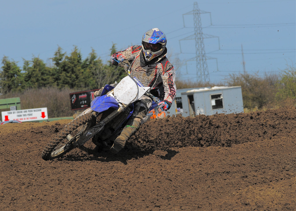

CW8_8384_2_2 by harrylessman, on Flickr

3 as above but with a quick edit but still minimum contrast
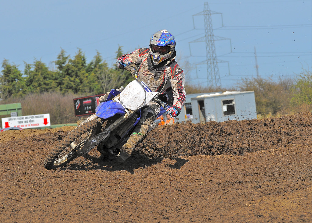

CW8_8384_2_2_2 by harrylessman, on Flickr

4 quick edit with contrast as it came out the camera
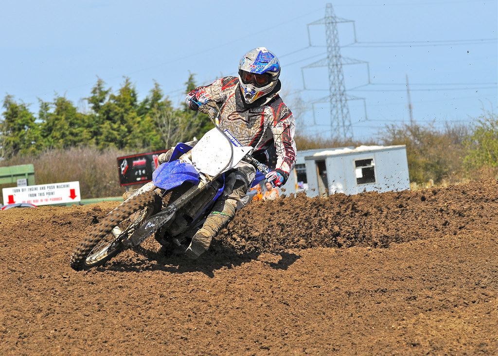

CW8_8384_2 by harrylessman, on Flickr
 
I'm not familier with Nikon bodies, but I presume you have any settings you can alter - sharpness, contrast etc on the body - on a Canon you have several different user settings you can use to fine tune the body for the results you want the camera to do for you ?

Might be worth checking these to see if the Contrast has been boosted in camera previously to aid a different lens ?
 
Last edited:
Thanks, settings are as factory on the D300 although I will now drop the contrast setting in the body to compensate for it. I've only used the lens a few times and didn't notice at first but with the nice light yesterday it became more obvious to me..

Cheers
 
It is impossible for a lens to make the scene more contrasty than it is, and the closer it gets to reality the sharper it looks. This is good!

What you have there is very contrasty light - bright sun on one side, dark shadows on the other, very high dynamic range. Common ways of reducing it are fill-in flash, a reflector, or lift the shadows in post processing.
 
No 1 looks pretty good to me, you just need to very slightly lift shadows (not much, maybe 10-15, not more in Lightroom) and you're done. All the others look very unnatural and somewhat washed out.
remember you shot this in very hard sunlight!

The only thing that you could try is using CPL to darken sky and then you can expose the ground slightly more. I certainly wouldn't decrease the contrast.
 
I think no.1 looks the best (only on my phone so can't judge properly), are you using a calibrated screen to view them?
 
No1 is punchy and as it should be, looks like there was strong sun that day so you will get more contrast.

The rest look washed out and second rate
 
emm food for thought there, both 1 and 4 are the same just a bit of lightening on the shadows but same contrast as 1

the other 2 have the contrast reduced down to minimum so i may need to go somewhere in-between

ive not calibrated the screen but believe it was by past owner, its a 24 inch iMac. i swear my eyes are getting worse since i started wearing glasses for computer and driving etc :/

cheers
 
Last edited:
It looks too aggressive to me, some of the blacks look a bit washed out and the earth looks weird.
 
Number 1 looks spot on to me. Sigma lenses are quite contrasty anyway, thats whay I love about them. All the rest bar #4 look washed out
 
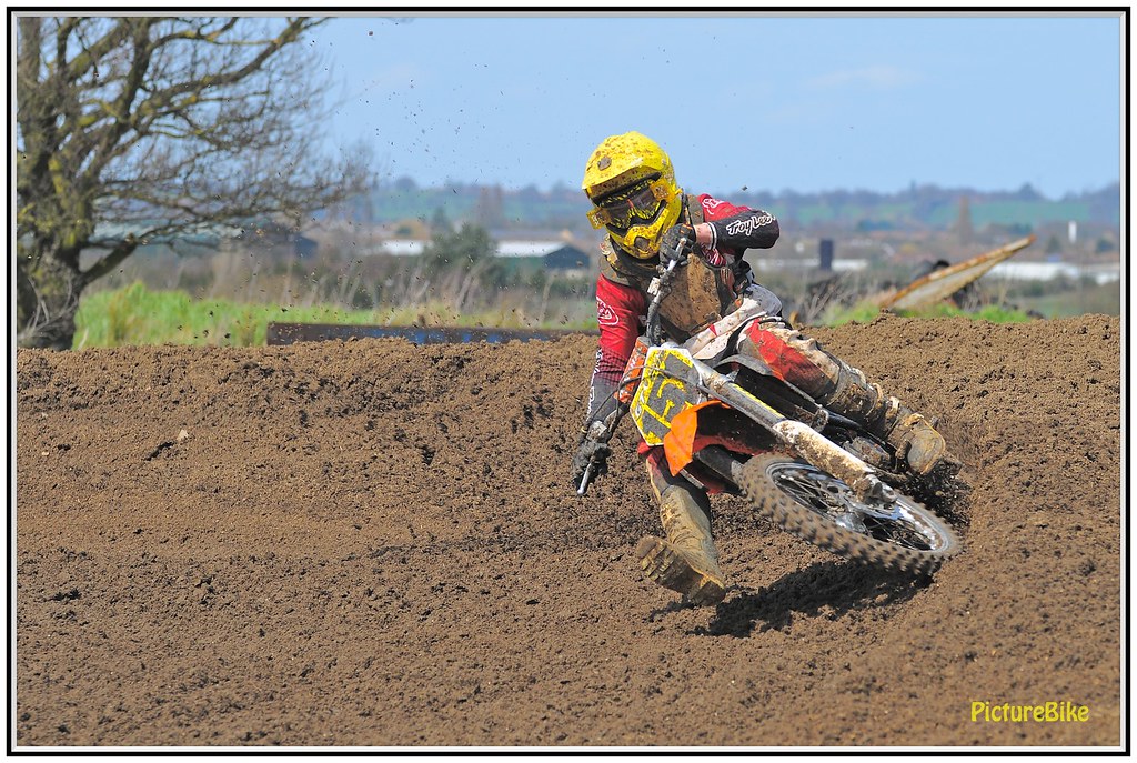
how does this look to you guys ?


CW8_8084 by harrylessman, on Flickr


Slightly over processed. I prefer the first shot. I see nothing wrong with it.

BTW... re: camera settings.. you shooting RAW? If so they'll have no effect.
 
Thanks, might be me just being a bit OCD, originally I thought 1 was fine then started heaving douts. Think ill leave well alone then

These are Jpeg, but I do also shoot raw depending in the amount of expected workflow, often 1000 images weekly with MX
 
Terrible is what comes to my mind. I think you need to spend some time calibrating screen paying attention to blacks and shadows

odd that, as its almost identical settings and processing including the contrast as the first image that everyone else seems to think is about right, still thanks for the comment :thumbs:
 
Back
Top