

Hi there,
I've been playing around with some B&W conversions and would be interested in feedback on the conversions & shots.
Thanks.
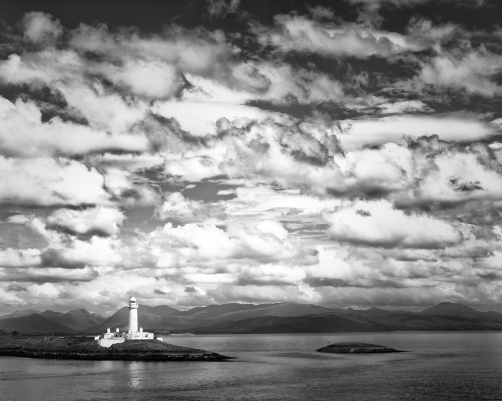
Clouds over lighthouse on Mull crossing- by *Kats Photography*, on Flickr
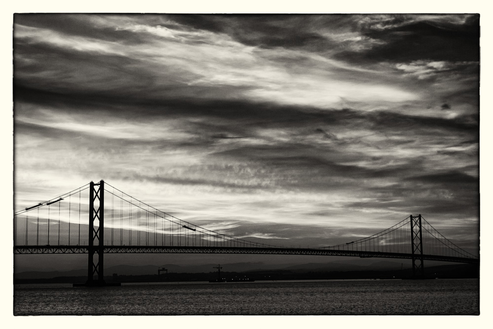
Forth Bridges Skies-3 by *Kats Photography*, on Flickr
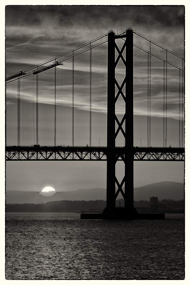
Forth Bridges Skies-2 by *Kats Photography*, on Flickr

Forth Bridges Skies-1 by *Kats Photography*, on Flickr
I've been playing around with some B&W conversions and would be interested in feedback on the conversions & shots.
Thanks.
Clouds over lighthouse on Mull crossing- by *Kats Photography*, on Flickr
Forth Bridges Skies-3 by *Kats Photography*, on Flickr
Forth Bridges Skies-2 by *Kats Photography*, on Flickr
Forth Bridges Skies-1 by *Kats Photography*, on Flickr