Lindisfarne

Messages
1,619
Edit My Images
Yes
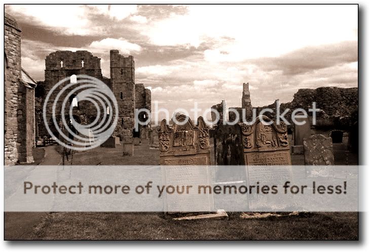
ok, so before ye all go atellin me i should slide this, move that, poke this, prod that, invert, overlay burn and blurr, i just thought i would put this up because i really want to see what others can do with it. I never seem to know just how far to go with these sort of things, so DJW are you listening. As you can see, i started it, but have come to an abrupt end, not sure where to go from here.
lyndisfarne.jpg


thanks, bye the way, no doubt for anyone who has been there, the whole ground is uneven and nothing lines up.
 
ooh - I like this shot - it has a very moody feel to it. look forward to seeing what 'star treatment' it gets!
 
Hey there Boon ! Gotten used to the new nom de plume ?

What a great moody looking place you have pictured ! Love the style and your sky looks full of foreboding. :thumb:

Anyway - I really hope you don't mind (and I am no DJW !) but I have never, repeat NEVER downloaded anyone's pic and played ! Till now ! :getmecoat

You have the distinction (resisted temptation to say honour for obvious reasons) of being my guinea pig !?! :embarasse

So here is my first play with someone else's pic ... and it happens to be yours;

lyndisfarne_edited_1.jpg


I have only really tried to make it more pleasing for me - and I do not know what your original intention was. I have increased contrast, played with a few levels (almost randomly) and sharpened a tad.

I have also cropped out the slanty wall bit from the left side and a few spurious bits on the right. I don't yet know how to straighten stuff !

So ... what do you reckon at my go ? :ponders:

Edit ... Ooops - first off downloaded the thumb sorry and now put right it looks a bit pixellated on my screen but I think you can see what I tried to do !
 
Going through my Blue period just now : -

lindy.jpg


Do you have it in colour or was it shot in B&W ??
 
Steve that is a VERY good shot to start off with there!
 
hi all
many thanks for the kind remarks, did not expect that at all,
i have the picture in colour should anyone want to start from scratch, just ask,
i must admit, i would have thought someone would remove the boundry wire, it looks a mess to me, but a couple of nice takes on it there, i like both the smaller versions, but not to keen on Vens crop, definately look like something is missing in that one. I may even have another go myself.

great stuff lads
 
Got to leave the Boundary wire in or the Zombies will escape :shock:
 
they have already gone mate, too late, whooooaooaoaooao

ps who is the rider in your avatar, i used to marshal for the bikes.
 
Boon said:
they have already gone mate, too late, whooooaooaoaooao

ps who is the rider in your avatar, i used to marshal for the bikes.

Me on my R6 :) , done a few track days on it , that shots from Rockingham.
 
have you been to donnington, mallory park, cadwell, brands, silverston, i also did a few airfields too, cant remember the names though.
 
A bit belated but I couldn't resist having a go. Other than the usual I cloned out the vicar and a white spot on the front gravestone.

lyndisfarne.jpg


regards
 
now thats what i call eerie, real moody and i dont want to walk down that path. Well done Stephano, i like this a lot, hey what was that bump, i heard a bump, no it was definately a bump, i'm gettting out of here.
 
Here's my effort.

boongraveyard0fr.jpg


Using adjustment layers I:

• Pulled in the levels
• Added some contrast with curves
• Boosted the contrast (with Brightness/contract) by 6%
• Used the burn tool (shadows and mid tones) in certain areas that needed emphasis, ei: the sky, FG grave stones ect.
 
Boon, what a great subject & shot to start with !! .

I'm not going to amend your shot as it already has been processed well by others :) ....but I would love a play with the original (I'll fire you my EMAIL address). I'm sure the likes of Bachs will have his take on this aswell, as he has invested a lot of time in B&W recently.

BTW good jobs by the others on your shot & it just goes to show everyone has a different taste for the way they like their Monos' ;)

One thing though on your original shot.... I opened up & looked at the levels :shock:

Levels.jpg


Try pushing the black pointer in from the left until it meets the start of the histogram....now pull the white pointer in from the right until it also meets the histogram. Now adjust mid pointer left or right , vieing the image until you get the result you want. Going back into Levels should now show something like this :-

levels2.jpg


In your photo now you should see you now have some deep blacks & near pure whites.....much better contrast. "Levels" & "Curves" should always be used to increase/decrease contrast, rather then "contrast adjustment" which loses image detail.

Note with B&W images you can actually pull the Level sliders in beyond the start / end of histogram for even more dramatic effects.
 
Think P-E and jimandasideof... have hit the mark for me with the processing.

However, you can't make anything unless it's a good shot to start with and I really like that Steve. Well done mate.
 
Steve, that's a great shot. Can you post up the colour version for us?

I find it quite - well, amusing isn't quite the word... maybe 'intriguing'... that two of the headstones are outside the boundary wire - almost as if they're the ones that have 'escaped'. Maybe they belong to the same family - or (looking at the anchor on one of the stones), they were all in the same boat that capsized? The style of headstone and their respective carvings seem to me to be almost too similar to be coincidental. I would subtly highlight them in some way...
 
Hi Boon, (lol love the name now), i think your original image is fantastic, black and white is effective, personally i might have removed the couple in the background, i think the scene is very haunting and has a "lonely" feel to it, and the people distract from that (just my my psychoscot interpratation ) :D
 
Catdaddy said:
Steve, that's a great shot. Can you post up the colour version for us?

Wow, this is too much folks, i wasn't even going to post this one here, as i thought it not good enough, but i am overwhelmed by the response.

@DJW sent the picture to you mate via email, thanks for the info on the levels as well.

i have the original one here, although trimmed down file size for the forum.
if you look over the middle section of the forground gravestone, you can see Lindisfarne castle about a mile away in the distance. Have fun...
ruins.jpg
 
Fiddled with levels.

Converted to b&w using channel mixer, two versions, one to try and control the brightness on the grass (failed :() overlayed them and flattened the image.

Created another layer for USM, sharpened at about 150%, 50ish px. Use opacity to blend layers.

Sharpened again with high pass sharpening.

Added border.

spencersversion.jpg
 
cracking picture gandhi, reminds me of the first rays of sunlight after a thunderstorm, and i think you got it just about right.
well done
 
Wow, Gandhi!

Here's my version... not quite as dramatic, but hopefully this sort of conveys what I was trying to describe earlier...

Lindisfarne.jpg
 
i like it catdaddy, sort of sepia toned, and i think you have done a great job cloning out the folks at the back too.
here is an attempt by Matty, sent it to me last night:
DCP_1141worked.jpg
 
Cheers for the complements guys but I think matty's the best one so far. Makes mine look a bit melodramatic! chuckle.

Maybe we've come up with a variation on the assigment theme?
 
i am absolutely amazed at how many people are willing to have a go at it, DJW's is still to arrive yet, but i have really enjoyed this thread, Thank you all, i'm proud of you.
 
OK , here's my take....

Ruins.jpg


Steps taken were :-
- Adjusted Levels - As per couple of posts up.
- Converted to B&W via channels - 100% red - Monochrome ticked
- Subtle S shape curve applied to increase contrast

At this point noticed it was impossible to get sky & foreground to correct levels together....so :-

- Duplicated layer & adjusted levels to get sky as I wanted
- Added Mask to layer around buildings & foreground to bring original shot back
- Actually left mask a bit rough around ruin edge to give impression of shadow.
- Left building to left dark to lessen impact to shot

Looking better but still not possible get foreground a decent contrast without darkening ruins too much...so :-
- Using lassoo tool with feather of a few pixels, selected roungh loop of foreground from ruin
- Adjusted selection with Levels to get contrast that fitted in with ruins behind.
- No sharpening performed

....& that was it. No better than some others on here...just another take :)
 
..& here is a more sympathetic conversion, from same layers above, but with central level adjuster moved fror lighter shot, plus S curve more subtle. All down to personal preference ;)

Ruins2.jpg
 
DJW:thumb:

and thanks for taking the time to tell how you did it.
 
& what about this for a HDR way. Took original shot & adjusted centre slider of Levels to create a light, medium & dark shot that was saved. Loaded into Photomatix & create HDR photo. Load back into PS, convert to B&W & Voila.

ruinhdr1.jpg


Purposely made this one lighter still, so full range for people to view/comment.

Thats it...no more now ;)
 
well, what can you say, all 3 are brilliant, similar way of doing things, but 3 very different outcomes, great effort. I think my favourite one is the last HDR one, just a shame about the visitors, they should ban them when i am there :D
i would just like to thank everyone who has been involved.
 
Some excellent variations coming through. I think it's great how everyone interprets it slightly differently. Thanks to Boon for sharing this excellent shot in the first place :thumb:
 
DJW said:
You drive a hard bargain....gone ;)

Nothing beyond your capabilities:D
this is another shot from a slightly different angle, have cloned out the wife, rope border and the visitors, and Lindisfarne castle can be clearly seen in the distance (1mile exactly)
lyndisfarne1.jpg
 
Back
Top