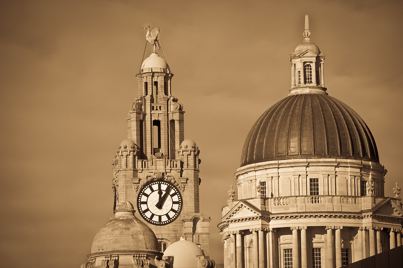
Liverpool Albert Dock

Pic 2 stands out to me. it works compositionally and black and white suites the buildings on the left.

Pic 1 looks a little slanted to the left. Nice processing but doesn't work for me I'm afraid.

I do like the last image because of the bold white and blue colours and the abstract lines but Pic 2 still wins imho.

Thanks for sharing.
 
trevr said:
Pic 2 stands out to me. it works compositionally and black and white suites the buildings on the left.

Pic 1 looks a little slanted to the left. Nice processing but doesn't work for me I'm afraid.

I do like the last image because of the bold white and blue colours and the abstract lines but Pic 2 still wins imho.

Thanks for sharing.

Thanks for your input. It all helps me to understand. Thanks again
 
Must say I like all of these shots. I have studied the first for some time and I really do like the toning and the subject. Very sharp without being OTT and very nicely exposed. I might be inclined to crop some of the dead space on the left but others wil have different views.

I think the second is a classic and very well exposed monochrome, the pathway leads the viewer into the shot.

Number thre is the least strong for me, I think because ther are too many image element, but again that is a personal view.

The last one is a very nice architectural study, very nice lines verging on the abstract.

I'd be happy having aken any of those!
 
Jao said:
Must say I like all of these shots. I have studied the first for some time and I really do like the toning and the subject. Very sharp without being OTT and very nicely exposed. I might be inclined to crop some of the dead space on the left but others wil have different views.

I think the second is a classic and very well exposed monochrome, the pathway leads the viewer into the shot.

Number thre is the least strong for me, I think because ther are too many image element, but again that is a personal view.

The last one is a very nice architectural study, very nice lines verging on the abstract.

I'd be happy having aken any of those!

Thanks very much for you comments
This was one of them days that my shots seamed to be turning out better than normal. I don't get many of these days. But I keep trying to master photography.
Thanks again.
 
Yeah #2 for me also, good job. shame it could not have been shot at a slightly wider angle to get the top of the first lamppost in IMHO
#1 I guess the sepia thing will divide opinion, not keen personally. Other than that I'm not sure what to look at, if that makes sense?
 
siblingchris said:
Yeah #2 for me also, good job. shame it could not have been shot at a slightly wider angle to get the top of the first lamppost in IMHO
#1 I guess the sepia thing will divide opinion, not keen personally. Other than that I'm not sure what to look at, if that makes sense?

Ye I tend to agree about the sepia style I can't seam to make my mind up about them. It's good to get other people's opinions

Thanks again
 
Really like the 2nd and 3rd images.

The level of sepia tinting in the 1st one seems a bit much to me as everything is now the same tone and therefore a bit blander than a more subtle toning might have been- looks as though the sky might have been a bit bland to start with but would like to see the sky a bit lighter.
 
Jim_Tod said:
Really like the 2nd and 3rd images.

The level of sepia tinting in the 1st one seems a bit much to me as everything is now the same tone and therefore a bit blander than a more subtle toning might have been- looks as though the sky might have been a bit bland to start with but would like to see the sky a bit lighter.

Thanks Jim
I see what you mean about image 1. Now as you have pointed it out it does appear bland and life less. Thanks for your input .
 
I was walking around there myself a couple of weeks ago - weather was better for you by the looks of it - I like them, particularly the first 2 although i'd like to see the 1st in B&W...
 
justa1972 said:
I was walking around there myself a couple of weeks ago - weather was better for you by the looks of it - I like them, particularly the first 2 although i'd like to see the 1st in B&W...

We were lucky it was a cracking day. A little cold but very clear. Thanks for your comment. Here's a b&w version


Black and white version by Gary Chadbond, on Flickr
 
Back
Top