Liverpool Sunrise Panoramic

Messages
2,225
Name
Will
Edit My Images
Yes
This image is actually comprised of 15 distinct exposures tone mapped and then stitched together.

The image is a bit wide for the forum, but clicking on it will take you to a larger version on Flickr.


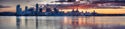
I'm quite pleased with how the finished image turned out, but I'm also wondering how I might have improved on it at the time or could do better in the future. One suggestion I've had is to shoot in portrait format so that I can fit more of the sky in.

Also, I've had one of these printed via RedBubble and it turned out darker than I expected. Is this to be expected? My monitor isn't calibrated. Would this help?

Over to you guys, go nuts. No cotton wool required! (y)
 
WOW, I think it's great.

I think there is enough sky to be honest.
 
I agree, it's absolutely stunning! Can't really comment past that to be honest!

Chris
 
Great combination of simplicity of image with enormity of content. Brilliant image which sets the standard for the Liverpool waterfront.
 
I've been meaning to get to Birkenhead some time to try and take a picture like this. Any chance of letting me know exactly where this was taken? A Google map or a street name would be great.

You've been very lucky with the light and got an excellent panoramic there. Well done.
 
First off, let me say I think it's a great image. Don't let the critique which follows blind you to that!

However, I think shooting in portrait format would definitely have been better. The sky at the upper right is absolutely beautiful but you've lost a lot of it because of the orientation.

Here's a little illustration. I shot this pano with the camera in portrait orientation, and when I was working on it I tried a crop to see what would have happened if I had shot in landscape orientation and hadn't got all the sky in the original. There's no doubt in my mind that the one with the sky is better. It's just more spacious.

205192137_Hn2UD-M.jpg


205192359_xut2K-M.jpg


Some other thoughts ....

I'm not generally a fan of tone mapping (I know opinions vary widely on this!!) but I think you've done this quite nicely. It's very subtle.

I can't help wondering whether it would be better if you'd straightened the horizon. I know that curved look is characteristic of wide panos, but it wouldn't take a big transformation to straighten it and I think it would be an improvement.

Speaking of horizons, I think the composition with the horizon right in the middle of the picture is a bit "flat". I know there's not a lot you can do about it now, but more sky would have allowed a more spacious and dynamic feel to the image.

Finally, I think the image (I'm looking at the full-size one on Flickr) could do with a bit of judicious sharpening. It's a tad soft.

Hope this helps!
 
I've been meaning to get to Birkenhead some time to try and take a picture like this. Any chance of letting me know exactly where this was taken? A Google map or a street name would be great.

Sure, it was taken next to the car park of Seacombe ferry terminal.

I've put the image on the Flickr map. Just look at the Additional Information section to find the map link.
 
I think shooting in portrait format would definitely have been better. The sky at the upper right is absolutely beautiful but you've lost a lot of it because of the orientation.

I completely agree. I don't know why, but shooting in portrait mode just didn't cross my mind at the time. I was probably too busy trying to get all of the shots before the light changed too much! I know for next time though!

I'm not generally a fan of tone mapping (I know opinions vary widely on this!!) but I think you've done this quite nicely. It's very subtle.

Compared to the single exposures, the effect is incredibly subtle in this case. The clouds might look overly processed, but they actually looked like that at the time. The main thing I got from tone mapping was to bring the buildings out of shadow.

Here's what a single exposure (metered for the sky) looks like:

4da412c6.jpg


I can't help wondering whether it would be better if you'd straightened the horizon. I know that curved look is characteristic of wide panos, but it wouldn't take a big transformation to straighten it and I think it would be an improvement.

I'm not sure what would be the best way to do this. What would you suggest?

Speaking of horizons, I think the composition with the horizon right in the middle of the picture is a bit "flat". I know there's not a lot you can do about it now, but more sky would have allowed a more spacious and dynamic feel to the image.

Yeah, if I could shoot it again, I would probably aim to get more of the sky.

Finally, I think the image (I'm looking at the full-size one on Flickr) could do with a bit of judicious sharpening. It's a tad soft.

Noted.

Hope this helps!

It does, thanks!

Thanks to everyone for the feedback. It's much appreciated. :)
 
Where abouts did you take that from? From down near New brighton?

I'm after redoing my panoramic, but i need it less wide, and where you took it looks better than from when i did.
 
A brilliant image! Very well captured
 
I keep opening this post up to take another look at the image - Never seen Liverpool captured from that angle and width and I REALLY like it.
 
Back
Top