

- Messages
- 273
- Name
- Mike
- Edit My Images
- Yes
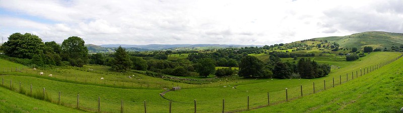
Had a quick trip out to Bala area the other day, and became quite fixated on the tower in this reservoir. Was a little choppy at the time.
1. Autostitch across the dam
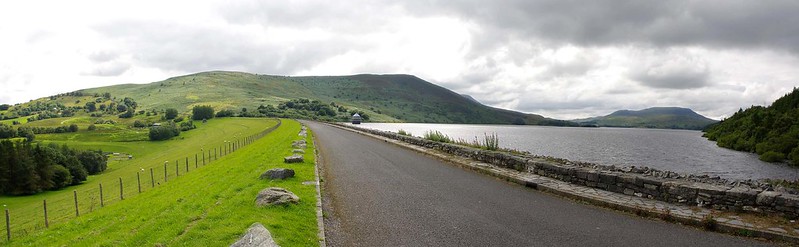 pano3 by Mike Edwards, on Flickr
2. Tower
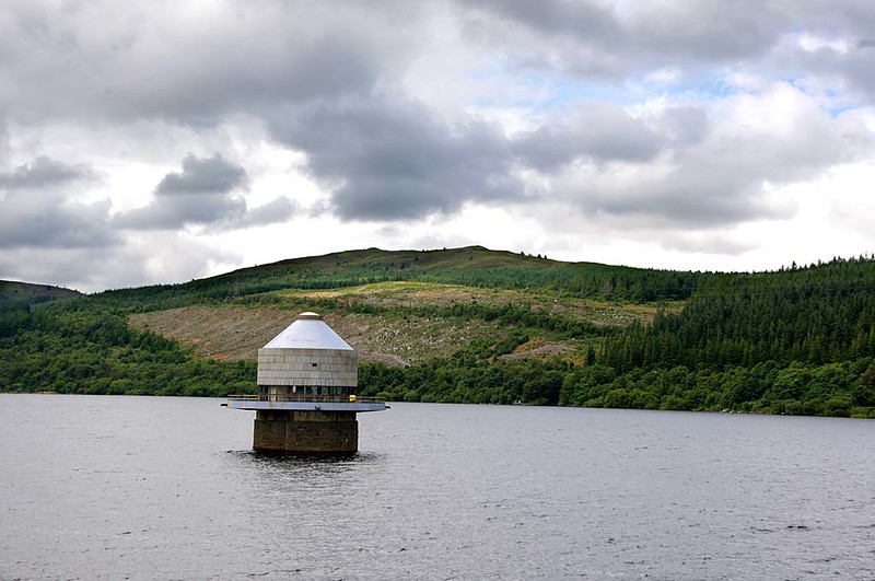 IMGP9619-web by Mike Edwards, on Flickr
3. Tower again
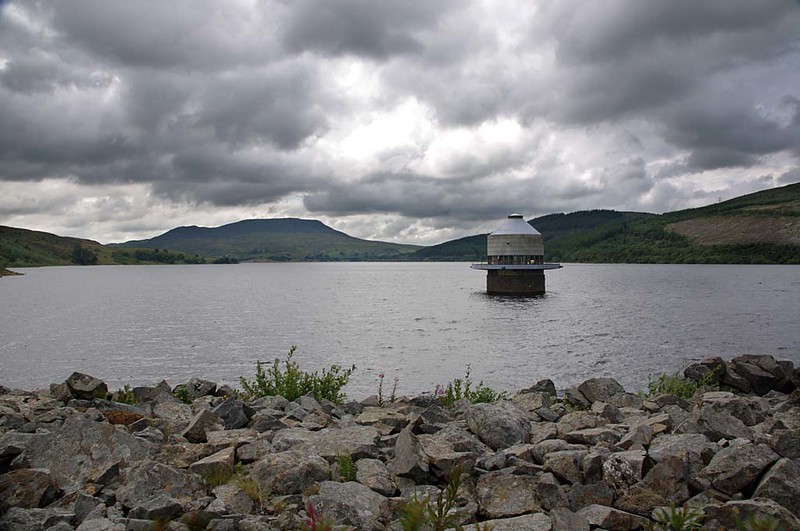 IMGP9609-web by Mike Edwards, on Flickr
I made a comment in another thread (ETA - this one https://www.talkphotography.co.uk/threads/pontsticill-reservoir.631354/ ) about how my images never seem to be quite as sharp as others, I wonder if anyone has any thoughts or suggestions on why this might be? These are taken on my Pentax Kx, using a Sigma 18-200 zoom which has become my walkaround lens. I've processed them (a little, not that much) in a very old version of Photoshop, which basically means altering the levels a little, increasing the contrast, resizing down to 1024xwhatever and running the unsharp mask on them. The panorama was done by autostitch so I wouldn't be surprised if that lost a little clarity, it's the others I'm mainly thinking of. I am working with the jpg rather than the raw images, mainly because my old PS doesn't seem to like DNG files.
So any thoughts would be most welcome. I tried changing from PB to Flickr for hosting as a commenter on another forum suggested that (or maybe thumbsnap) might be doing something that loses clarity. If it's even possible, I'd be happy to post one of the raw unedited images if someone was willing to mess around with it in newer software.
1. Autostitch across the dam
pano3 by Mike Edwards, on Flickr2. Tower
IMGP9619-web by Mike Edwards, on Flickr3. Tower again
IMGP9609-web by Mike Edwards, on FlickrI made a comment in another thread (ETA - this one https://www.talkphotography.co.uk/threads/pontsticill-reservoir.631354/ ) about how my images never seem to be quite as sharp as others, I wonder if anyone has any thoughts or suggestions on why this might be? These are taken on my Pentax Kx, using a Sigma 18-200 zoom which has become my walkaround lens. I've processed them (a little, not that much) in a very old version of Photoshop, which basically means altering the levels a little, increasing the contrast, resizing down to 1024xwhatever and running the unsharp mask on them. The panorama was done by autostitch so I wouldn't be surprised if that lost a little clarity, it's the others I'm mainly thinking of. I am working with the jpg rather than the raw images, mainly because my old PS doesn't seem to like DNG files.
So any thoughts would be most welcome. I tried changing from PB to Flickr for hosting as a commenter on another forum suggested that (or maybe thumbsnap) might be doing something that loses clarity. If it's even possible, I'd be happy to post one of the raw unedited images if someone was willing to mess around with it in newer software.
Last edited:
") - partly because I'm not really going to the locations that would inspire that. It was more of case of taking the camera with me on a trip, rather than selecting the trip for the photographic opportunities. The dam there isn't that inspiring, not least because all the side you can see is grassed over. But the main issue for me is the lack of clarity compared to those in that thread I linked to - which might be because the tower there is made of stuff that doesn't have such sharp edges, or many other things. But if it's down to something I'm doing it would be nice to figure out what, so I can stop doing it.
- partly because I'm not really going to the locations that would inspire that. It was more of case of taking the camera with me on a trip, rather than selecting the trip for the photographic opportunities. The dam there isn't that inspiring, not least because all the side you can see is grassed over. But the main issue for me is the lack of clarity compared to those in that thread I linked to - which might be because the tower there is made of stuff that doesn't have such sharp edges, or many other things. But if it's down to something I'm doing it would be nice to figure out what, so I can stop doing it.
 pano1
pano1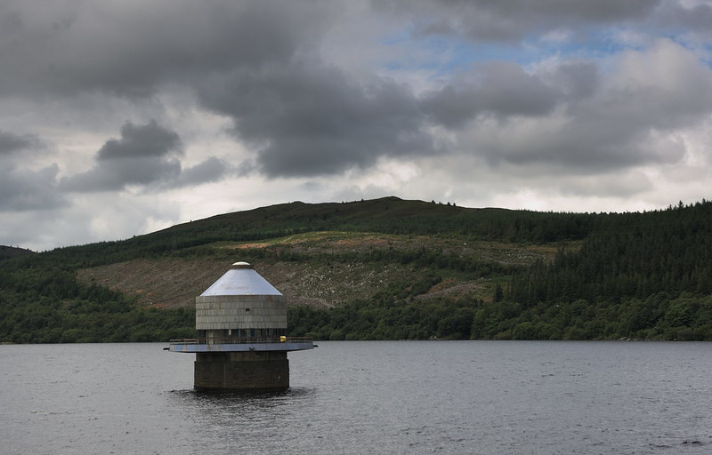 IMGP9619-rt