Location Portrait

Messages
450
Name
Tim
Edit My Images
Yes
A portrait from a location shoot I did on Monday. Doesn't have quite the impact of the full res file. Image replaced by the one in my reply below.

View attachment 103649
 
Last edited:
They aren't, looks can be deceiving at 365kb, no sadness on my part.

Thank you.
 
nice capture but agree with nick owen about focus looks soft on my screen too
 
Perhaps you thought I was being sarcastic... I actually meant it's a shame it 'looks' OOF, because it's a nice shot. I'll take your word for it that they are in fact sharp. But then, why put up a fuzzy low res file for comment?

:plus1:
 
Perhaps you thought I was being sarcastic... I actually meant it's a shame it 'looks' OOF, because it's a nice shot. I'll take your word for it that they are in fact sharp. But then, why put up a fuzzy low res file for comment?

nice capture but agree with nick owen about focus looks soft on my screen too

I put a low res image up because I don't want to have a high res one lifted by anyone. The eyes are sharp enough on the full res file and I accept as a critique of this file, yes they could be sharper. I had this with another low res file a while back which was ok at full res. On that occasion I took the small file and added contrast to lashes and highlights which made it look way sharper, I don't currently have the time or inclination to do that here as I have a pile of files to process right now.

There is more than eye sharpness that can potentially improved upon in any image, if the eyes on this one are going to prevent further discussion I'll live with it as I am not inclined to put a full res copy of this on line.

I didn't think anyone was being sarcastic, just sounded a little dramatic when I wasn't planning to have the file go to print as a front cover shot for vogue.

Thanks for looking and taking time to critique, all useful stuff. Much appreciated.

Tim
 
You might have been better sharing a smaller sized but higher quality pic. The problem is that it's too tall for me to see on the screen to appreciate as a whole and judge the composition and engagement. All I can take in is the fuzzy low resolution of it all.

A very big, very low resolution file is hard to comment on when viewed online. A smaller image with less quality reduction would be easier to pass comment on.

That's a fair point. Thank you.

Location Portrait 1.jpg
 
Immediately I'm drawn to the area under her right eye. It looks like something has been corrected there and you've left very obvious marks where you've processed.
 
Immediately I'm drawn to the area under her right eye. It looks like something has been corrected there and you've left very obvious marks where you've processed.

Thanks for taking a look and replying. I might not be onto the right area but here is an edit. If it's the area I just tweaked, it's the same on the original file.

Thank you.

Location Portrait 1A.jpg
 
I think it's a very nice image.
I would say it's plenty sharp enough, but the point of focus is forward of the eyes... ~ at her bangs. I would deal with the slight bags under her eyes, probably the dark eye corner rt side a bit. And I find the earrings somewhat distracting.
 
I was referring to this area. Looks very odd. Will remove if you want

18327-1496934104-fad57a4adccf533b9fe0221599b142e1.jpg
 
I think it's a very nice image.
I would say it's plenty sharp enough, but the point of focus is forward of the eyes... ~ at her bangs. I would deal with the slight bags under her eyes, probably the dark eye corner rt side a bit. And I find the earrings somewhat distracting.

I was referring to this area. Looks very odd. Will remove if you want

Thanks both of you for your input, I've just had a quick tinker and hope it's going in the right direction, I think it's better and I've had a kick up the backside which will make me more critical of details in my images going forward.

Very useful. Appreciated.

Location Portrait 1AA.jpg
 
I would say it's better. But be careful about removing too much detail, there should be some lines under her eyes. Here's about where I would be (quick edit)...
Frequency separation to deal w/ color and texture separately. New layer below high frequency layer painted on (and removed earrings as well :)). Masked some sharpness off of hair. Duplicated high pass layer in vivid light mode for eyes/lips (basically, I shifted the focus back a touch).
I'm sure you could do better with a bit more time/effort, I was a bit sloppy...

View attachment 103733
 
Last edited:
BTW, I *think* you used frequency separation to start with... I would suggest a bit less blur overall on the low pass layer to start with, some of the skin texture has a bit of that "embossed" look to it and over-softening is usually the cause. You can always add more selectively...
 
Last edited:
BTW, I *think* you used frequency separation to start with... I would suggest a bit less blur overall on the low pass layer to start with, some of the skin texture has a bit of that "embossed" look to it and over-softening is usually the cause. You can always add more selectively...

Thanks for your time Steven, some really useful advice there, yes I did use frequency separation first, the image wasn't as good as I'd like from the outset in terms of having to work on it. I'll be totally honest and add the fact that it wasn't even supposed to be a portrait shot, though it turned into one because when I was working on the whole image from which this was taken, I noticed just how great the facial expression is as a portrait. I decided that as I could have the crop with enough resolution to upscale it and then knock it into shape with some additional work and get something worth having at the end, I'd might as well persist on that path. See attached image below which shows the how the above crop evolved. It was shot on the move with a fair bit of wind blowing through the windowless carcass of the building, so I can't complain about having to tidy it a bit.

Sorry it took me while to get back, I've been shooting solidly since last Thursday and had a stack of images to get through.

Regards

Tim

Crops.jpg
 
Thanks for your time Steven, some really useful advice there, yes I did use frequency separation first, the image wasn't as good as I'd like from the outset in terms of having to work on it. I'll be totally honest and add the fact that it wasn't even supposed to be a portrait shot, though it turned into one because when I was working on the whole image from which this was taken, I noticed just how great the facial expression is as a portrait. I decided that as I could have the crop with enough resolution to upscale it and then knock it into shape with some additional work and get something worth having at the end, I'd might as well persist on that path. See attached image below which shows the how the above crop evolved. It was shot on the move with a fair bit of wind blowing through the windowless carcass of the building, so I can't complain about having to tidy it a bit.

Sorry it took me while to get back, I've been shooting solidly since last Thursday and had a stack of images to get through.

Regards

Tim

View attachment 103997
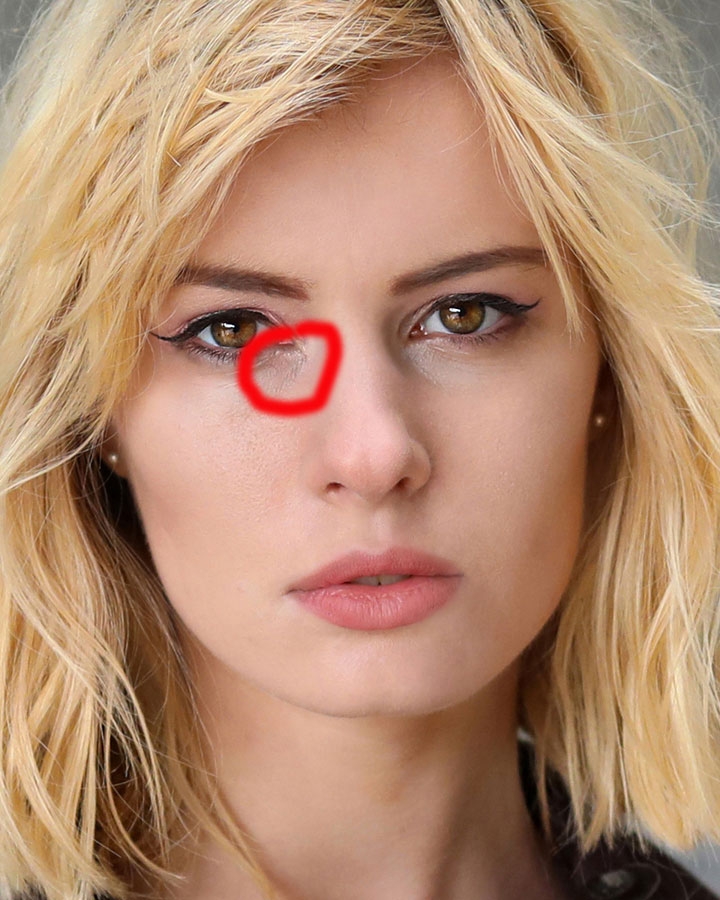
I much, much prefer the widest shot. Doesn't need much work at all, though I'd find it hard to resist a little cloning & toning.

How on earth do you find time to process the images if you've been shooting since Thursday????
I'm shooting twice a week at the moment and completely failing to keep up. I know I've got a slack period coming, though, and will catch up then.

The wide shot was my instinctive pick too, I just can't help myself exploring a shot once I've pulled it out of the pile. Time, yes Simon, I'm treading water and mightily glad I have a quiet week now, unless that changes.

Oh yes, a little toning and cloning doesn't go amiss, in actuality I'm finding the photography fulfilling these days, just got to keep it real :)

Thanks guys, all the best

Tim
 
I much, much prefer the widest shot. Doesn't need much work at all, though I'd find it hard to resist a little cloning & toning.
.
This^
Not only a better shot - but I have to admit the reason I didn't comment on the original is that it was labelled a 'location portrait' and had no sense of location. I figured it was needless negativity. I'd like to see a full sized image of the wide shot tidied and tweaked.

BTW my rule of thumb with retouching is that the subject would never notice (caveat - I don't do 'beauty' I do portraits). Steven's edit is close to perfect IMHO
 
I much, much prefer the widest shot. Doesn't need much work at all, though I'd find it hard to resist a little cloning & toning.

How on earth do you find time to process the images if you've been shooting since Thursday????
I'm shooting twice a week at the moment and completely failing to keep up. I know I've got a slack period coming, though, and will catch up then.


This^
Not only a better shot - but I have to admit the reason I didn't comment on the original is that it was labelled a 'location portrait' and had no sense of location. I figured it was needless negativity. I'd like to see a full sized image of the wide shot tidied and tweaked.

BTW my rule of thumb with retouching is that the subject would never notice (caveat - I don't do 'beauty' I do portraits). Steven's edit is close to perfect IMHO

Thanks Phil and Simon, here is a full res copy of the full frame aside from a very minimal crop. I've done some tidying but not loads.


Derelict 1 by Timothy Lawes, on Flickr
 
Very nice. I haven't done a side-by-side comparison or detailed inspection to work out what you've done, but I like it.

fwiw, things I would consider changing..

The composition is very central. I think the diagonals would work better if Pippa was more to the right of the frame, with more space to the left. I might even try to adjust it in post.
I might zap the dark patch on the blue frame. I'd also try removing the light switch in the background. If she was more to the right it might balance the composition but as it is it unsettles things slightly.
I'd try to unify the palette of the pink graffiti and blue paint a little
I'd probably remove some of the more wayward strands of hair.

Still, a lovely pic of a beautiful model.

Thanks Simon, some really useful input there. I've had a tinker and done some of the suggested work. I'm not going to do too much more tidying until the composition is in a happy place. Fortunately I make a point of panning through a backdrop with a quick burst after the actual shots so I can add to either side if required when editing.

Really appreciate your time.

Cheers

Tim

Derelict 3 by Timothy Lawes, on Flickr
 
I much, much prefer the widest shot. Doesn't need much work at all, though I'd find it hard to resist a little cloning & toning.

How on earth do you find time to process the images if you've been shooting since Thursday????
I'm shooting twice a week at the moment and completely failing to keep up. I know I've got a slack period coming, though, and will catch up then.
Oh Simon, how your comment rang with me. I LOVE taking the photos but processing the shoot afterwards takes me so much time. I am trying to discipline myself on just how images I actually take but if the model is "transitional" and reacts to camera I just keep reacting to her....it's a vicious circle! Currently on holiday but when I get back I have four shoots back to back...discipline discipline discipline, note to self, DISCIPLINE.
 
I think I still prefer the headshot. I do like the wider shot, but as edited it seems rather flat/dull/cold.
Primarily a levels adjustment and a touch of dodge/burn.

Once again Steven, Apologies for the late reply, I like the edit you did, I was kind of pondering livening it up a little and hadn't got round to doing it so great to see an example, I'll have another play with my final edit. I'll keep it a little bit bleak as that was the nature of the venue and general vibe.
Much appreciate your time to contribute, A big, big thanks.

Tim
 
Back
Top