Being very brutal
@smr I'll tell you why I wouldn't, if I was in the judging panel, have picked yours. I am sorry if this comes across as somewhat harsh and whilst I appreciate you've put a lot of work into the image, your photography in general - but this isn't anywhere near the best you have produced.
Here are my thoughts....and again sorry for the bluntness of this post.
1. Aspect ratio - in a book with square pages, it's best to offer a 5:4, 4:3, 1:1. Yours would look lost on the page - it really is very wide. When they view images, and the size you have to supply to them - it won't stand. Pano's only really work well displayed full screen on a large screen, or printed wide. They won't see yours in this way.
2. Bottom right corner of yours, the trees are rammed right against the frame edge. Look at the others, they all have a bit more space at the bottom. I agree re the rest of your comments are composition but that's pretty much the only thing yours has going for it and even then, the lopped off bottom is a big no and that would put the brakes on for me, then and there.
3. Being very harsh, yours is pretty dull. There isn't quite enough snow to really make it scream winter, more a UK dreich misery winter than an actual nice one. There's bits of brown poking through and being frank, all of the others do the snow thing better.
4. Overall I think your's is a little flat and dull. If you try B&W, raise the whites right up, move the blacks in a bit more, it might work, but I am not sure it'll really sing. It's crying out for some light, defined sky, some shadows from the sun/clouds, just something.
5. Lighting and sky. You have a sort of undefined sky with a little bit of blue, it's not grabbing me.
In short - Steve Tuckers has a better sky, more snow, more contrast and a preferable aspect ratio and being blunt, easier on the eye composition. It's my favourite, I really like the mono processing, beefy sky against the white snow look. It's really top stuff and an image I would be quite happy to call my own.
James Pedlans isn't great but that bit of light saves it over yours. Not lopped off tree's on the side though. Not a great image and quite a wide aspect ratio for them, but look at the bottom, overall it's better balanced than yours. Overall though, I wouldn't have had that one in the book either, dull drab sky - like yours alas.
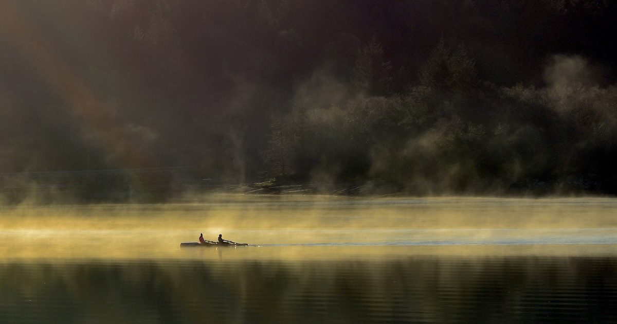
Francis Taylors is drab, but again consider aspect ratio and the fine mist going on. You can feel the cold looking at it and the gentle processing renders a soft paintery feel. It isn't my sort of image, I prefer direct light, strong light and shadows - natural contrast if you like but it's just the sort of thing these judge's lap up. Yours sits between the soft paintery feel look and drab. It just isn't quite one or the other whereas Francis is.
Sean Quilters is actually quite nice. Light, textured defined sky, book friendly aspect ratio and inoffensive processing (pretty much).


")