- Messages
- 340
- Name
- Arron
- Edit My Images
- Yes
Well it's been a long time, fell out of love with my camera and never seemed to nail any shots. After a recent trip to Manchester and it's Christmas Markets I think in love again with photography.

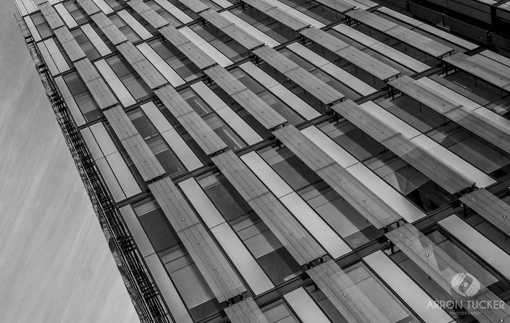
Manchester & The Quays by ArronTuckerPhotography, on Flickr

Manchester & The Quays by ArronTuckerPhotography, on Flickr

Manchester & The Quays by ArronTuckerPhotography, on Flickr
Feedback most appreciated.
Manchester & The Quays by ArronTuckerPhotography, on Flickr
Manchester & The Quays by ArronTuckerPhotography, on Flickr
Manchester & The Quays by ArronTuckerPhotography, on Flickr
Feedback most appreciated.
") No.1 is my favourite from set managed to get whilst there.
No.1 is my favourite from set managed to get whilst there.