Maspalomas Lighthouse

Messages
4,288
Name
Neil
Edit My Images
No
Just back from Gran Canaria and thought I'd share a few images on Maspalomas lighthouse! They were shot on my D7000 with the standard kit lens (18-55 DX) on my small travel tripod.

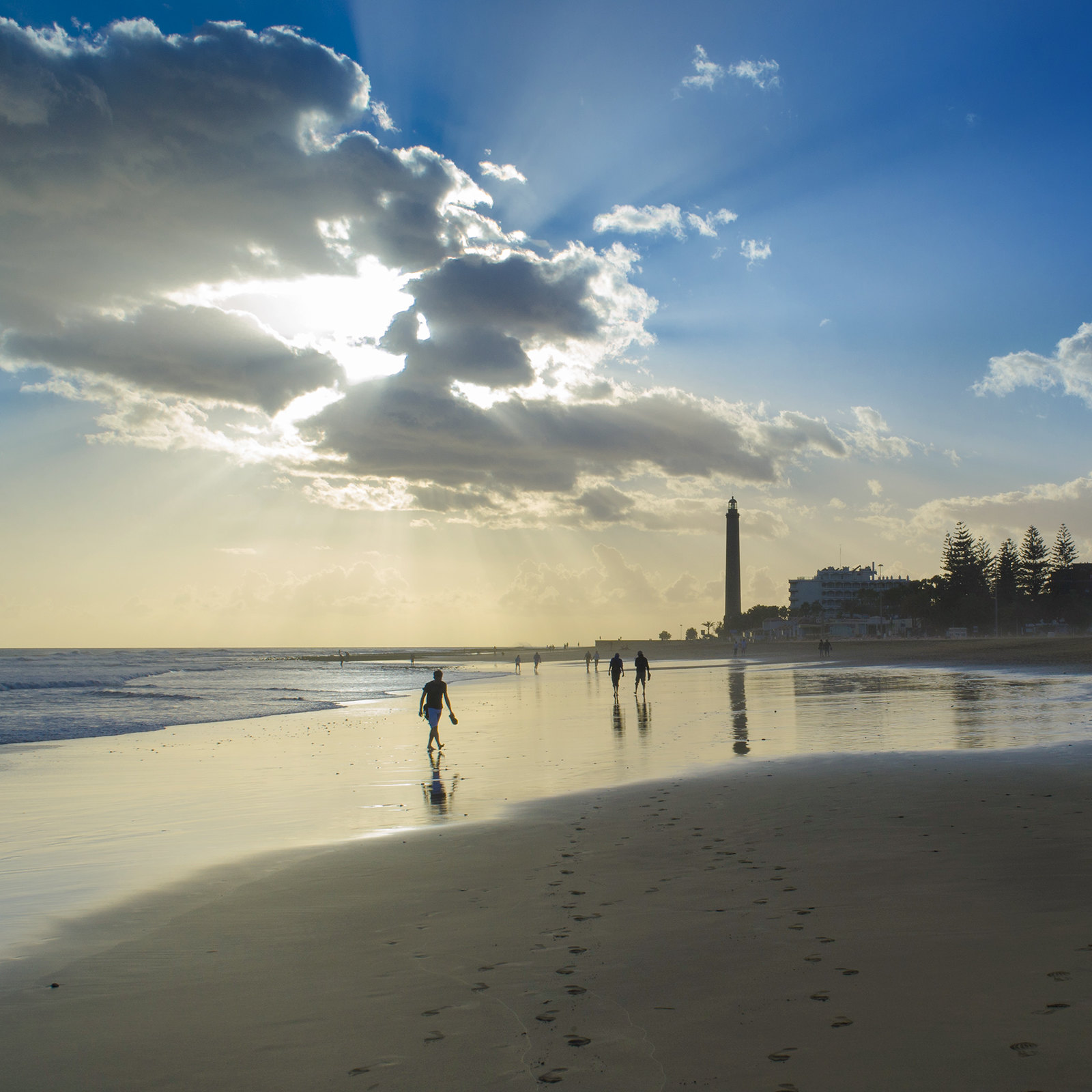
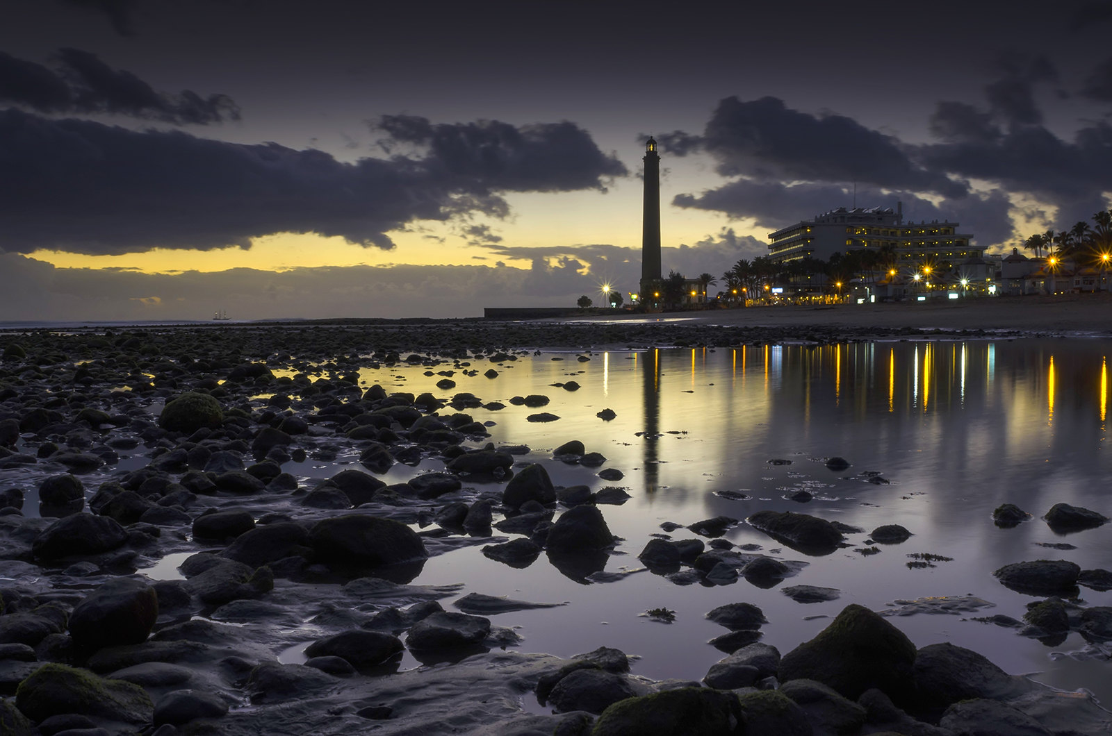
Maspalomas Lighthouse Sunset
The Maspalomas Lighthouse (Spanish: Faro de Maspalomas) is an active 19th century lighthouse at the southern end of the Spanish island of Gran Canaria, in the Canary archipelago. It lies at one end of the Maspalomas beach, 4 kilometres (2.5 mi) south of the resort town centre, next to the area known as the Maspalomas Dunes.

The lighthouse is a distinctive landmark in the resort, and is the tallest masonry lighthouse in the Canaries at 56m, being superseded only by the more modern 59m concrete Morro Jable lighthouse on Fuerteventura.

With a focal height of 60m above the sea, its light can be seen for 19 nautical miles, and consists of a pattern of three flashes of white light, over a period of thirteen seconds.


[URL='https://flic.kr/p/r4e8dS']

[/url]
 
Last edited:
Hi Neil, hope you had a good time.

Hope you don't mind if I offer a bit of crit? Lots of people seem to throw their toys out but I will proceed on the assumption that you wont. :)

Keep your eye on the horizon, 2 & 3 are off a tad.

To my mind, 2,3 and 4 are all too dark. with large areas just black. If you were going for the electric light, dark sky look I would consider cropping a lot of the dark area out. e.g the last one, chop off the picture just below the tip of the reflected lighthouse.

2 might have been really nice if the foreground stones could be seen, its the best pic compositionally I think. To do this you either have to invest in ND grad filters or take 2 or 3 images at different exposures and do a bit of judicious blending.
 
Hi Keith, thanks for the comments.

Personally I don't think the horizons are out, the slope of the rocks and beach may make it look as if they are? Take a look at the lighthouse and the level walkway to the left.

I see your points on the blacks however and unfortunately didn't take the filters away with me. I did try hand holding a cheap soft grad but the results haven't come out great with most shots having a moire effect! I will possibly try bringing back a bit of detail in the blacks later tonight, see if I can get a better result.

Cheers
 
2 might have been really nice if the foreground stones could be seen, its the best pic compositionally I think. To do this you either have to invest in ND grad filters or take 2 or 3 images at different exposures and do a bit of judicious blending.

I've upped the foreground a little more, so there are more highlights on the rocks. I don't really want to bring the details up any more as I fear it could become a HDR mess.
 
Number 2 is my favourite, and the subtle light on the rocks is lovely.

I'd have said number 1 looked a bit left-hand-down, but if the lighthouse is vertical then that can't be the case.

Number 3 could still do with a little more lightening on the left/foreground rocks *in my opinion*.
 
Number 2 is my favourite, and the subtle light on the rocks is lovely.

I'd have said number 1 looked a bit left-hand-down, but if the lighthouse is vertical then that can't be the case.

Number 3 could still do with a little more lightening on the left/foreground rocks *in my opinion*.

I will have look at the RAW files for 3 and 4 later Toni, as I agree with both you and Keith.

I did medal with the horizons quite a bit for all shots. The slight slope of the beach does give it the feeling that it is slightly off, I did even try and compensate for it, but you really notice the lighthouse going off vertical if it's not perfect.

Cheers for the comments guys.
 
No 1 is bang on level, I use the scroll bar and scroll the image up to the edge of the current window to check and it's perfect.

Also worth mentioning, the thing with critique is it not always meant to be applied immediately to the photos critiqued. I see it more as advice/tips that could be borne in mind if you were ever in the same sort of situation again.

Obviously advice to crop a bit off or something that can be achieved in post processing is different.
2p
 
Last edited:
No 1 is bang on level, I use the scroll bar and scroll the image up to the edge of the current window to check and it's perfect.

Also worth mentioning, the thing with critique is it not always meant to be applied immediately to the photos critiqued. I see it more as advice/tips that could be borne in mind if you were ever in the same sort of situation again.

Obviously advice to crop a bit off or something that can be achieved in post processing is different.
2p

I've lightened the foreground on 3, which makes a big improvement, the detail is there to bring back so I may as well do it now in PP!!! As far as the horizon goes, I've just put some guides across vertically and horizontally and they are as level as can be so I've left them.
 
Back
Top