

- Messages
- 46
- Name
- Ken
- Edit My Images
- Yes
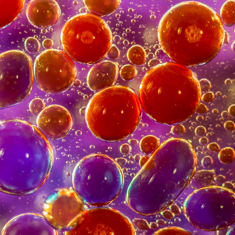
First go at oil and water, so open to critique / advice on how to improve / have more fun.
The first few are coloured water added to oil, whilst the last 2 are oil added to water. In each case I used two desk lamps and some coloured paper / glossy magazine covers underneath the container.
Previously posted in Creative forum but not much in the way of response there :-(
 _DSC8308 by Ken McN, on Flickr
 _DSC8323 by Ken McN, on Flickr
 _DSC8333-Edit by Ken McN, on Flickr
 _DSC8339 by Ken McN, on Flickr
 _DSC8356 by Ken McN, on Flickr
 _DSC8360 by Ken McN, on Flickr
 _DSC8385 by Ken McN, on Flickr
Grateful for your thoughts.
Ken
The first few are coloured water added to oil, whilst the last 2 are oil added to water. In each case I used two desk lamps and some coloured paper / glossy magazine covers underneath the container.
Previously posted in Creative forum but not much in the way of response there :-(
_DSC8308 by Ken McN, on Flickr_DSC8323 by Ken McN, on Flickr_DSC8333-Edit by Ken McN, on Flickr_DSC8339 by Ken McN, on Flickr_DSC8356 by Ken McN, on Flickr_DSC8360 by Ken McN, on Flickr_DSC8385 by Ken McN, on FlickrGrateful for your thoughts.
Ken