Midland railway centre in hdr.

Bumph GB

Junior Member
Messages
461
Name
David
Edit My Images
Yes
I'm sure these shots will divide opinions, i guess i've been well and truly bitten by the hdr bug.
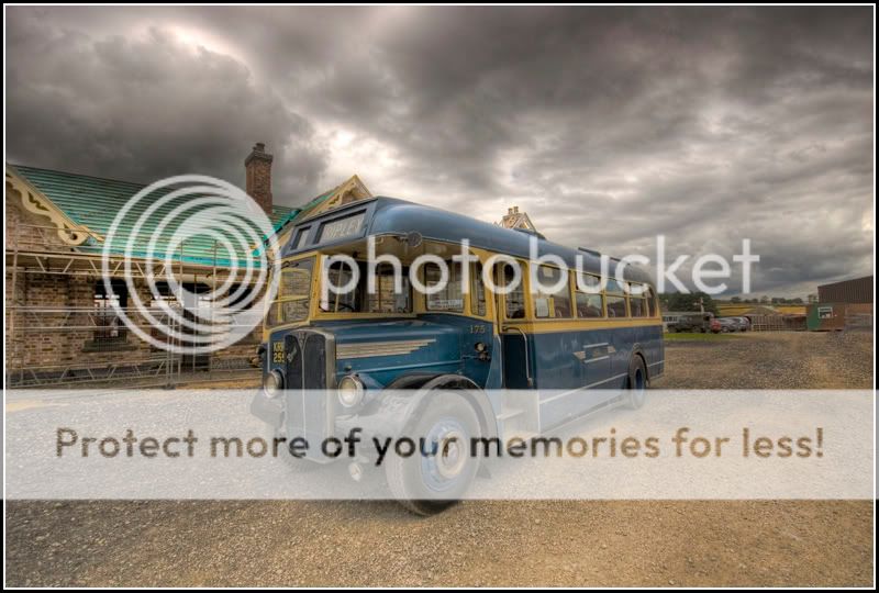
1) A bus (in hdr)

Bushdr.jpg


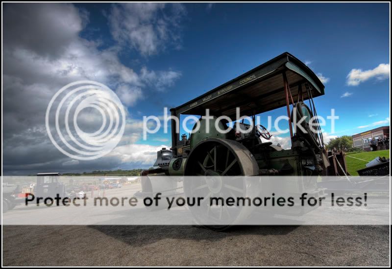
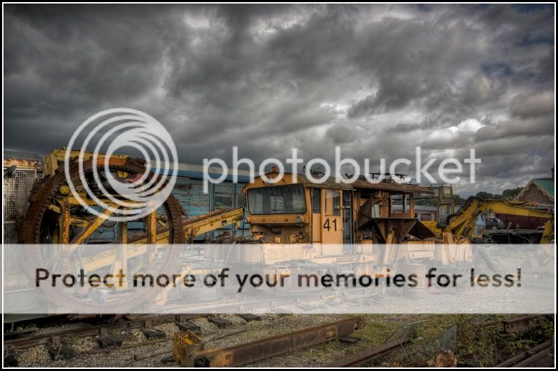
2) A steam roller (in hdr)

Tractionengine.jpg


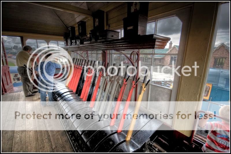
3) A signal box (in hdr)

Signalbox.jpg


4) A couple of smaller trains (in hdr)

Doubleheader.jpg


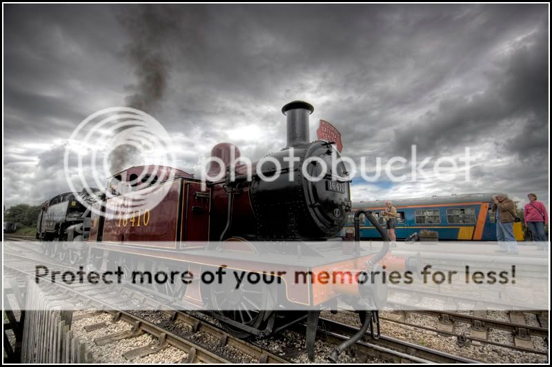
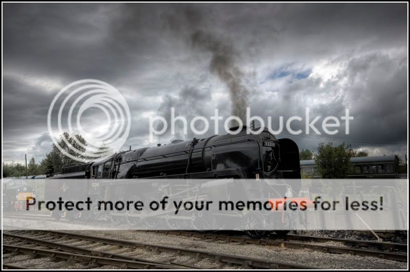
5) A bigger train (in hdr)

Insteam.jpg


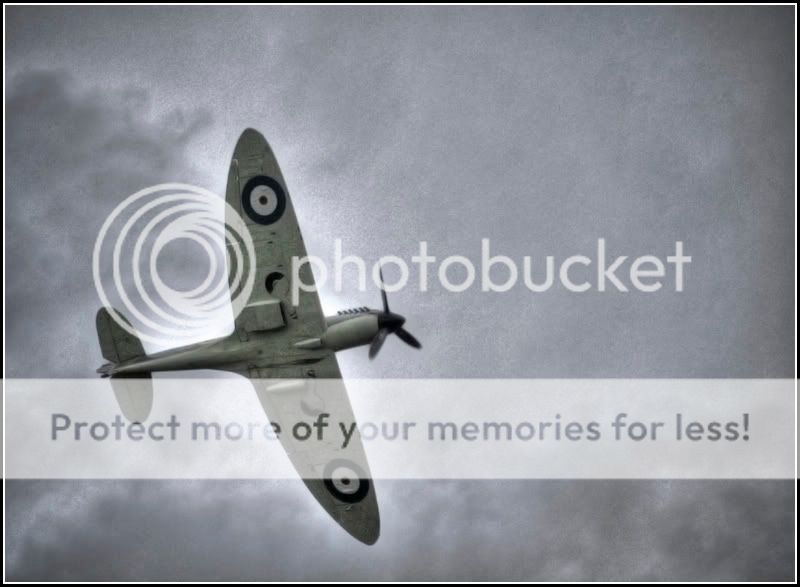
6) A spitfire did a bit of a fly by (in hdr)

Spitfirehdr.jpg


7) A shot i was gonna use for the comp (in hdr)

Trainstuffhdr2.jpg


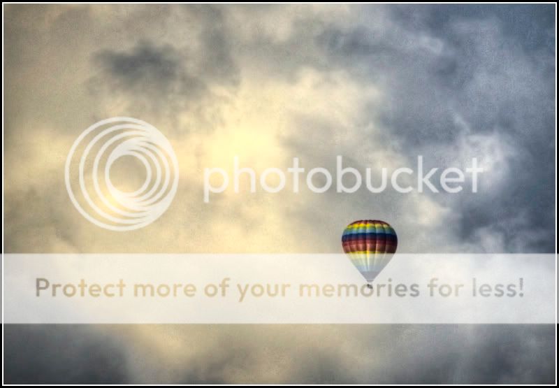
8) A lovely balloon (i think you'll already have guessed. In hdr)

Balloon.jpg


These where all taken on sunday the 24th of august and hopefully i've worked the hdr out of my system through overkill.
C&C is as always welcome, even if you just want to say you don't like them *** they're tonemapped.
Thanks for looking, Dave.
 
Last edited:
I've started dabbling in HDR, and I think the hot air balloon looks good with the redder sky, but most of the others could have just done with a colour saturation boost rather than full on tone mapping and contrasty-ness.
 
Some fantastic shots here :clap:

I know absolutely diddly squat about HDR but my first impression is that you've got quite a good grip on the whole thing. My favourite is No.3, i think there's some excellent tones and colours in that one and the subject is certainly interesting. I'd be tempted to crop Jasper and a little off the top to use the levers as a natural lead into the father and son though(?) Still a great set (y)
 
I really like #3 and #1 in that order :)
 
For me, there are a couple of shots here where the side effects of the processing has a louder voice than the shot itself. A few where I don't feel the process and added any value to what you started with and I've also been wondering if (in HDR) belongs in the shot title/credit at all anyway.

All of the above faded into nothing when I got to the balloon shot though. That's just spot on for me. Image and processing in total harmony. (y)(y)
 
1, 4, 5 and 7 are my favourites. For me thw balloon in no.10 needs to be bigger, filling more of the sky. There appears to be some blurring in the steam roller in no.2
 
FYI the bus is an AEC Regal ;)
Shame there was scaffolding going up.

I quite like this set :D and there is something about 7 i really like.. a great subject for the time of mood that the HDR gives it.
 
Number 7 is awsome.
 
Thanks for the comments everyone, i'll try to address the points made in the order they where posted.
Mikeszs: I deliberately de-saturated the shots, i just prefer them that way.

Benroy: I see what you mean about No3, he is rather misleading in the bottom corner their.

JPS: I don't like to make excuses for poor shots but when the spit came i still had the 10-20mm on and had to quickly swap to my longer lens and had to use auto as i've never done any aviation photography, that shot is the best i could do with what i had.

Kipax: I'm glad you like em, i'm also glad no-one has mentioned the amount of cloning i had to do on the right to remove three people.

dazzajl: I put hdr in the title as i felt there would probably be alot of comments about the fact that i'd over used the effect, it's more of a warning to people who don't like the effect. The balloon shot did come out pretty much exactly how i saw it in my minds eye at the time.

Nilagin: Unfortunately i was at full 200mm and i had have cropped it quite a bit too, though as i said above, that's what i was after.

Badgerbaiter: Err, you're right, i only noticed it this morning but in faffing about i've made i bit of a mess of that one. I'll re-upload it after the footy.

leon1p: Cheers for the clarification, i don't mean to seem ignorant but i have very little knowledge on most classic transport, my dad on the other hand could probably tell you the chassis number of it!

Matt & Dave: Cheers fellas!
 
Number 1 and 4 work well in HDR....I too have started experimenting with it...quite good on some photos, absolutely wrong on others!!
 
leon1p: Cheers for the clarification, i don't mean to seem ignorant but i have very little knowledge on most classic transport, my dad on the other hand could probably tell you the chassis number of it!

You won't wonder why I know what kind of bus it is then, Your dad sounds like my dad :LOL:

Also I hope you dont think I was being a know it all.. Just thought I'd tell you in case you ever needed to know for titling your image with a bit more info if you ever use your image elsewhere or someone asked you :D
 
Having spent 12 years working AB and TCB in a lever frame signalbox, number 3 must be my favourite just for the subject matter. I love the style of these as they remind me of the old painted jigsaw puzzles I was tomented by as a kid ... and still am.
 
OOOH, i like number one, has a vintage feel to it, very nostalgic!
:)
I perosnally think you have done a good job.
I actually made my first hdr last night; was a shocker! haha
:)
 
Really good shots. Love the steam roller with the sky like that, looks like its holding the clouds back.

I must say though that I don't like the spitfire or the balloon at all with the processing you've used.

Keep up with the HDR's :)
 
Love the images but not the HDR. I think they'd look far better with just the saturation bumped up and some warmth added to them.
 
Personally, I think HDR is something which if used on the right photo can make something really nice, these I dont think fit into that category and its just a load of photos run through HDR.

Like a lot of effects, including B&W, it needs the right shot for it to add anything.

Sorry!
 
Klmc: Thank you very much, it's a very nostalgic place, it's very rough around the edges and ramshackle but that's part of its charm.

Nilagin: I really should pay more attention to what i'm posting in the future.

Dal: Cheers! The more i look at the steam roller pic the more i like it. I wasn't 100% sure about posting the spitfire as it is a bit of a mess.

slideordie: As i said earlier, the de-saturated look is what i preferred and i do genuinely feel that the tonemapping gave the photos a greater depth.
 
Love the images but not the HDR. I think they'd look far better with just the saturation bumped up and some warmth added to them.


Totally in agreement there appear to be spome great shots here but they are spoiled by the HDR which is way over the top,I am not anti HDR per se but only where it is so obvious as in these images.
 
Personally, I think HDR is something which if used on the right photo can make something really nice, these I dont think fit into that category and its just a load of photos run through HDR.

Like a lot of effects, including B&W, it needs the right shot for it to add anything.

Sorry!

Agreed. Theres lots of standard tone mapping problems showing up. Varied areas of over/under-exposure. Lack of contrast too. They look like they've been taken right from Photomatix, which isn't the final step. You still need to do work in Photoshop.
 
Back
Top