- Messages
- 2,639
- Name
- Gareth
- Edit My Images
- Yes
Taken today around 4pm so sun not overhead but still pretty high. Not ideal but you have to work with what you've got.
Pentax K1 | D FA 24-70mm | Benro TMA38CL with GD3WH geared head | Benro Masters big stopper | Formatt Hitech Firecrest C-PL
Colour
 Monknash by Gareth Williams, on Flickr
Mono
 Monknash by Gareth Williams, on Flickr
Pentax K1 | D FA 24-70mm | Benro TMA38CL with GD3WH geared head | Benro Masters big stopper | Formatt Hitech Firecrest C-PL
Colour
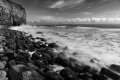
Monknash by Gareth Williams, on FlickrMono
Monknash by Gareth Williams, on Flickr