
- Messages
- 3,353
- Name
- Simon
- Edit My Images
- Yes
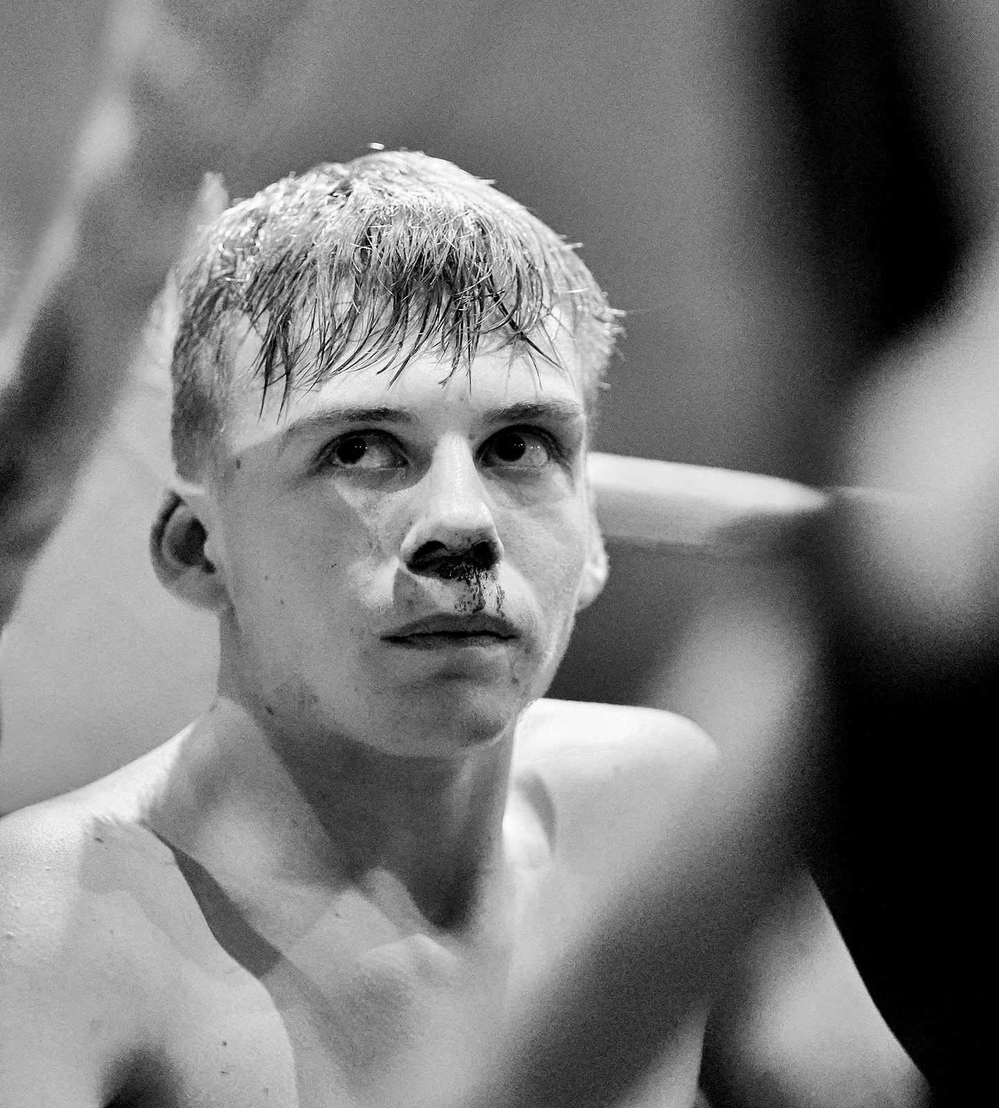
Had a great night shooting boxing with a Sony A9 and A9ii with 85mm F1.8 and 35mm F1.8 lenses. The wide standard lens for action and the short tele for the corner shots. Lighting was horrendous and while the shots looked fine in colour the mono looked better imo
 _A922817mono by Simon Wootton, on Flickr
 _A922306 by Simon Wootton, on Flickr
 _A9_9843 by Simon Wootton, on Flickr
 _A921304mono by Simon Wootton, on Flickr
 _A923817 by Simon Wootton, on Flickr
 _A927978 by Simon Wootton, on Flickr
_A922817mono by Simon Wootton, on Flickr_A922306 by Simon Wootton, on Flickr_A9_9843 by Simon Wootton, on Flickr_A921304mono by Simon Wootton, on Flickr_A923817 by Simon Wootton, on Flickr_A927978 by Simon Wootton, on Flickr


")