Mother/Daughter portrait critique please

Messages
211
Name
Sarah
Edit My Images
Yes
Hi my 7 year old loves to pose for the camera so I thought I'd take advantage and have a play with my new (to me!) D300s, with the 50mm 1.8

I usually use flash quite religiously but after ploughing through many online tutorials this weekend (mainly on photoshop which I have just invested in!) but also on lighting, I decided to try some portraits using just natural flash.

She also loves to take pictures so I let her take one of me which I have put on at the end!

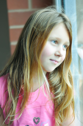
Although I like this one I think if I had focussed on her nearer eye the photo would have been technically better. I had it on the 'crosshair' focus (not sure what it's called!) and the focus dot kept moving around... How do I position it and get it not to move!? aaarrgh!

11799239693_7fa0c7fc22.jpg


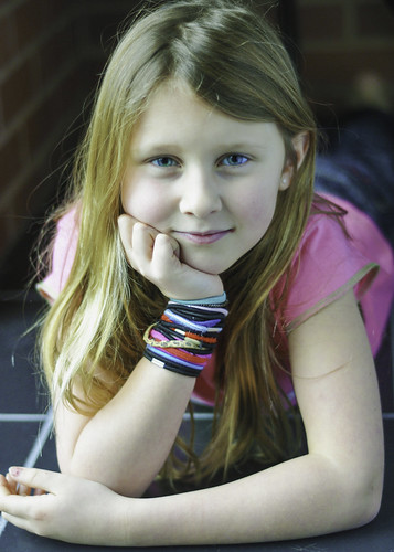
This one I love her eyes in and I upped saturation in PS to give it a bit more oompf...too vivid though? I'm not sure ...personal taste I guess!

11799232893_cf5e92e201.jpg


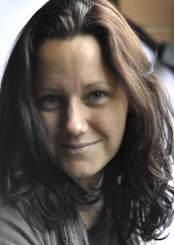
This is the one she took of me...I like it! Think I might have to watch she doesn't steal my camera!
11799632826_977f67b06e.jpg


Any constructive critique gratefully received!

Thanks a lot :)
 
I do like the first, 2nd the whites of the eyes are blue on my screen, maybe a bit tight in the frame, 3rd looks dark to me, only my opinion though
 
Hi Sarah. I like these photos too. Poses and light look good to me.Not sure how you managed to make the whites of her eyes blue too. On my screen your Daughters hair as a green/yellowy tint to it. You may have done this in pp for an effect you like or there again I could be just talking pants and thats just how it is :)

Gaz
 
All three suffer from their backgrounds which are distracting or intruding into the image but that aside i like them all.

1. Is a very nice pose & lighting, thoughtful looking, framing is ok but looks a bit wonky due to the brick mortar angle.
2. Really nice pose, lovely expression, detail and depth of field. The eyes on my calibrated monitor are a little overdone for me. One thing to note careful chopping body parts off, in this case her fingers.
3. You've got some competition behind the camera for sure! Your pose is excellent as is the eye contact, really nice. Lighting on this one is also great, looks really nice and natural.

:)
 
I think the pics are nice,
I would have used a wider aperture to give a much shallower dof, I think with a bit of decent post processing they would be made into much nicer images. The colour balance on number 2 looks wrong to me, I would have it much warmer. Number 3 looks a little dull and slightly underexposed, again easily fixable in post production. Do you use Lightroom? If not I would take a look at it. There's a whole load of great tutorials on slrlounge for Lightroom. Shoot raw images and learn how to post produce in Lightroom and you're going to get some great images for sure. Photoshop is great but it's more of an editing tool, for post production I would always use Lightroom, much easier and quicker IMO.
Keep it going, and try to use natural light as much as possible, it will make you a better photographer ;)
 
I do like the first, 2nd the whites of the eyes are blue on my screen, maybe a bit tight in the frame, 3rd looks dark to me, only my opinion though

Yes I agree about the tightness of the frame - I was squished right up next to her so as to avoid the snoozing cat ;)
 
Hi Sarah. I like these photos too. Poses and light look good to me.Not sure how you managed to make the whites of her eyes blue too. On my screen your Daughters hair as a green/yellowy tint to it. You may have done this in pp for an effect you like or there again I could be just talking pants and thats just how it is :)

Gaz

Haha well it's not greeny in real life, she hasn't yet entered that stage although no doubt we will battle it out at some point in about 7 years time!! :eek:
I'm not sure how I got the whites of her yes to have a blue tinge... I hadn't spotted it before it was mentioned here but now I see it!
All three suffer from their backgrounds which are distracting or intruding into the image but that aside i like them all.

1. Is a very nice pose & lighting, thoughtful looking, framing is ok but looks a bit wonky due to the brick mortar angle.
2. Really nice pose, lovely expression, detail and depth of field. The eyes on my calibrated monitor are a little overdone for me. One thing to note careful chopping body parts off, in this case her fingers.
3. You've got some competition behind the camera for sure! Your pose is excellent as is the eye contact, really nice. Lighting on this one is also great, looks really nice and natural.

:)

Hi Sharky - thanks for your comments... TBH I didn't even think about the background... was literally trying just playing around with the light coming in from the patio doors and testing using a reflector and it's effects as I haven't used one before! Good point about the wonkiness :rolleyes: impression...will watch out for that in the future... Ah yes the missing finger tips... slapped wrist, I blame the cat who plonked himself behind me which I didn't want to disturb so was limited in my movement and positioning!! (Excuses excuses) :naughty:
 
Back
Top