Critique My local!

Messages
3,307
Name
Nick
Edit My Images
Yes
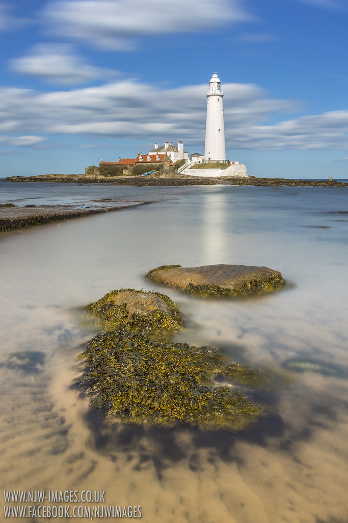
Popped down to St Marys Lighthouse a couple of days ago as the weather was great and the tide was pretty good for some seascapes.
Its best at high tide here but it had just turned and was about an hour below high tide so still reasonable!

Canon 6D & 24-105 F4L

1 - 58 seconds // F16 // 24mm // iso 50 // LEE 0.6HE // Hitech Firecrest 10 Stopper.


2 - 59 seconds // F16 // 32mm // iso 50 // LEE 0.6HE // Hitech Firecrest 10 Stopper.


Thanks for looking

Nick
 
Looks like the mediterranean sea.... I prefer the more muted blue tones in #2 but my is #1 a bright image.

Thanks for sharing your kit and settings very appreciated.
 
Cheers folks, I didn't hang around for the golden hour as it was a fleeting visit while my wife and daughter were at home napping (gotta get out while I can now lol) so I was only there for an hour or so, cheers for all the replies etc, I like #2 I deliberately processed #1 to be a bit brighter and more colourful as I don't usually make really contrasty colourful images and fancied a change lol :) might have another whirl at it and reduce the overall saturation :)
 
Very nice location. Images are oversaturated so look a bit unreal to me.

I feel the foreground in #1 doesn't work so well, and you could get something more dramatic/interesting by moving right to the edge of the submersed causeway and getting down really low, and having the causeway "arrowing" towards the lighthouse. The fact it's under water makes it even more interesting as you've got a nice long exposure there. The causeway therefore becomes your foreground, pointing towards the lighthouse which would be larger in the frame.

Something a bit like this:

Shoreham Sewage Outlet 4 by Tobers, on Flickr

For #2, I can see that you've put an interesting foreground into shot, which is good planning. But...the foreground "outcrops" are quite dominant, so while the lighthouse is your intended subject I keep getting distracted by the looming outcrops. I do like the "rays" coming out from the nearest outcrop thingy though - I'm sure there's something you could do with them.
 
A couple of very nice shots Nick, I don't have a fav' as I like them both very much.(y)

George.
 
I ike these Nick, I like the fact you haven't shot at golden hour or looked for the sunsetting behind, makes them a little different in my eyes.

love the strong blues and clear sea, yes poss a little oversaturated but I think it works well.
 
I like them both Andy, the first is a bit saurated but I like a bit of colour in seascapes and it contrasts well with the white of the lighthouse.

I have to say that I personally do not feel distracted by either of the foregrounds, for me they work really well in leading your eye into the lighthouse
 
A couple of nice ones there Nick

Another vote for number two - I like the composition and the foreground.

I prefer the more subtle colours in number 2 but you explained why you went a bit further in number 1 and that can easily be adjusted if you wanted to.

Looks like a great location although possibly a bit far for me.
 
In No 1 I find the lump of rock in the front centre distracting and I thought the shot would be to go closer but looking at the other photos on flickr as you get closer to the water you're going down quite a bit and the photo doesn't look as good. I think I would have cropped the rock out and moved the lighthouse to the right of the picture. The walkway still leads you into the picture and on to the lighthouse but there's not the distraction of the rock and sea to the right.

2nd photo is much more polished, my only criticism is I wish I'd taken it.

Both photos draw me in to the frame and make me want to roll up my trousers and walk over to the lighthouse.
 
Number 2 for me, really like the portrait orientation too. Nice choice of the foreground.

I would agree the blues are bit overcooked in number 1.
 
Yep another one for No2, and I can see why you had a play with No1.... Its nice to try something different now and again isn't it. I guess the answer you get is different depending on where you throw the question isn't it. If No1 was for a post card, its nice and punchy and saturated and it would probably take 1st place over 2.:)
Ask a bunch of Togs.....
So I guess we like subtle(y)
A nice pair, and I have no problems with the foreground in either. Wondering what that little widget is in the sea to the right of the lighthouse in No1?
Nice to have such a lovely location just on your doorstep Nick!
 
Wondering what that little widget is in the sea to the right of the lighthouse in No1?
Nice to have such a lovely location just on your doorstep Nick!

I'm very lucky to live near, its a great place to go!
The little bit to the right is a range finder the for battery guns that were at Tynemouth Priory a couple of miles down the coast!
 
I like both but I prerfer the composistion of number 1 as I like the way draws my eyes to the lighthouse.
 
Back
Top