Nailing Composition: Examples. Help Required.

EdinburghGary

Reply not Report
Messages
19,271
Name
Gary
Edit My Images
Yes
Guys,

Going to repost some images, but only wanting feedback on composition. I will provide my own comments, on why I *think* it works, but I need to know if I am making mistakes and I would love any advice, however small you may think it is. I will post a few images, and I invite you too to post images, with your thoughts on composition. I think, if we all chip in with examples and tips, we could learn lots.

Here are 3 that I felt worked in terms of composition. What would you change, and what errors have I made? Please be 100% honest, however harsh that may be. If these are crap compositions, tell me.

1
aminiadventure3small.jpg


Why I chose this composition. Bus stop shelter roughly on a third, bus stop post roughly on a third. The lamposts create a nice repeating pattern of verticals. THe sun is SLIGHTLY in the wrong place I feel, but is balanced nicely against the ground shine. The sky I feel has enough space to help open the image up a bit and give breathing space.

Am I way off???

2
2rdugs9.jpg


Why I chose this composition. Tower approximately on thirds, and I felt the diagonal shadows created nice lines. I liked the segmented feel given by having Dark Green, to Light Green, to Brown, to Sky, to Black. Almost like horizontal bands of colour (roughly).

3
forthrailbridge.jpg


Why I chose this composition. Obvious leading line of rocks, and the angle of the bridge I feel leads back through the image nicely. The lines are almost opposing but work IMO.


So there you have it. 3 I thought I had done well with. PLEASE, I beg you to be honest, and hold my feelings with no regard whatsoever. I am here first and foremost to learn.

Please post your own examples, and if you do, please share your thoughts on composition, and why you chose it.

I will make am effort from this day forward to explain why I chose a certain composition when posting photos.

Gary.

Looking forward to advice, and many more examples! :D

Gary.
 
Well, firstly nothing wrong with the quality of the pics. For composition, my opinions as follows:

1. Would like to see the sun very slightly more behind the shelter i.e. stand a little to the left. It would also be a much simpler, cleaner and more pleasing shot if the bus stop sign and bin wern't there or if the line of lights on the right was missed out. For me, there is just too much going on it that shot. Other than that, the proportion of sky is about right.

2. The tower just looks too small and doesn't have enough impact for me or give any real indication of the scale of it. I like the framing idea though which works well.

3. The lead in rocks are great and work very well, I just feel that the bridge then tails away titchy bit quickly, leaving too much of an empty void on the left.

Is this the sort of thing you're looking for. The above are just tweeks to shots which are still very good (and better than most of mine :lol:)
 
Personally, I am a REAL fan of your work, you are one of the people on here that inspire me to go out, but the top one is, while a nice shot, far from what I always perceive you to be capable of. I think the lamp posts could have been used leading into the image rather than out and I think the foreground is too prominent in the image (I still like the shot nonetheless). I think the second is a landscape with some trees blocking the view. The third I like the most, but I think if the leading rocks encorporated the Rule of thirds a bit more (at the start of the frame) it could have been improved, I also think there is a bit too much sky.
 
Thanks guys, exactly the responses I am looking for. It's only with complete honesty that anything will sink in for me :D Amazing what I miss in my own photos. Had not acknowledged the bin, OR that post in the field which I have just spotted!

Anyway, I am looking forward to seeing how this thread develops.

Gary.
 
im not good in this but 1 and 2 dont work for me at all....in 3....clone out bridge and crop bit on top and left :D
but its only me and me know nothing ;)
and i do really like colors in 3 but bridge spoils it for me :)
L.
 
Been flicking on into this thread several times tonight, so time to make a contribution - only my opinions you understand and I am no great photographer.

1 - compositionally it works for me, its probably about as photogenic as a bus shelter and a bin can ever look.

2 - hmmm...yes, it ticks all the normal rules for compostion, yet somehow...I can't really put my finger on it other than to say I feel it needed a few broken rules, will try and pin it down and come back to it.


3 -It has all the key ingredients, good light, foreground interest, lead in lines and the more elusive ingredients of mixing modern engineering with nature successfully, the rocky foreshore leading the eye into the bridge and in turn the bridge taking the eye to the distant horizon. I 'think' the only problem with this one is that the bridge and the foreground fight for supremecy as the focal point, however you sort of get two for the price of one here - chop bottom 2/5 off and you have a wall hanging 'panorama' that also works incredibly well and gives the bridge the upper hand.
 
I'm no expert at composition, so these are just opinions. :)

#1 I think the strong verticals together with the colours, are the strength of this shot. If I was being very picky I'd try cropping just a smidgeon off the top - just to reduce the amount of empty space in the left hand side of the sky.

#2 The tower, as someone else says, looks out of scale. The framing trees are quite dominant. If the reason for taking the photo was the tower then imo, it would look better larger and perhaps shooting slightly upwards from a lower angle to give it gravitas. If the reason was just for the general scene then I think I'd reduce the emphasis on the framing trees a little.

#3 I can't honestly make any suggestions - it looks fine to me :shrug:

btw - this is a great thread and one I shall certainly learn from. :)

Jean
 
#1: The only real crit I'd have on this one Gary is that I noticed the top of the right hand lamp post leads out of the frame of the shot; whereas it might have worked better if the whole lamp post was actually in shot - if you see what I mean?

#2: Again, just one observation. I too love the lines of colour, but I feel the image is overshadowed (sorry about the pun!!) by what I consider the heaviness of the trees and branches silhouette. The lines of colour are all level apart from that...?

#3: Well, the only crit of this image is that I envy you the D3 you own and took it with!! :)

John
 
im not good in this but 1 and 2 dont work for me at all....in 3....clone out bridge and crop bit on top and left :D
but its only me and me know nothing ;)
and i do really like colors in 3 but bridge spoils it for me :)
L.

Thanks for the feedback mate :D

I don't want to crop the bridge, as I feel it is the main, or one of the main focal points.

Gary.
 
Well, firstly nothing wrong with the quality of the pics. For composition, my opinions as follows:

1. Would like to see the sun very slightly more behind the shelter i.e. stand a little to the left. It would also be a much simpler, cleaner and more pleasing shot if the bus stop sign and bin wern't there or if the line of lights on the right was missed out. For me, there is just too much going on it that shot. Other than that, the proportion of sky is about right.

2. The tower just looks too small and doesn't have enough impact for me or give any real indication of the scale of it. I like the framing idea though which works well.

3. The lead in rocks are great and work very well, I just feel that the bridge then tails away titchy bit quickly, leaving too much of an empty void on the left.

Is this the sort of thing you're looking for. The above are just tweeks to shots which are still very good (and better than most of mine :lol:)


Thanks so much. All those verticals draw me to the first, buts its good to see alternative opinions.

2, this is where I really struggle. Seeing a lovely scenery, and translating it into a shot that works. I tried to capture the entire landscape, but as a result I have ignored I guess one of the main features of the scene, OR played it down too much.

3, I agree completely.

Gary.
 
Been flicking on into this thread several times tonight, so time to make a contribution - only my opinions you understand and I am no great photographer.

1 - compositionally it works for me, its probably about as photogenic as a bus shelter and a bin can ever look.

2 - hmmm...yes, it ticks all the normal rules for compostion, yet somehow...I can't really put my finger on it other than to say I feel it needed a few broken rules, will try and pin it down and come back to it.


3 -It has all the key ingredients, good light, foreground interest, lead in lines and the more elusive ingredients of mixing modern engineering with nature successfully, the rocky foreshore leading the eye into the bridge and in turn the bridge taking the eye to the distant horizon. I 'think' the only problem with this one is that the bridge and the foreground fight for supremecy as the focal point, however you sort of get two for the price of one here - chop bottom 2/5 off and you have a wall hanging 'panorama' that also works incredibly well and gives the bridge the upper hand.

Thanks YV :) Now, a small ship or so would have been fantastic in the left of the bridge frame, to balance it.

Gary.
 
I'm no expert at composition, so these are just opinions. :)

#1 I think the strong verticals together with the colours, are the strength of this shot. If I was being very picky I'd try cropping just a smidgeon off the top - just to reduce the amount of empty space in the left hand side of the sky.

#2 The tower, as someone else says, looks out of scale. The framing trees are quite dominant. If the reason for taking the photo was the tower then imo, it would look better larger and perhaps shooting slightly upwards from a lower angle to give it gravitas. If the reason was just for the general scene then I think I'd reduce the emphasis on the framing trees a little.

#3 I can't honestly make any suggestions - it looks fine to me :shrug:

btw - this is a great thread and one I shall certainly learn from. :)

Jean

Thanks Jean :D

I will go back and try 2 and see if I can put the advice to good use! :D

Gary.
 
#1: The only real crit I'd have on this one Gary is that I noticed the top of the right hand lamp post leads out of the frame of the shot; whereas it might have worked better if the whole lamp post was actually in shot - if you see what I mean?

#2: Again, just one observation. I too love the lines of colour, but I feel the image is overshadowed (sorry about the pun!!) by what I consider the heaviness of the trees and branches silhouette. The lines of colour are all level apart from that...?

#3: Well, the only crit of this image is that I envy you the D3 you own and took it with!! :)

John

Thanks :)

Your point in number 1 perplexed me at the time, and I tried to avoid. The trouble is, each time I got a full head in, I also had another post!!! It repeats. and one is not available without the other. I think I would need to move to left quite a lot to sort that issue.


2: Thanks, number 2 clearly needs revisiting. I still like it as it reminds me of one of my favourite places, in good light. But I do want to try and perfect any techniques.

3: It's lurvley :D

Gary.
 
3 -It has all the key ingredients, good light, foreground interest, lead in lines and the more elusive ingredients of mixing modern engineering with nature successfully, the rocky foreshore leading the eye into the bridge and in turn the bridge taking the eye to the distant horizon. I 'think' the only problem with this one is that the bridge and the foreground fight for supremecy as the focal point, however you sort of get two for the price of one here - chop bottom 2/5 off and you have a wall hanging 'panorama' that also works incredibly well and gives the bridge the upper hand.


I think the crop here would be great - you lose the brightest rocks but retain some interest from them and the bridge takes back the main focus.
 
I'd like to see this thread develop into a tutorial.

I'd also like to see more pictures analysed but I'll add my comments on your shots anyway..

First one looks fine as a composition. The one problem is I'm looking for a subject and end up looking at the bracket on the bottom glass panel. It needs a person in the shelter silhouetted or even a passing dog - just something to look at in its surroundings.

Second one has plenty of composition elements - tower on a third, areas of colour and arguably some lead in from the top left branches. Two things that spoil it are the lack of sharpness of the subject tower and the dominance of the foreground (above and below) that make you feel outside the scene looking in. It looks like a picture of some foreground with a soft out of focus background. Using trees etc as a frame rarely works.

Last one is a pleasing composition with its lead in lines carrying your eye. I've seen plenty of your long exposure shots that have been beautifully sharp to contrast the blurry water but this isn't one of them. Only the foreground rock looks sharp not the subject. getting a good composition is great but it is spoiled if you end up looking at the wrong thing because the subject is blurry.

And for the record I'm no expert and have tastes that influence how I comment but I have looked at a lot of landscape pictures :)
 
I'd like to see this thread develop into a tutorial.

I'd also like to see more pictures analysed but I'll add my comments on your shots anyway..

First one looks fine as a composition. The one problem is I'm looking for a subject and end up looking at the bracket on the bottom glass panel. It needs a person in the shelter silhouetted or even a passing dog - just something to look at in its surroundings.

Second one has plenty of composition elements - tower on a third, areas of colour and arguably some lead in from the top left branches. Two things that spoil it are the lack of sharpness of the subject tower and the dominance of the foreground (above and below) that make you feel outside the scene looking in. It looks like a picture of some foreground with a soft out of focus background. Using trees etc as a frame rarely works.

Last one is a pleasing composition with its lead in lines carrying your eye. I've seen plenty of your long exposure shots that have been beautifully sharp to contrast the blurry water but this isn't one of them. Only the foreground rock looks sharp not the subject. getting a good composition is great but it is spoiled if you end up looking at the wrong thing because the subject is blurry.

And for the record I'm no expert and have tastes that influence how I comment but I have looked at a lot of landscape pictures :)

Thanks Robert. I wonder what is causing my middle and back of scene to soften up. I always use a 2 second timer, followed by 1 second mirror lock up, and then the shutter fires, so it can't be mirror slap. It leaves Hyperfocal Issues (I don't understand how it works), or it is something else causing movement (less likely).

The bridge is perhaps easier to explain, as if I remember rightly, it is a 30 second exposure, so even every so slight movement or vibrations of the bridge I guess could cause issues?

Thanks for your comments, always give me food for thought and you are a realist :D

Gary.
 
I don't think the bridge was moving :)

Maybe try a normal exposure at the same time so you can see if the focus is right. 2 and 3 both look like the focal point was too close and not on the subject. We focus on a subject in a shot and if it is not sharp we don't know what to look at instead and the composition fails.
 
I don't think the bridge was moving :)

Maybe try a normal exposure at the same time so you can see if the focus is right. 2 and 3 both look like the focal point was too close and not on the subject. We focus on a subject in a shot and if it is not sharp we don't know what to look at instead and the composition fails.


How do I ensure foreground is sharp if I focus past it though? For example if I focused on the bridge, would the rocks have been in focus?

Gary.
 
If you have a definite subject it has to be sharp. You don't want the rocks sharp at the expense of the subject bridge. f11 f13 sort of area should get you a reasonable sharp foreground when focussed on the bridge.
 
If you have a definite subject it has to be sharp. You don't want the rocks sharp at the expense of the subject bridge. f11 f13 sort of area should get you a reasonable sharp foreground when focussed on the bridge.

Thanks Robert,

Will go back and put it into practice. What I currently do is focus in the thing closest to me in the frame, and step down to f22.

Gary.
 
Try different apertures out. Diffraction can make things soft at f22 though some lenses are fine at f22.
 
rosetot.jpg


Ok i've added it.

Now onto compositions

On this photo, this was the best angle to take this shot composition doesn't really apply here, I try to make this image more intresting by using colour, bokeh, DOF & a slight softening of the overall picture.
 
Thanks Robert,

Will go back and put it into practice. What I currently do is focus in the thing closest to me in the frame, and step down to f22.

Gary.

Gary, next time you take this shot try focusing at a point about 1/3 of the way into the picture, in this instance I would recommend making the furthest rock of the leading line of rocks. bear in mind though I am no expert on landscapes :D but I have seen and heard this advice on a number of occasions.

I also wouldn't get too hung up on the rules of composition, in my mind they are only a guide and I have seen many outstanding images (including some of yours) that don't follow the 'rules'.

In saying that here is one of mine which roughly follows the thirds rule:

Norfolk027ver3.jpg


This one almost does :D :

Sunset-moon057.jpg


On this one the boat shed is obviously on the third but nothing else is but it still works (imo):

Scottish-loch-1soft-focus-1.jpg
 
I meant to say, that shot of the bridge is the nuts and I would be more than happy if it was mine.
 
Composition is an area i always fall down on, as well as just about every other area in photography, so these are very much the thoughts of an amateur.
Gary, I love the first and third photos and find myself lingering to look at them, but the second one is not comfortable to look at. The scenery is not holding me and my eyes are wandering up to some rather boring trees.
I think Wilky's rose is beautiful but it feels too close to the top of the picture and my eye wanders down to the stem.
Hacker's pics i find beautiful and could sit and daydream in front of the last one for ages.
 
Here's a different way of thinking about your Forth Bridge photo, Gary....

Why have that ugly pile of rocks in the foreground? Yeah, I know all the stuff about lead-in lines, compositional balance, blah blah blah. But at the end of the day it's still an ugly pile of rocks that you wouldn't look at twice ordinarily, except perhaps to make sure you didn't trip or slip on them. They are completely unphotogenic and detract immeasurably from the beauty of the scene.

This is such a common issue with landscape photography. If you're using an ultra-wide lens, as so many people seem to like to do, then you have this huge DOF and huge foreground. So you have to find something - anything! - to put there, to "balance" the composition - though all too often the balance is only in a narrowly geometric sense, not in an aesthetic sense.

Don't ask me what the answer is though. I haven't a scooby.
 
On this one the boat shed is obviously on the third but nothing else is but it still works (imo):

Scottish-loch-1soft-focus-1.jpg

You know, Hacker, I've seen a lot of compositions on here (TP) that use reflections as a key part of the image and the vast majority have a fairly central "horizon". What's more, I think that it's totally appropriate in these cases - any other way tends to involve cropping out bits of the subject or it's refection :|.

If I had my way "The Rule of Thirds" would be renamed, "The Guideline of Thirds" :thumbs:.


Oh and Gary, #3 is a blinder mate :clap:.
 
Gary,

Your first image, I feel, is too busy. There are too many vertical "objects". If its any help, I think it would be better balanced without the bus stop sign. Giving the lamp posts a bit more breathing space on the rhs would improve it as well.

Despite being taken in very nice light, the second does nothing for me at all. It's a picture of a chimney in a field with some branches at the top!

I also feel that you have over-analysed the image. Technically it is quite competent in the terms you have set yourself, but otherwise......

Personally, I have never thought that a boring sky filled with branches actually works, either.

Number three has a very serene feel to it, which I love. The bridge is a fabulous piece of engineering and looks great in great light.

However, I also agree with StewartR that the rocks in the foreground look as if they have been placed there to fill the foreground up! The left hand side is empty and the image feels unbalanced.

I wonder if it would have been possible to exclude the rocks altogether, or try them on the lhs? Could you have used a longer focal length? Do you have any other images from this shoot? Sometimes, though, despite all the individual elements being right, as they seem to be here, its impossible to get that perfect picture.

If you have problems with front to rear sharpness, you do need to be able to use hyperfocal techniques. f22 is not always the answer although in this image it probably would be because your foreground is very close. You would need to focus further into the image.

jerry
 
Hi Gary,

Thanks for posting these and prompting an interesting discussion on composition. It's a great way to get people involved and we all learn something. :thumbs:

I won't pretend to be an expert on landscapes, but I'll answer from an aesthetic point of view.

1. I liked the composition, but as with some of the other commenters, felt that the bus stop sign detracted from the scene. It was a bit too dominant and draws the eye away from the other nice features and lines. Beautiful light though.

2. This didn't work for me. Yes, it's compositionally competent and ticks boxes but it lacks interest.

3. This is the "money shot". I'd be really happy if I captured an image like that. It's just pleasing to look at. Although I like the original composition, Yv's suggestion of cropping the bottom part of the image with the foreground rocks has a lot of merit too.
 
Gary! Helloo-oo!

Hi! :thumbs:

Hi Gary,

Thanks for posting these and prompting an interesting discussion on composition. It's a great way to get people involved and we all learn something. :thumbs:

I won't pretend to be an expert on landscapes, but I'll answer from an aesthetic point of view.

1. I liked the composition, but as with some of the other commenters, felt that the bus stop sign detracted from the scene. It was a bit too dominant and draws the eye away from the other nice features and lines. Beautiful light though.

2. This didn't work for me. Yes, it's compositionally competent and ticks boxes but it lacks interest.

3. This is the "money shot". I'd be really happy if I captured an image like that. It's just pleasing to look at. Although I like the original composition, Yv's suggestion of cropping the bottom part of the image with the foreground rocks has a lot of merit too.

Thanks,

Good to see a varied response to the shots, and interesting seeing the different view points. I liked the bus stop, and its opposite view to the lamposts, but similar shape. I can see how some see it as cluttered.

THe 2nd shot seems to have failed more considerably, and I am glad it has as it now has me questioning my composition technique even more.

Gary,

Your first image, I feel, is too busy. There are too many vertical "objects". If its any help, I think it would be better balanced without the bus stop sign. Giving the lamp posts a bit more breathing space on the rhs would improve it as well.

Despite being taken in very nice light, the second does nothing for me at all. It's a picture of a chimney in a field with some branches at the top!

I also feel that you have over-analysed the image. Technically it is quite competent in the terms you have set yourself, but otherwise......

Personally, I have never thought that a boring sky filled with branches actually works, either.

Number three has a very serene feel to it, which I love. The bridge is a fabulous piece of engineering and looks great in great light.

However, I also agree with StewartR that the rocks in the foreground look as if they have been placed there to fill the foreground up! The left hand side is empty and the image feels unbalanced.

I wonder if it would have been possible to exclude the rocks altogether, or try them on the lhs? Could you have used a longer focal length? Do you have any other images from this shoot? Sometimes, though, despite all the individual elements being right, as they seem to be here, its impossible to get that perfect picture.

If you have problems with front to rear sharpness, you do need to be able to use hyperfocal techniques. f22 is not always the answer although in this image it probably would be because your foreground is very close. You would need to focus further into the image.

jerry

Thanks for taking the time, very in depth. I actually picked the rocks out due to the golden light hitting them, and wanted them to be a major feature of the image. I have several of the lone bridge in nice light, I think this though, is better balanced than all others I have.

With regards to rear sharpness, I am not yet satisfied that I understand focusing correctly in the field. That's for a separate thread I guess - and something I may bring up later.

There have been lots of threads here on TP about focussing for landscapes. Here's one.

Thanks dude.

You know, Hacker, I've seen a lot of compositions on here (TP) that use reflections as a key part of the image and the vast majority have a fairly central "horizon". What's more, I think that it's totally appropriate in these cases - any other way tends to involve cropping out bits of the subject or it's refection :|.

If I had my way "The Rule of Thirds" would be renamed, "The Guideline of Thirds" :thumbs:.


Oh and Gary, #3 is a blinder mate :clap:.

Thank you :)

Here's a different way of thinking about your Forth Bridge photo, Gary....

Why have that ugly pile of rocks in the foreground? Yeah, I know all the stuff about lead-in lines, compositional balance, blah blah blah. But at the end of the day it's still an ugly pile of rocks that you wouldn't look at twice ordinarily, except perhaps to make sure you didn't trip or slip on them. They are completely unphotogenic and detract immeasurably from the beauty of the scene.

This is such a common issue with landscape photography. If you're using an ultra-wide lens, as so many people seem to like to do, then you have this huge DOF and huge foreground. So you have to find something - anything! - to put there, to "balance" the composition - though all too often the balance is only in a narrowly geometric sense, not in an aesthetic sense.

Don't ask me what the answer is though. I haven't a scooby.

I understand that having rocks for the sake of having rocks, is daft. I wanted two things with these rocks though. I wanted the golden light on them, and the slow motion of water brushing aside them. I have lots from this area with no foreground interest, and I feel this image is nicer (although others may think the opposite).

Composition is an area i always fall down on, as well as just about every other area in photography, so these are very much the thoughts of an amateur.
Gary, I love the first and third photos and find myself lingering to look at them, but the second one is not comfortable to look at. The scenery is not holding me and my eyes are wandering up to some rather boring trees.
I think Wilky's rose is beautiful but it feels too close to the top of the picture and my eye wanders down to the stem.
Hacker's pics i find beautiful and could sit and daydream in front of the last one for ages.

Thanks for taking the time, indeed hacker has posted awesome shots. That git is too talented :D

I meant to say, that shot of the bridge is the nuts and I would be more than happy if it was mine.

:D

Gary, next time you take this shot try focusing at a point about 1/3 of the way into the picture, in this instance I would recommend making the furthest rock of the leading line of rocks. bear in mind though I am no expert on landscapes :D but I have seen and heard this advice on a number of occasions.

I also wouldn't get too hung up on the rules of composition, in my mind they are only a guide and I have seen many outstanding images (including some of yours) that don't follow the 'rules'.

In saying that here is one of mine which roughly follows the thirds rule:


This one almost does :


On this one the boat shed is obviously on the third but nothing else is but it still works (imo):

Ok i've added it.

Now onto compositions

On this photo, this was the best angle to take this shot composition doesn't really apply here, I try to make this image more intresting by using colour, bokeh, DOF & a slight softening of the overall picture.

Lovely shot too mate. Thanks for all the advice.

Try different apertures out. Diffraction can make things soft at f22 though some lenses are fine at f22.

I am looking into this issue I have more, I think I will print some hyperfocal charts for my lenses.

Cheers everyone!

Can someone else post some images with a view to discussing composition? Lots to learn! :D

Gary.
 
Can someone else post some images with a view to discussing composition? Lots to learn! :D

Gary.

Ok Gary, one from me


"Yew Tree Bottom in the Mist"

I kid you not - the area is called Yew Tree Bottom. :D

DSC_3917LR.jpg


I'm rubbish at criting my own stuff - so I'd love comments - especially about composition since that's the focus (sorry!!) of the thread - but anything else that strikes you is fine, too.

Jean
 
I have to say Gary that I'm always impressed with your work, ant the picture of the bridge is outstanding.

I always struggle with landscapes, so here's a few of mine that I'd like some comment on, as I get very frustrated with composition....

These were all taken on vacation a couple of years ago, while on a cruise.

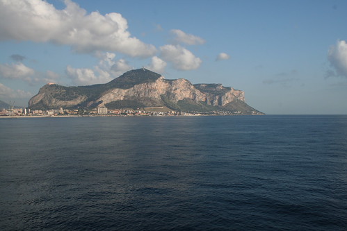
No: 1 - Approach to Sicily:

2573223820_a437a166b5.jpg


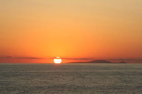
No 2 - Island in the sun

2573217758_f778e7b683.jpg


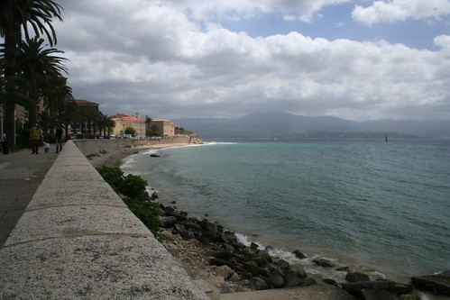
No 3 - Esplanade

2572387913_83aa7389c8.jpg


Larger copies are available on my Flickr here:

Any comments, hints or tips wouldn't go a miss :thumbs:

Steve
 
Back
Top