Heya.
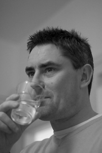
OK, I'm going to use the second image as an example, because you've done a good job on the lighting.
First, the reason the second image is strongest in terms of lighting is because of the lighting direction. See the catchlights in the eyes? They're present in both eyes and near the top of the eye, which means you have a light source illuminating the important part of the face. The shadows are falling toward the back of the face and slightly downward, which means the mask of the face is highlighted. That's just right for a flattering portrait.
I can tell by the small size and "hardness" of the catchlights that there is a single light source, and it is either small or relatively far away. Still, because the direction of the light is good, the slightly hard light is fine.
What you're lacking in this shot is midtones. You've got great modeling shadows given dimension to the face, but they're not terribly effective because they're so very light. I've pulled down (darkened) the midtones while leaving everything else basically alone. See how the image changes?
(A slight disclaimer: all monitors are different, so this image may appear too dark to some people. Adjust the midtones to your personal taste and monitor; the important thing is to see the major difference between the first and second images.)
Make sense?
- CJ