Hey everyone, sorry but it's yet another 'my first website' thread!
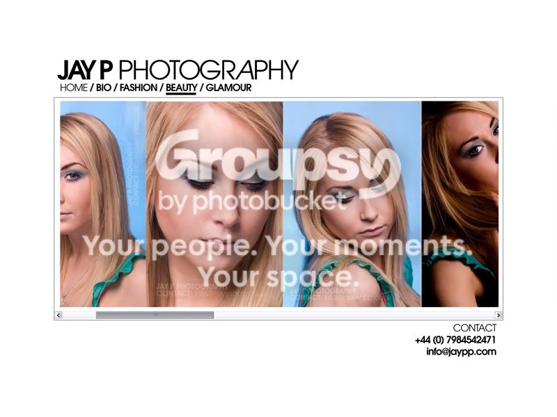
I just wanted to get you thoughts and opinions on what you think of a web design i've just been messing around with for the last hour.
It's actually for a brief set by my Uni, 'Self Negotiated Brief' where we need to set ourself a brief, I chose to design a website for photography, as that is also something I would like to get into.
I'm going for a sort of classy, sophisticated, elegant feel to the website. My photos dont necessarily represent that sort of style yet, but that is what i'm eventually going for.
I will be having a Home, About/Bio, and Portfolio links. I am also considering linking to my Flickr as that'll have a wider range of shots, this website is mainly to use as a portfolio.
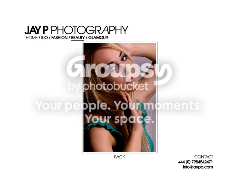
Here are two images, which show the theme of the site and a potential gallery look.
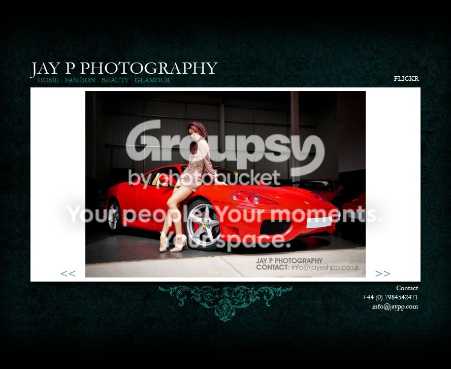
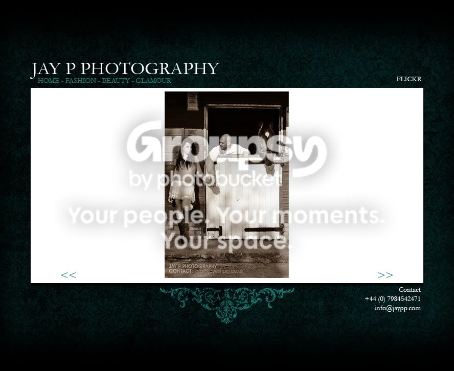
The typeface isn't final, neither are the << >>, just temporary until I can conjure up something decent. Ignore the watermark on the actual image as that is going to change too.
Let me know what you HONESTLY think! Whether you like some aspects, or whether you would prefer to :bonk: hit me on the head with a mallet!
Jay
I just wanted to get you thoughts and opinions on what you think of a web design i've just been messing around with for the last hour.
It's actually for a brief set by my Uni, 'Self Negotiated Brief' where we need to set ourself a brief, I chose to design a website for photography, as that is also something I would like to get into.
I'm going for a sort of classy, sophisticated, elegant feel to the website. My photos dont necessarily represent that sort of style yet, but that is what i'm eventually going for.
I will be having a Home, About/Bio, and Portfolio links. I am also considering linking to my Flickr as that'll have a wider range of shots, this website is mainly to use as a portfolio.
Here are two images, which show the theme of the site and a potential gallery look.
The typeface isn't final, neither are the << >>, just temporary until I can conjure up something decent. Ignore the watermark on the actual image as that is going to change too.
Let me know what you HONESTLY think! Whether you like some aspects, or whether you would prefer to :bonk: hit me on the head with a mallet!
Jay