Definately B&W for me.
I'll reiterate my thoughts on the when a B&W shot should be B&W or colour.
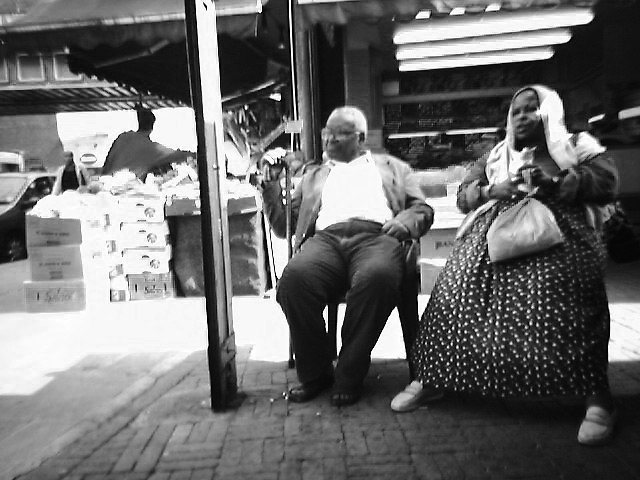
A shot should be in B&W when the colour of an image is distracting to the main 'story' or purpose of the shot.
In this shot, you are trying to portray a couple of elderly (and most probably knackered) shoppers, sat down looking like theyre having a well needed rest.
In the B&W I'm intrigued to look at their faces, look at their surroundings, and to explore the image.
The colour version, I'm just visually assaulted by that cardigan, that skirt, the shopping bag, and those trousers.
My eyes get slapped about the image, then come to rest on that hideous pattern, all dazed and confused
")
So the B&W it is for me.