

- Messages
- 1,899
- Edit My Images
- Yes
When i first went out with my tripod a few weeks back i managed to get a shot of Tower bridge with the Olympic sign up.
At the time i was really happy with it, being my first real night time shot i still am, but the more i look at it the less i like it and the more faults i can find with it.
Last night i was out again and gave it another go. This time i used my ND filter for the first time.
At the moment im happier with it i think? One reason being the Olympic sign was lit this time.
Its a little dark for my liking though and im not sure why it has come out so dark. The tide was out too, that was disappointing.
Anyway, here they are. Id love some feed back on these and tips on where ive gone wrong.
1st attempt
Tower Bridge by TS446Photo, on Flickr
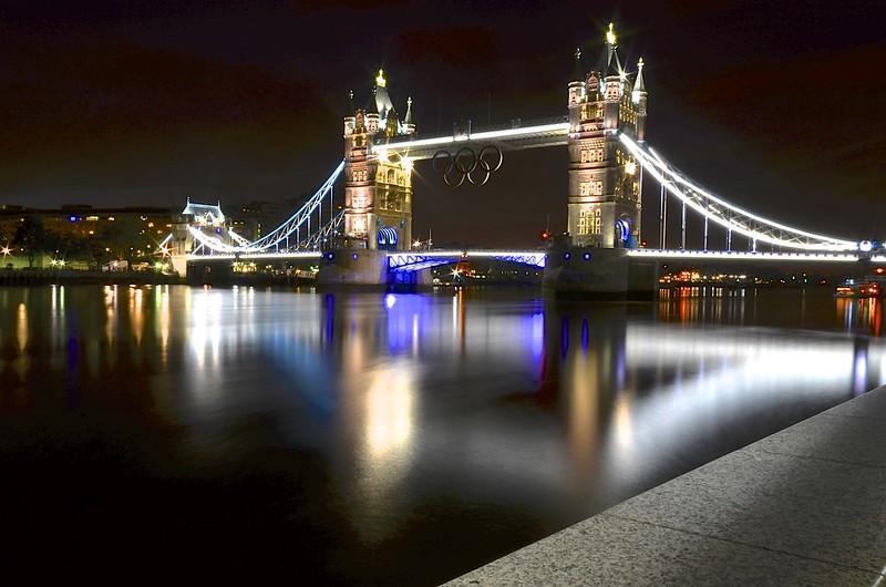
2nd attempt

Olympic Tower Bridge by TS446Photo, on Flickr
Thanks for looking
At the time i was really happy with it, being my first real night time shot i still am, but the more i look at it the less i like it and the more faults i can find with it.
Last night i was out again and gave it another go. This time i used my ND filter for the first time.
At the moment im happier with it i think? One reason being the Olympic sign was lit this time.
Its a little dark for my liking though and im not sure why it has come out so dark. The tide was out too, that was disappointing.
Anyway, here they are. Id love some feed back on these and tips on where ive gone wrong.
1st attempt
Tower Bridge by TS446Photo, on Flickr
2nd attempt
Olympic Tower Bridge by TS446Photo, on Flickr
Thanks for looking

")

