

- Messages
- 3,175
- Edit My Images
- Yes
After asking for advice on the good TP forum, i've had great fun photographing Paris.
Went to Eiffel tower and Tour Montmartre on two nights when I was free, to be able to capture a lot of sunset shots and night time views. Then went to Sacre Coeur, the Catacombes, and finally Louvre. Unfortunately had to hurry back on Saturday evening.
After a week of post processing bits when I'm free, I've finally picked my favourites. Now hoping for some constructive criticism.
1.

Paris by wuyanxu, on Flickr
2.

Fancy lamp post by wuyanxu, on Flickr
3.

Sunset over Paris by wuyanxu, on Flickr
4.
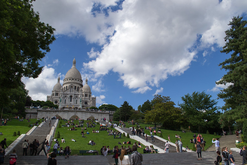
Sacré Cur by wuyanxu, on Flickr
5.

Bones and skulls by wuyanxu, on Flickr
6.
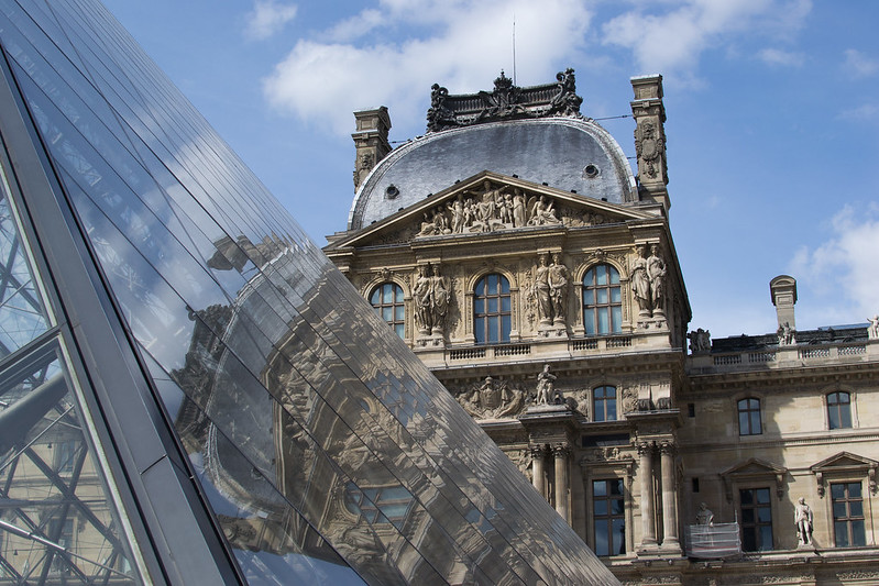
Louve, old and new by wuyanxu, on Flickr
More in this flickr set.
Comments and constructive criticism are very welcome.
thanks for viewing.
Went to Eiffel tower and Tour Montmartre on two nights when I was free, to be able to capture a lot of sunset shots and night time views. Then went to Sacre Coeur, the Catacombes, and finally Louvre. Unfortunately had to hurry back on Saturday evening.
After a week of post processing bits when I'm free, I've finally picked my favourites. Now hoping for some constructive criticism.
1.
Paris by wuyanxu, on Flickr
2.
Fancy lamp post by wuyanxu, on Flickr
3.
Sunset over Paris by wuyanxu, on Flickr
4.
Sacré Cur by wuyanxu, on Flickr
5.
Bones and skulls by wuyanxu, on Flickr
6.
Louve, old and new by wuyanxu, on Flickr
More in this flickr set.
Comments and constructive criticism are very welcome.
thanks for viewing.


