

- Messages
- 50
- Name
- greig
- Edit My Images
- Yes
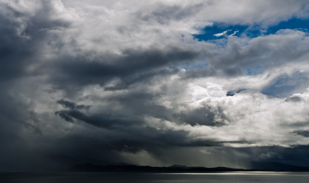
Welcome thoughts on this shot of storm passing over Skye.
View is from South Skye back to mainland
 Passing Storm (2014 WK35) by 13 Monkeys, on Flickr
View is from South Skye back to mainland
Passing Storm (2014 WK35) by 13 Monkeys, on Flickr")