Perfect exposures...

Messages
2,835
Name
Richard
Edit My Images
Yes
How do people get images to really pop with colour and brightness.

Take this image for example,

photography_by_zackarias_27.jpg


photography_by_zackarias_02.jpg


Its from http://www.zarias.com

I guess its just extensive experience!
 
Exquisite lighting technique.
The first clearly has off camera flash and I'd be surprised if the 2nd doesn't, looking at how harsh the sun is on the womans back.
White balance is right, but surprisingly left the sky a little green in the first, but I can't help but think that was intentional as he's done such a good job.
 
So many pictures I see are just so bright and colourful but I feel mine are just crappy
I guess I find it hard to expose for dark and light at the same time.
 
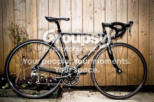
I think cyclone is right, the man is using flash. Here's two snapshots of my bike taken within seconds of each other, one with flash the other without. You should be able to tell which is which. One sparkles, the other is flat and dull. It's surprising what flash can do even outside in daylight. Not making any claims about the quality of shot by the way.

#1

showphoto.php
[/url][/IMG]

#2

showphoto.php
[/url][/IMG]
 
first is good flash, second is ambient I reckon from the rest of the shot - thinking light was behind the subject

oh and zack has mad skills :D
 
But in the second there is a shadow from his hand on the machine thing, Id say 2 probably had a reflector used?

looks like it to me as well (or a diffused flash) - the light's coming from two directions. simple shot, i think the differing colours add to the pop (lovely blues, green, gold, white, rust..)

its just experience, technique and knowing how to light a scene and where to place the models.
 
Off camera flash (definitely in first, and I find it hard to believe there is no flash or reflector used in second one) and post processing in my opinion.
 
Without flash is it better to overexpose and then fix?

I just seem to keep blowing out all the highlights. cant seem to make an image have the punch I want.

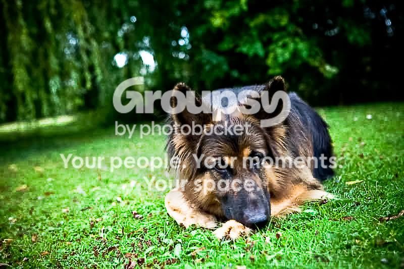
Took this one of the dog but I still dont think its right at all.

IMG_2777.jpg
 
I think the other way around, slightly underexpose for the background then light up your subject to make them pop.
That's what's going in in he first pic anyway, have a look at Jason Cole's posts on here.
 
I guess im more interested in using natural light to start with. I dont think my examples were that good in showing what im after
 
In the first photo it looks to me like the sky was been deliberately under exposed with the foreground lit by off camera flash or reflectors. Bringing down the luminance of the blue channel in lightroom is an easy way of getting a similar effect.
 
Without flash is it better to overexpose and then fix?

I just seem to keep blowing out all the highlights. cant seem to make an image have the punch I want.

Took this one of the dog but I still dont think its right at all.

This lacks punch to me because the DoF is too narrow. There's not enough of interest that's sharp and catches the eye. That and it looks like a fairly overcast day, direct sunlight would definitely give it more pop.
 
Without flash is it better to overexpose and then fix?

I just seem to keep blowing out all the highlights. cant seem to make an image have the punch I want.

Took this one of the dog but I still dont think its right at all.

It looks to me like you have very flat lighting, with no contrast on the dog - where are the shadows? Lack of contrast leads to a lack of punch and an apparent lack of sharpness as well. For living things it is always good to have a sparkle in the eyes as well. Given the circumstances your exposure looks good to me. Who cares about the small blown areas in the backgroun? They do not add anything to the scene and are not important. Just clone over them.

If you want punch then you need punchy lighting and good contrast. A good exposure, with low ISO, helps, but the quality of the light is what counts.

Shoot in flat light and you get flat looking photos....

20090421_150247_6974_LR.jpg


Put some life into your lighting (just sunlight) and things begin to pop....

20090420_160200_6933_LR.jpg


Both examples are without edits.

I had a bit of a tinker with your image, to lose the distracting highlights, make the dog more of a feature, warm up the colour balance and add some contrast to the dog. I also strengthened the catchlights in the eyes, but rather crudely, I'm afraid. If the light is poor there is only so much you can do at the point of capture. The rest you sort out in your magic room.

20090805_120043_2777_LR.jpg
 
It looks to me like you have very flat lighting, with no contrast on the dog - where are the shadows? Lack of contrast leads to a lack of punch and an apparent lack of sharpness as well. For living things it is always good to have a sparkle in the eyes as well. Given the circumstances your exposure looks good to me. Who cares about the small blown areas in the backgroun? They do not add anything to the scene and are not important. Just clone over them.

If you want punch then you need punchy lighting and good contrast. A good exposure, with low ISO, helps, but the quality of the light is what counts.

Shoot in flat light and you get flat looking photos....

20090421_150247_6974_LR.jpg


Put some life into your lighting (just sunlight) and things begin to pop....

20090420_160200_6933_LR.jpg


Both examples are without edits.

Good examples Tim, I guess my thinking was that shoot in the shame so there are soft shadows, I think I have taken that too far.
 
Good examples Tim, I guess my thinking was that shoot in the shame so there are soft shadows, I think I have taken that too far.

Shade works well for people, because it allows them to relax their faces and not squint, plus it does avoid ugly shadows. With furry and feathered creatures my opinion is that the rules are a bit different. The shadows seem to matter far less, they tend not to squint, and contrasty light emphasises details in feathers and fur.

This pigeon is being zapped by full sunshine and isn't even blinking. I don't think the shadows are an issue either. At this size it doesn't look really "popping" but there is bags of detail there and good contrast. This is unedited. Sorry about the composition; this was just a test shot.

20090803_174807_1389_LR.jpg


100% crop....
20090803_174807_1389_Neat_LR.jpg


Note how microshadows between the feathers help emphasise the details and thus enhance the illusion of sharpness. In flat/soft lighting those shadows would disapear and the details would merge together making the image look soft and lacking clarity and punch.
 
img2777edit2.jpg


Reduced exposure by half a stop. Color temp 5500K to counteract shade i.e. cooler, to look "warmer". Contrast mask applied, for Tim's amusement. ;)
 
Pictures that pop have great light, and tend to have lots of bright and contrasting colours - like yellow, light blue, pink, light green. These are all about one third of the spectrum, whereas solid red, blue and green are much darker, being two thirds of the spectrum each.

I don't think there is any great secret to it, just bright, clean, bold colours and the light to show them off.
 
they both use off camera flash and lots of it. In the first shot he has deliberately under exposed the sky and used a lot of power and probably a very large soft box to perfectly expose the subject. The second he has more than likely used the same setup but simply as fill otherwise his face would be in shadow the same as woman sitting behind. The soft box is down low to camera right just enough to avoid apearing in the reflection and to cause a shadow of his hand on the tshirt.
 

How did you add the contrast and sharpen that? I always find it very difficult to get normal daylight shots to look sharp and punchy too.

When I use curves I make a broad 'S' shape, but the problem with that is the blacks then become too black and all the shadow merges in to one, do it less and it doesn't have contrast. I've also tried the unsharpen trick, and it works a bit better, but I still don't get the "punch".:thinking:
 
How did you add the contrast and sharpen that? I always find it very difficult to get normal daylight shots to look sharp and punchy too.

When I use curves I make a broad 'S' shape, but the problem with that is the blacks then become too black and all the shadow merges in to one, do it less and it doesn't have contrast. I've also tried the unsharpen trick, and it works a bit better, but I still don't get the "punch".:thinking:

To be honest (and using the Alsatian as an example again
as its a gorgeous looking dog )
I get into all sorts of crap with "curves"
preferring to use (CS3) shadows and highlights and "match colour" for a bit more luminance.
USM I find is the best sharpening tool radius 1Px, threshold 0%,
and amount "to suit your needs"


copy_IMG_2777.jpg
 
How did you add the contrast and sharpen that? I always find it very difficult to get normal daylight shots to look sharp and punchy too.
I made my changes in Lightroom, but having deleted the file I no long have the history of edits. What I can say is that I never use the curves tool. I always use exposure/recovery/fill/blacks as necessary and sometimes brightness/contrast too. I may have thrown in some clarity as well, and possibly a little vibrance. For this shot I think I added some localised sharpening to the dog and some localised softening to the background. I also made a hue adjustment to make the grass a bit less green and slide it towards yellow a little. Oh, and probably the first thing I did was to warm it up with a WB tweak. Obviously I cropped a lot tighter to remove the distractions in the background and make more of a feature of the dog, creating more of a "portrait" feel to it rather than simply a dog in the park type thing.

Since I can't remember exactly what I did, I had another go from scratch.....

Original, with crop applied...
20090805_120043_2777_LR.jpg


Adjusted version as now with new edits(left), and previously as included earlier(right)....
20090805_120043_2777_LR.jpg


The grass is looking better in this newer version. I should have cloned out that bright bit top right, but never mind.

Adjustment history (read from the bottom, up)....
20090807_083533_33_LR.jpg


The dust spot adjustments were simply an attempt to brighten the catchlights in the eyes.

HTH,
Tim.

 
You don't need off camera flash... I'm not trying to say i've got any technique down to a T but this is with a flash attached to the camera makes a hell of a difference when it comes to blowing out skies, a bit of simple pp aswell.
3712027845_ff88f178d1_b.jpg
 
To be honest (and using the Alsatian as an example again
as its a gorgeous looking dog )
I get into all sorts of crap with "curves"
preferring to use (CS3) shadows and highlights and "match colour" for a bit more luminance.
USM I find is the best sharpening tool radius 1Px, threshold 0%,
and amount "to suit your needs"


copy_IMG_2777.jpg

I made my changes in Lightroom, but having deleted the file I no long have the history of edits. What I can say is that I never use the curves tool. I always use exposure/recovery/fill/blacks as necessary and sometimes brightness/contrast too. I may have thrown in some clarity as well, and possibly a little vibrance. For this shot I think I added some localised sharpening to the dog and some localised softening to the background. I also made a hue adjustment to make the grass a bit less green and slide it towards yellow a little. Oh, and probably the first thing I did was to warm it up with a WB tweak. Obviously I cropped a lot tighter to remove the distractions in the background and make more of a feature of the dog, creating more of a "portrait" feel to it rather than simply a dog in the park type thing.

Since I can't remember exactly what I did, I had another go from scratch.....

Original, with crop applied...
20090805_120043_2777_LR.jpg


Adjusted version as now with new edits(left), and previously as included earlier(right)....
20090805_120043_2777_LR.jpg


The grass is looking better in this newer version. I should have cloned out that bright bit top right, but never mind.

Adjustment history (read from the bottom, up)....
The dust spot adjustments were simply an attempt to brighten the catchlights in the eyes.

HTH,
Tim.

Thanks for the tips. I'll have to have a go at those when I next edit a photo.:thumbs:
 
couldnt resist having a go, no other point lol
IMG_2777-1.jpg
 
And I just wanted to have a stab at it too. It is a good photo, but needs photoshop work to bring out the best in it - like most pictures really.

 
thats nice, i like mine but prefer yours, still new to this editing stuff, had another go and this probably about the best i can manage at the moment though ive used yours for inspiration really.the blacks needed to come up a bit didnt they to get more contrast.
have i overdone it now?
IMG_2777-3.jpg

had a go at the bike too, hope the pic owner doesnt mind. losing a lot of detail with small file though.
DSC_6926.jpg
 
Back
Top