

- Messages
- 514
- Name
- Tony
- Edit My Images
- No
As a matter of interest, why do you think you need your domain suffix/extension in the logo?Better?


As a matter of interest, why do you think you need your domain suffix/extension in the logo?Better?
As a matter of interest, why do you think you need your domain suffix/extension in the logo?
Can't go wrong with Comic Sans.
No. It's still got the camera. The font's too 'skinny and the JJA being bold makes it look as if it's separate from the photo.co.uk
IMO
Hmmm... I'd lose it. It serves no purpose unless I'm missing something specific to what you do/need, and it's quite contraining in terms of logo design.I'm not really sure TBH. Habit more than anything I guess.
Tough crowd!
All good, interesting stuff.
Always good to find out how others see a design. Although it can become a case of too many cooks.Tough crowd!
All good, interesting stuff.
")
MUCH better without the unnecessary text. Bit of a conundrum for me, though, as the original font works better with the camera but I like the look of the last font the most. Perhaps worth trying to separate it more from the camera image and just nudge it up a tad (or bring the font down a bit - just prevent it appearing to be misaligned with the image).Who knew choosing a font was so much fun
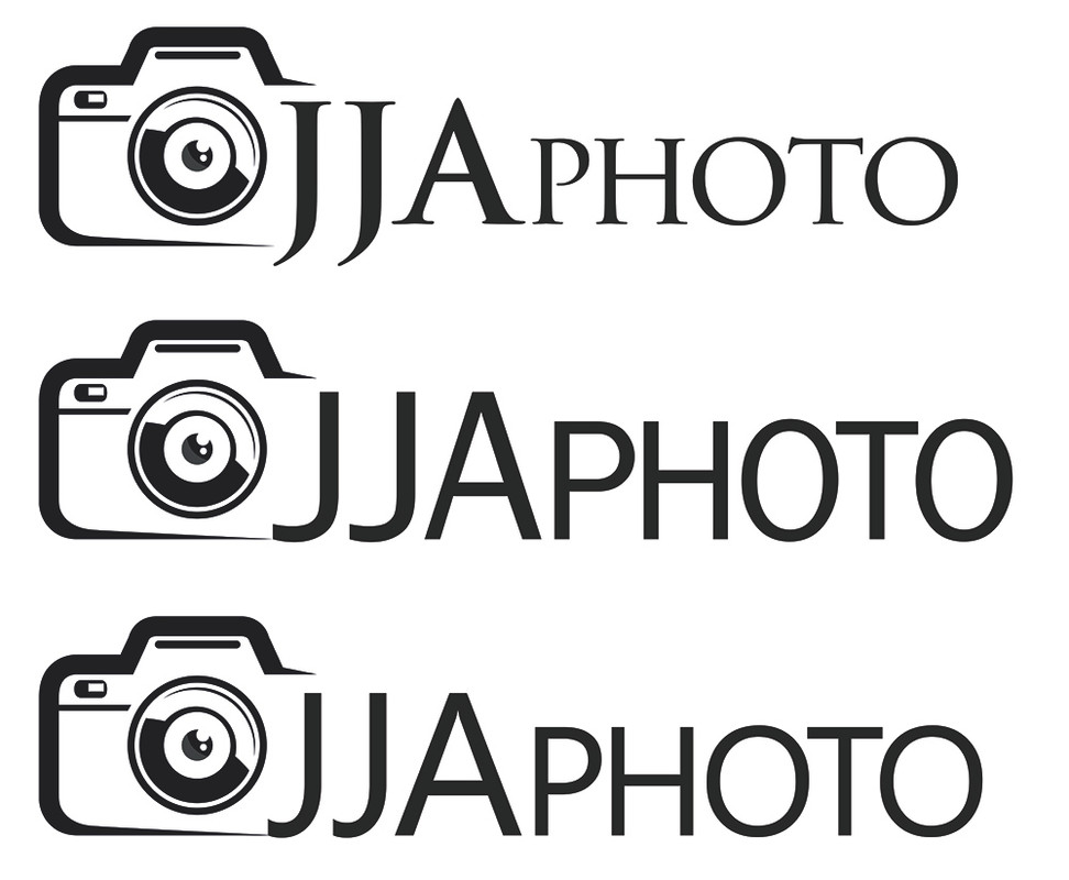
Any of the below?! (ignoring rushed positioning)
MUCH better without the unnecessary text. Bit of a conundrum for me, though, as the original font works better with the camera but I like the look of the last font the most. Perhaps worth trying to separate it more from the camera image and just nudge it up a tad (or bring the font down a bit - just prevent it appearing to be misaligned with the image).
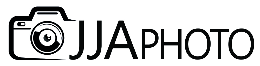

I like the first one, it looks pretty stylish imoWho knew choosing a font was so much fun
Any of the below?! (ignoring rushed positioning)

")
