Pladda

Messages
9,955
Name
Graham
Edit My Images
Yes
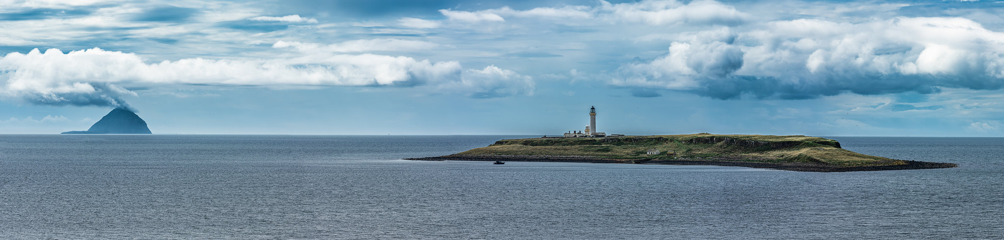
Initially it was going to be just Pladda, but the cloud formation around Ailsa Craig almost had a volcano look which I thought was interesting, so I kept it in. But does this wider crop cause Pladda to be a little lost? Critique is always welcome.

One of the things I'm trying to improve with is reigning in the number of photos in a stitch. Whilst I do like a big detailed pano, I feel that it can sometimes be too much for a screen.

 
No - looks good as it is.

Thanks. I'm not sure if something about Pladda doesn't quite look right? It almost looks superimposed. I'm using a laptop this week, which I often wonder how people manage to do because physically tilting the screen an extra inch changes the contrast so how do you maintain consistency?

It's been quite brutal doing stitches on it because I would be maxing out the 16GB Ram and the SSD would be taking over. However, two new 16GB sticks just arrived so now have 32GB and hoping that will make a big difference.
 
Firstly, it's a lovely scene.

I do see your point about Pladda, the bottom edge of it looks a little cut out, especially to the right hand side. I'm not sure what you use for PP but sharpening can sometimes cause this effect as well as texture or clarity. It could just be an artifact of the stitching process. I'd check the single, non processed image of that part of the stitch.

It's a really nice image, would look good on a wall. (y)

Thanks and I definitely agree that something about it doesn't look right. There was a minor aligment issue which I didn't notice until after doing my editing, which was rather annoying, but it was on the sea level, but I wouldn't rule out other areas.

There was a fair amount of editing so it's more than likely this has also had an impact, perhaps along with the small detail being reduced so much as it doesn't quite look so bad in the full resolution here LINK, however, there doesn't appear to be very much (or enough) difference with the water immediately around the rocks which I feel give it that pasted on look. I'll need to check the originals as you say. I'm not keen editing on this laptop, whilst the specs are decent the screen feels poor.
 
Here's a screen grab from the original and it still looks weird to me! lol

1689167077258.png


Compared to the original left side, the water is far more authentic looking. I guess it must have been the light or the angle I was shooting it from?

1689167027272.png


EDIT: Just to add, now that I've upgraded from 16GB to 32GB of RAM oh what a difference that has made with editing on this thing! Was just remembering about your computer build thread, in fact was looking at it early this morning.
 
Last edited:
Was just remembering about your computer build thread, in fact was looking at it early this morning.


That turned into a bit of a beast. It doesn't break a sweat with anything I throw at it.


Edit: I agree, the full size linked version and the screen grab of the original aren't as noticeable. I have a feeling it's something in camera but probably to do with the light too, then emphasised in PP.
 
Last edited:
Ping.

Light just came on.


Did you lift the shadows on the island, and highlights elsewhere?
 
Last edited:
Ping.

Light just came on.


Did you life the shadows on the island, and highlights elsewhere?

Ah, I did, I think from memory quite considerably. One of the critiques from a previous photo was that the land was too dark and needed the shadows lifted, so I took it onboard.

I'm going to revisit the edit on this as I'm not happy and now that I've increased my RAM it should be a lot easier!

I'll be paying closer attention to this now, thanks!
 
Had another play and a less aggressive edit, but it stil looks a little odd, even with no editing at all. The original is underexposed as I was exposing for highlights, so that maybe hasn't helped.


Pladda v2 Resized.jpg
 
Back
Top